

Learn More About Us

To optimize your blog for mobile readers, embrace responsive designA web design approach that makes web pages render well on a variety of devices and window or screen ... so that content adjusts seamlessly across devices. Prioritize fast loading speeds by compressing images and using caching. Simplify navigation with a hamburger menu and limit items to essentials. Optimize multimedia with lazy loading and responsive images. Enhance readability using a clear font, short paragraphs, and bullet points. Implementing these strategies will greatly improve user experience and keep them engaged with your content for longer.
When optimizing your blog for mobile readers, embracing responsive design is essential. You want your blog to look great on any device, whether it’s a smartphone, tablet, or desktop.
By using a responsive design, your content automatically adjusts to fit different screen sizes, offering a seamless reading experience. This approach eliminates the need for users to zoom or scroll excessively, keeping them engaged.
Start by choosing a mobile-friendly theme or template. Many platforms offerThe specific product or service being promoted by affiliates. themes that adapt to various devices.
Also, consider using flexible images and fluid grids. This guarantees that visuals resize proportionally, maintaining the integrity of your design.
Test your blog on multiple devices to see how it performs. Remember, a responsive design enhances user experience, keeping readers coming back.
As you refine your blog's responsive design, another key element to focus on is fast loading speeds. Mobile readers expect quick access to content, and any delay can leadA potential customer referred by an affiliate who has shown interest in the product or service but h... to higher bounce rates.
To guarantee your blog loads swiftly, optimize images by compressing them without losing quality. Minimize HTTP requests by reducing the number of plugins and scripts running on your site.
Also, consider using a content delivery network (CDN) to distribute your blog's content efficiently across various locations. Enable browser caching to allow returning visitors to load your blog faster.
Every millisecond counts, so test your blog on different devices and networks to identify and fix sluggish areas. Prioritizing speed enhances user satisfaction and boosts search engine rankings.
To enhance user experience on mobile, streamline your blog's navigation. Users want quick access to content, so a cluttered menu can frustrate them.
Simplifying navigation keeps readers engaged and encourages them to explore more of your site. Here are ways to do that:
These steps guarantee a smooth, user-friendly mobile experience.
Even though mobile devices have smaller screens, they can still deliver vibrant visuals when images and multimedia are optimized effectively.
Start by confirming your images are compressed without losing quality. Large files slow down your site, leading to frustrated readers. Use tools like TinyPNG or JPEGmini to reduce file sizes.
Next, choose the right file format. Use JPEG for photos and PNG for graphics with transparent backgrounds.
Implement responsive design techniques so images adjust to various screen sizes. For multimedia, confirm videos are mobile-friendly by using HTML5 video formats and offering captions for accessibility.
Additionally, lazy loading can improve load times by only loading images when they’re in view.
Optimizing visuals keeps your blog engaging while maintaining swift performance.
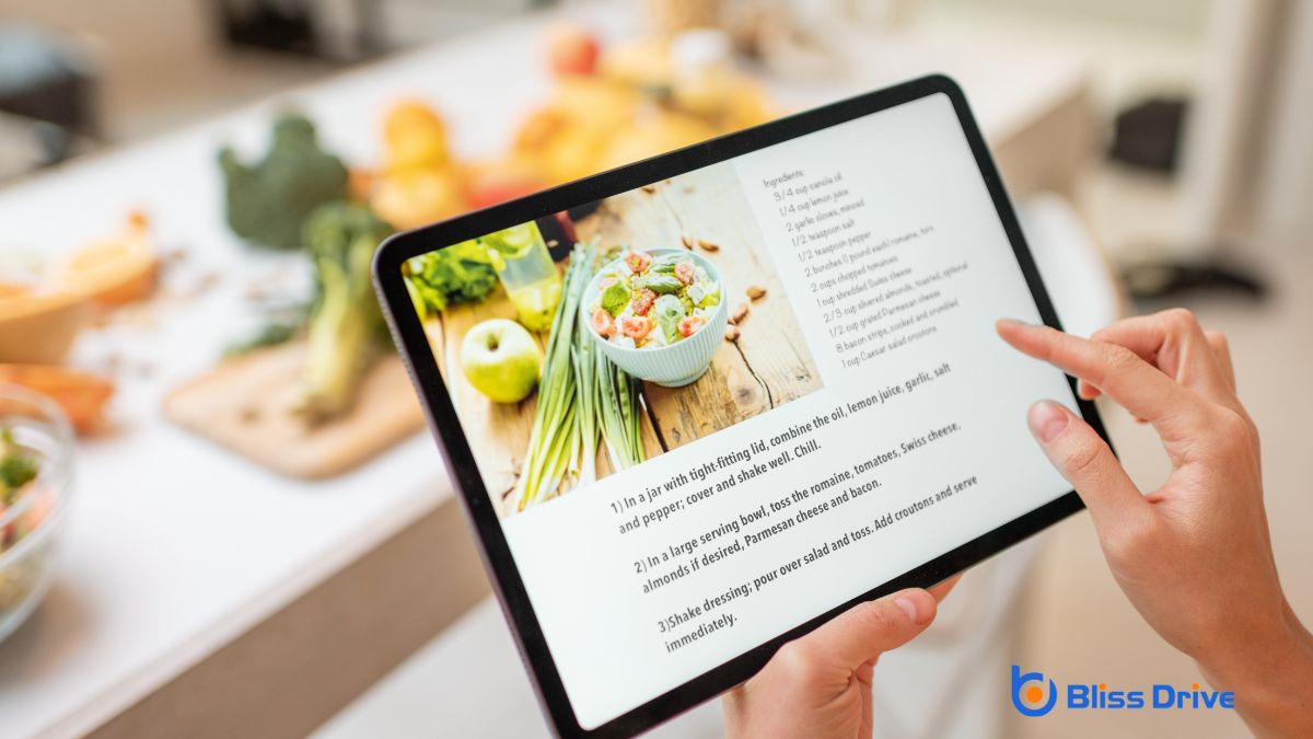
Optimizing visuals is only part of the equation; making sure your content is easy to read on small screens is equally important.
Start by choosing a clear, legible font. Stick to a size that’s comfortable for mobile users to avoid unnecessary zooming.
Consider these strategies to enhance readability:
Implement these tips, and your blog will be more inviting for mobile users.
In optimizing your blog for mobile readers, make certain you're embracing responsive design so it looks great on any device. Prioritize fast loading speeds to keep readers engaged and minimize bounce rates. Simplify navigation, making it easy for users to find what they need quickly. Optimize images and multimedia to guarantee they load seamlessly and don’t slow down your site. Finally, enhance readability with clear fonts and layouts, making content easy to digest on small screens.


