

Learn More About Us
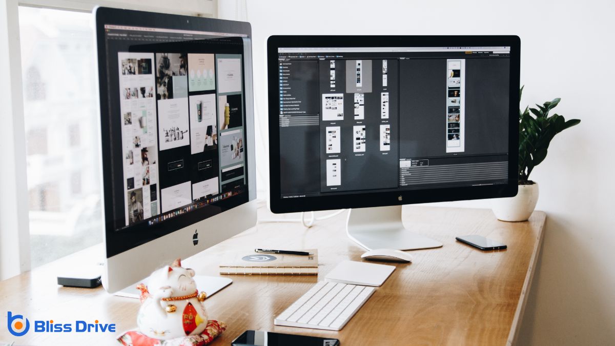
Let's explore the fascinating world of web design and discover how it shapes our online experiences. We'll look at three key types: static, dynamic, and responsive. Each of these design approaches offers unique advantages depending on the project's requirements. Understanding their differences can help us make informed decisions for creating effective websites. Curious about how these designs work and which might be best for your needs? Let's continue and find out.

Static web design, a fundamental approach in the digital domain, offers simplicity and reliability. We find it ideal for websites where content doesn't require frequent changes. Imagine visiting a site where information is static and consistent each time. That's the beauty of static design—it's straightforward and easy to manage.
In static web design, each page exists as an independent HTML file, making it faster to load and secure. We don't need complex server-side processing, which means fewer vulnerabilities. This method suits small businesses or personal sites where engaging content remains constant.
Let's appreciate how static design empowers us to create functional websites without the fuss. With the right tools, we can achieve a clean, professional presence online, ensuring our message remains clear and accessible.
How do we create websites that adapt and respond to users' needs? By embracing dynamic web design, we can craft sites that interact with users in real-time using server-side scripting languages like PHP or ASP.NET.
These websites can access databases, customize content, and provide interactive features, making them more engaging and functional than static designs.
Dynamic web design allows us to tailor user experiences by tracking user behavior, preferences, and actions. This approach facilitates personalized content delivery, ensuring users see relevant information, boosting satisfaction and engagementThe interactions that users have with a brand’s content on social media..
Unlike static websites, dynamic sites can update without manual intervention, offering fresh content effortlessly.
As we navigate dynamic design, we must focus on efficient coding and robust server configurations to maintain performance and security.
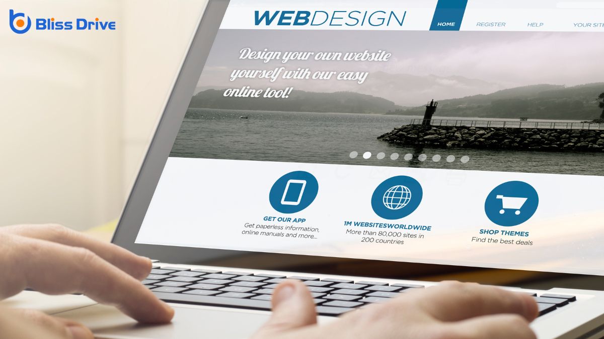
When creating websites, it’s essential to embrace responsive web design to guarantee our sites function seamlessly across various devices and screen sizes. Responsive design guarantees our content looks great whether viewed on a smartphone, tablet, or desktop. We achieve this by using flexible layouts, images, and CSS media queries to adapt to the user’s environment.
Understanding the basics of responsive design involves recognizing the fluidity it brings. Instead of designing multiple versions of a site, we create one that intelligently adjusts. This adaptability enhances user experience and accessibility.
Why should we care about the different types of web design? Understanding them helps us choose the best approach for our needs.
Let’s compare their benefits.
Responsive design adjusts seamlessly to various screen sizes, ensuring our site looks great on both desktop and mobile devices. This adaptability can enhance user experience and improve search engine rankingsThe position at which a website appears in the SERP..
On the other hand, adaptive designDesigning webpages to adjust to different screen sizes and devices, similar to responsive design. offers tailored experiences by using different layouts for specific devices, providing precise control over our site’s appearance.
Finally, static design, while less flexible, is straightforward to develop and maintain, making it ideal for simpler projects with limited budgets.
Selecting the right web design for our project can seem intimidating, but it doesn't have to be.
First, let's consider our goals. Do we need a responsive design to guarantee our site looks great on any device? If so, this option adapts seamlessly to different screens.
Or maybe we need a static design, perfect for projects with consistent content that rarely changes. Ultimately, if our project requires frequent updates, a dynamic design might be best, allowing easy content management.
Next, let's think about our audience. Who'll visit our site? Understanding their needs and preferences will guide our design choices.
Finally, we should consider our budget and timeline. Aligning these factors with our design type will guarantee a successful project outcome.
To sum up, we've explored the three main types of web design: static, dynamic, and responsive. Each serves a unique purpose, catering to different project needs. Static design is great for sites with minimal updates, while dynamic design offers real-time interaction and customization. Responsive design guarantees a seamless experience across devices. As we choose a design approach, let's consider our project's goals and audience. By aligning our choice with these factors, we can create the most effective web presence.


