Learn More About Us
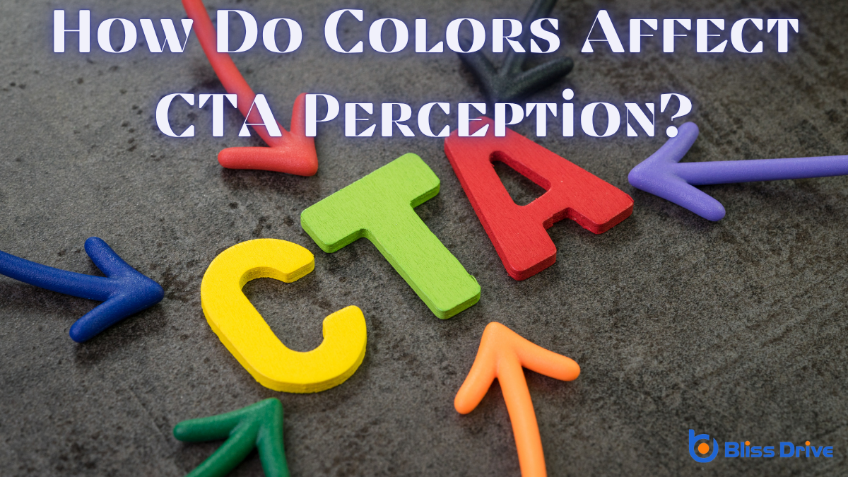
You're about to discover how the colors you choose for Call to Action (CTA)A prompt that encourages users to take a specific action, such as "Buy Now" or "Sign Up." buttons can dramatically influence how users perceive and interact with them. Colors aren't just visual elements; they evoke emotions and guide decisions. Imagine the urgency of red, the trust instilled by blue, or the optimism of yellow. These hues can be the difference between a click and a missed opportunity. Ready to reveal the secrets behind these powerful tools?
Though it might seem subtle, color plays an essential role in marketing by influencing consumer emotions and behaviors. When you encounter different colors, each one can evoke specific feelings and reactions.
For instance, blue often creates a sense of trust and calmness, making it popular among brands wanting to convey reliability. Yellow, on the other hand, can stimulate feelings of happiness and energy, drawing attention and uplifting moods.
Understanding these psychological impacts helps marketers create effective messages and calls to action (CTAs). When you see a color, your brain immediately processes it, linking it to past experiences and emotions.
This subconscious association can guide your decisions, whether you’re aware of it or not, ultimately impacting how you perceive and interact with marketing materials.

When it comes to grabbing attention and creating a sense of urgency, red is unmatched. You’ll find that red naturally draws the eye, making it a powerful choice for Call to Action (CTA) buttons. This color conveys excitement and urgency, compelling users to act quickly.
Red can stimulate strong emotions and create a sense of immediacy, which is why it’s often used in sales or limited-time offers.
However, it’s essential to use red strategically. Too much red can feel overwhelming or aggressive, so balance is key.
Consider the context of your website or app design and guarantee the red CTA stands out without clashing with other elements. This way, you can effectively harness red's power to drive conversions and engagementThe interactions that users have with a brand’s content on social media..
While red captures urgency and excitement, blue brings trust and dependability to your Call to Action (CTA) buttons. When you use blue in your CTAs, you’re tapping into a color that's universally associated with stability and confidence.
Think about how often blue is used by banks and tech companies; it’s not a coincidence. This color reassures users, encouraging them to click because they feel safe and secure.
Using blue is particularly effective when you want to communicate reliability. It’s perfect for CTAs that involve signing up for services or sharing personal information.
Green, a color often linked with nature, growth, and renewal, brings a sense of balance and harmony to your Call to Action (CTA) buttons.
When you use green in your CTAs, you tap into its calming and reassuring qualities that can subtly encourage users to take action. It’s a color that signals go, making it effective for buttons that leadA potential customer referred by an affiliate who has shown interest in the product or service but h... to positive actions like signing up or completing a purchase.
People often associate green with trust and reliability, which can enhance their comfort level in engaging with your content. Additionally, green's link to money can make it particularly appealing in e-commerce settings.

Just as green embodies growth and harmony, yellow brings a burst of optimism and warmth to your Call to Action (CTA) buttons. When you incorporate yellow, you’re inviting positivity and energy into your design. This color can make your audience feel enthusiastic and motivated to engage. You’re fundamentally telling them that there’s something exciting waiting for them on the other side of that click.
Yellow is a color that naturally captures attention. It’s associated with the sun, light, and joy, making it perfect for drawing eyes toward your CTA.
When you use yellow, you’re not just highlighting a button; you’re setting a mood. Your audience will feel a sense of cheerfulness and urgency, encouraging them to take the next step.
Contrasting colors can dramatically influence how your audience perceives your Call to Action (CTA) buttons. By using contrasting colors, you guarantee your CTA stands out, catching the viewer's eye and prompting interaction.
Here’s how you can utilize contrasting colors effectively:
Use these tips to enhance your CTA’s visibility and effectiveness.
After understanding how contrasting colors can enhance your CTA's visibility, it's important to evaluate and refine your choices.
Start by testing different color combinations to see how they resonate with your audience. Use A/B testingA method of comparing two versions of a web page or app against each other to determine which one pe... tools to compare variations and determine which color schemes yield higher engagement rates. Pay attention to user feedback and analyze performance metricsKey indicators used to measure the effectiveness of affiliate marketing efforts, such as clicks, con... like click-through rates and conversions.
Don't rely solely on intuition; data-driven decisions are key. Remember, context matters—colors that work for one audience mightn't work for another.
Continuously experiment and adapt as trends and preferences evolve. Keep an eye on your competitors, too. Their successful strategies might offerThe specific product or service being promoted by affiliates. insights you can apply.
Ultimately, optimizing CTA colors requires a balance of creativity, analysis, and adaptation.
In choosing CTA colors, remember that each hue evokes specific emotions and actions. Use red to create urgency, prompting immediate clicks. Opt for blue to build trust and reliability. Green invites growth and positivity, encouraging user engagementThe level of interaction and involvement users have with social media content.. Yellow adds warmth and optimism, making users enthusiastic to proceed. Don’t forget the power of contrasting colors to make your CTAs stand out. Continuously test and optimize to find the perfect color mix that resonates with your audience.