

Learn More About Us

To reduce layout shifts for SEO and enhance user experience, prioritize setting fixed sizes for all images and videos, and optimize media files to maintain layout stability. Use the font-display property with `swap` to keep text visible during loading and preload critical fonts. Manage dynamic contentEmail content that changes based on the recipient's preferences or behavior. with reserved spaces and placeholders to prevent shifts. Implement lazy loading for off-screen elements and use CSS transformations for smooth changes. Explore more to discover effective strategies for minimizing disruptions.
While it might seem minor, understanding the impact of layout shifts is essential for your website's SEO performance. When your site's elements move unexpectedly, it disrupts the user experience.
Imagine a visitor trying to click a button, but it suddenly shifts, causing frustration. This negative interaction can leadA potential customer referred by an affiliate who has shown interest in the product or service but h... to higher bounce rates and decreased engagementThe interactions that users have with a brand’s content on social media..
Search engines like Google prioritize user experience in their ranking algorithms. If your site frequently experiences layout shifts, it sends a signal that your site mightn't offerThe specific product or service being promoted by affiliates. the best experience.
This can affect your rankingsThe position at which a website appears in the SERP., pushing your site lower in search results. To maintain and improve your SEO, focus on minimizing these shifts. By doing so, you'll enhance user satisfaction and potentially boost your site's search visibility.
To effectively manage layout shifts, you need to understand the significance of Cumulative Layout Shift (CLS) in Core Web Vitals.
By measuring CLS accurately, you can pinpoint areas needing improvement.
Then, you can focus on optimizing your strategies to enhance user experience and boost your SEO performance.
Understanding the importance of Cumulative Layout Shift (CLS) is essential for enhancing your website's user experience and SEO performance. CLS is one of the Core Web Essentials metrics, and it measures visual stability.
Imagine you're reading an article online, and suddenly, the text shifts as an image loads. It’s frustrating, right? This not only disrupts your user experience but also impacts your site's overall ranking on search engines like Google.
A high CLS score indicates frequent unexpected layout shifts, leading to user dissatisfaction. By minimizing these shifts, you create a smoother, more appealing browsing experience.
Curious about how to measure Cumulative Layout Shift (CLS) effectively? Start by using tools like Google’s Lighthouse or PageSpeed Insights.
These tools help you track CLS, providing visual feedback on how layout shifts impact user experience. CLS is part of Google's Core Web Vitals, focusing on the stability of your page as it loads.
To measure CLS, pay attention to unexpected layout shifts. A good CLS score is less than 0.1, indicating minimal shifts.
Monitor the layout during page load and interactions. Track elements that may cause shifts, like images and ads, to understand their impact.
Having learned how to measure Cumulative Layout Shift (CLS), it's time to focus on optimizing CLS strategies to enhance your site's performance.
Start by prioritizing visible content, ensuring that images, ads, and any dynamic content have defined dimensions. This way, the page layout remains stable as it loads. Avoid inserting new content above existing content unless necessary, as it can push elements down unexpectedly.
Use CSS to reserve space for ads and embeds, reducing surprises.
Consider using the font-display: swap feature for fonts to prevent invisible text flashes.
Also, monitor your site's real-time performance using tools like Google’s PageSpeed Insights or Lighthouse. These tools offer detailed insights, helping you identify and fix elements causing shifts, improving user experience, and SEO rankings.
To reduce layout shifts, focus on setting fixed sizes for your images and videos.
By doing this and utilizing aspect ratio boxes, you guarantee that media loads in a stable manner without disrupting the flow of your page.
This approach not only improves user experience but also enhances your site's SEO performance.
When optimizing your website for SEO, setting fixed media sizes plays an essential role in minimizing layout shifts. By defining specific dimensions for images and videos, you guarantee that your page layout remains stable as it loads. This stability improves user experience and helps with your SEO ranking.
Here's how you can set fixed media sizes effectively:
Although it might seem complex at first, using aspect ratio boxes is a straightforward way to maintain stable dimensions for your images and videos.
By defining a specific aspect ratio, you guarantee that the space required for these elements is reserved before they load. This prevents unexpected layout shifts, enhancing user experience and boosting SEO performance.
To implement this, calculate the aspect ratio by dividing the width by the height of your media. Then, use CSS to set a padding-top property, which maintains the aspect ratio.
For example, a 16:9 video would have a padding-top of 56.25%. This approach keeps your page layout consistent, no matter the content size or screen resolution.
Even though fonts can enhance your website's aesthetics, improper font loading can lead to frustrating layout shifts that harm user experience and SEO.
You can minimize these layout shifts by optimizing how fonts load on your site. Consider these practices:
Implementing these practices improves your website's performance and user experience.

After optimizing font loading practices, another effective strategy to enhance your site's performance and SEO is implementing lazy loading for off-screen elements.
By doing this, you guarantee that images and videos not immediately visible to users aren’t loaded until they scroll down to view them. This approach reduces initial page load times, improving user experience and search engine rankings.
To implement lazy loading, consider using attributes like `loading="lazy"` in your HTML for images and iframes. This simple step helps browsers prioritize what needs immediate attention.
Additionally, you can leverage JavaScript libraries or frameworks to handle more complex lazy loading scenarios. By adopting lazy loading, you’ll minimize unnecessary resource usage, guaranteeing your website runs efficiently and looks appealing without unexpected layout shifts.
When managing dynamic content, it’s essential to ensure that your website remains stable and responsive, contributing positively to user experience and SEO.
Dynamic content can often lead to unexpected layout shifts, confusing users, and impacting your site's performance. To handle this effectively, follow these strategies:
While focusing on reducing layout shifts, CSS transformations and animations can be your allies in creating smoother changes that enhance user experience. Instead of abrupt shifts that confuse users, you can use these tools to shift elements gently.
For instance, transform properties like scale or rotate help adjust element sizes or positions without affecting the document flow. Animations can provide visual feedback that elements are changing, making the process feel intuitive.
To implement these, start with simple CSS properties like `transition` for gradual changes. It's essential to set duration and timing functions that suit your content's pace.
Effectively minimizing layout shifts begins with diligent testing and monitoring. You’ll want to guarantee your website provides a seamless user experience, which can be achieved by keeping a keen eye on layout shifts.
Here’s how you can do this:
To enhance your website's performance and reduce layout shifts, tap into a variety of tools and resources available.
Start with Google’s Lighthouse, a powerful tool that audits your site’s performance, accessibility, and SEO, pinpointing areas needing improvement. Google PageSpeed Insights gives you a detailed breakdown of your site's speed and user experience issues.
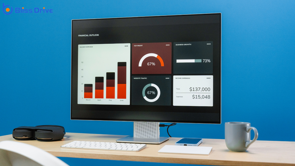
For tracking layout shifts, Google Search Console's Core Web Vitals report provides important insights into your site's performance metricsKey indicators used to measure the effectiveness of affiliate marketing efforts, such as clicks, con....
Dive deeper with tools like GTmetrix, which offers extensive reports on your site's loading speed and suggestions for improvement.
Don't overlook community resources and forums like Stack Overflow and WebDev, where developers share tips and solutions.
To reduce layout shifts and boost your SEO UX, you need to focus on stability and responsiveness. Prioritize setting explicit dimensions for images and videos, and optimize font loading to prevent unexpected shifts. Implement lazy loading for off-screen elements and handle dynamic content with care. Leverage CSS transformations for smooth animations. Regularly test and monitor your site's performance, using available tools to achieve a seamless user experience. By doing so, you'll enhance both user satisfaction and search rankings.


