

Learn More About Us
When it comes to mobile optimizationDesigning and formatting web content to ensure it performs well on mobile devices., several issues can impact your site's performance and user experience. Slow loading times annoy users, increasing bounce rates. Non-responsive designs make navigation difficult on different devices. Buttons should be large enough to avoid mis-taps. Intrusive pop-ups frustrate and distract users, while poor navigation leads to site abandonment. Inefficient image optimization wastes bandwidth and slows loading. If you're curious to improve your mobile site, there's much more to discover.

When it comes to mobile optimization, slow loading times can greatly affect user experience and engagementThe interactions that users have with a brand’s content on social media.. You’ve probably felt frustrated waiting for a sluggish page to load.
It’s essential to recognize that users expect quick access to information. If your site drags, they’ll likely leave and never return. Each second delay reduces user satisfaction and raises bounce rates.
To improve loading speeds, you should optimize images by compressing them without losing quality. Minify CSS, HTML, and JavaScript to reduce file sizes.
Leverage browser caching so returning visitors load pages faster. Also, consider using content delivery networks (CDNs) to distribute data efficiently.
Every improvement you make is a step toward retaining users and enhancing their mobile experience. Don’t underestimate the power of speed.
Even though mobile devices have become the primary way to access the internet, many websites still suffer from non-responsive design elements. You’ve likely encountered pages where images don’t scale properly or text requires endless scrolling. These issues make navigation frustrating and can drive users away.
A non-responsive design often ignores the different screen sizes and orientations of mobile devices, failing to adapt content accordingly.
To fix this, focus on using flexible grids and layouts that adjust seamlessly across devices. Implement scalable images and guarantee that text reflows naturally without losing readability.
When you're optimizing for mobile, button size is essential because users need to tap accurately without frustration.
Make sure there's enough spacing between elements to prevent accidental clicks on nearby links or buttons.
Prioritize user experience by ensuring touch targets are large and well-spaced.
In mobile optimization, button size plays a crucial role in user experience. When buttons are too small, users struggle to tap accurately, leading to frustration and potential abandonment of your app or site.
To guarantee ideal touch targets, consider these key points:
While optimizing for mobile, it's essential not to underestimate the importance of spacing between elements. When touch targets, like buttons or links, are too close together, users might accidentally tap the wrong item. This can lead to frustration and a poor user experience, potentially driving visitors away from your site.
To avoid this, verify there's adequate space between interactive elementsElements that require user interaction, such as buttons, forms, and sliders., making it easy for users to navigate with their fingers. Consider the average finger size and provide at least a 10mm touch target with enough padding around it. This helps in reducing accidental taps and improves accessibility.
Testing your design on multiple devices can help you identify spacing issues. Prioritize user comfort and functionality to enhance mobile usability and increase overall satisfaction.
Intrusive pop-ups often disrupt the mobile browsing experience, frustrating users and potentially driving them away from your site.
They can obscure content, slow page loading times, and lead to accidental clicks. To improve user experience and retain visitors, consider the following strategies:
Addressing intrusive pop-ups is just one piece of the puzzle for enhancing mobile user experience.
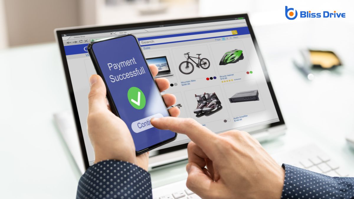
Another critical aspect is optimizing your images efficiently. Inefficient image optimization can slow down your site, frustrating users and increasing bounce rates. You must guarantee images are compressed without losing quality, making them faster to load on mobile devices. Use tools like TinyPNG or ImageOptim to reduce file sizes effectively.
Also, consider leveraging modern formats like WebP, which offerThe specific product or service being promoted by affiliates. superior compression.
Don't forget to use responsive images, guaranteeing they adapt to various screen sizes without sacrificing performance or quality.
Maneuvering a mobile site shouldn't feel like solving a puzzle, yet poor mobile navigation can often leave users frustrated and disoriented.
You want visitors to find what they're looking for quickly and effortlessly. Otherwise, they might abandon your site altogether.
To guarantee seamless navigation, focus on these key areas:
To guarantee your site is mobile-friendly, you need to address key issues like slow loading times and non-responsive design elements. Make sure touch targets are properly sized and avoid intrusive pop-ups that disrupt the user experience. Optimize your images efficiently and improve mobile navigation for seamless browsing. By tackling these challenges, you'll enhance user satisfaction and engagement, ultimately driving more conversions and success for your business in the mobile-driven world. Stay proactive and keep optimizing!


