Learn More About Us

Use CSS media queries effectively by adopting a mobile-first design strategy, guaranteeing your site is optimized for smaller screens first. Implement media queries based on content needs rather than specific device sizes to future-proof your designs. Test your design across various devices using tools like browser DevTools to guarantee consistent user experiences. Minimize media queries to boost performance and keep your styles clean and manageable. Explore more for an in-depth understanding and advanced techniques.

When designing responsive webpages, understanding the basics of media queries is essential. Media queries allow you to apply CSS styles based on the characteristics of the user's device, such as screen size, resolution, or orientation.
You can make your webpage adapt to different devices seamlessly by using media queries effectively. Start by identifying breakpoints where your design needs adjustments. Use the `@media` rule in your CSS to specify conditions for these breakpoints, ensuring that your layout remains user-friendly across various devices.
Remember, simplicity is key. Don't overcomplicate your styles. Instead, focus on making slight adjustments to improve usability and readability.
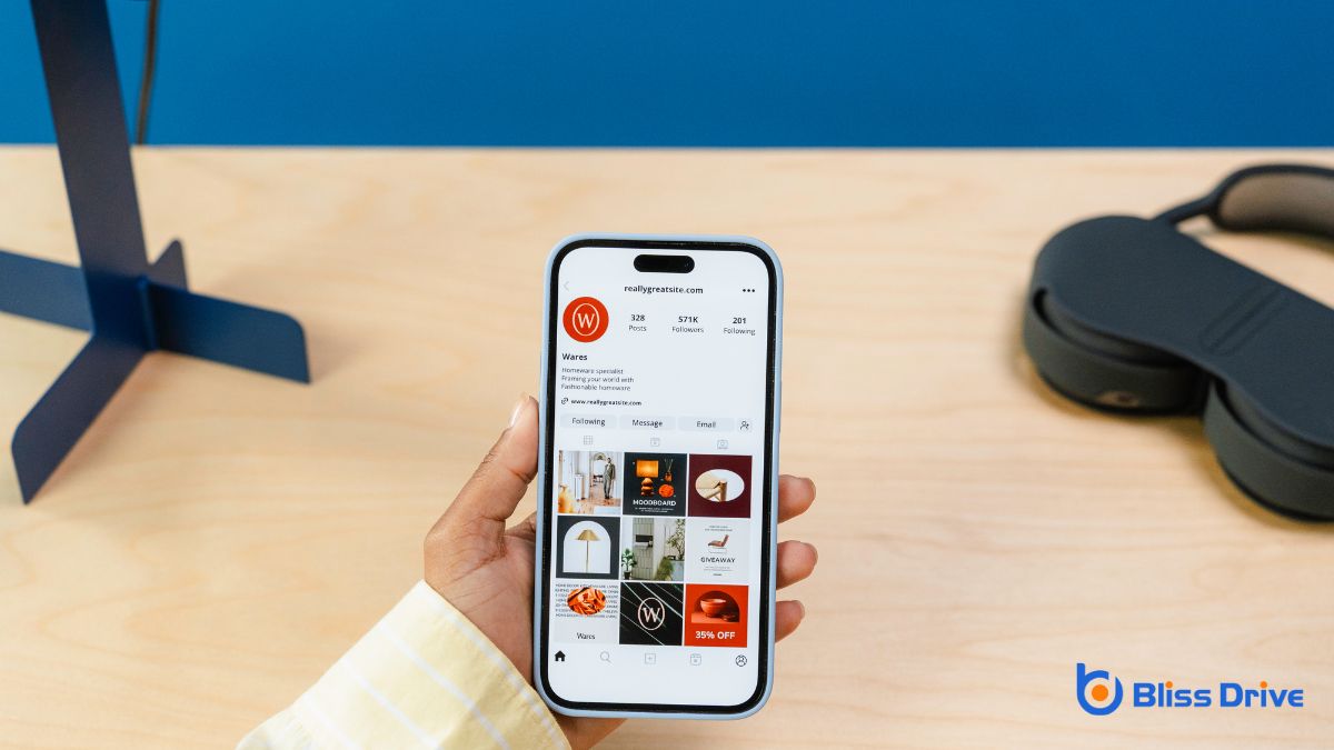
Embracing a mobile-first design approach can greatly enhance the user experience by guaranteeing your website is optimized for the smallest screens first.
Start by designing your layout and styles for mobile devices, where simplicity and efficiency are key. This guarantees your site loads quickly and looks great on smartphones and tablets, which are often the primary devices for web browsing.
In mobile-first design, you begin with the basics. Focus on essential features and content, adding complexity as the screen size increases.
This approach naturally leads to cleaner code and a more efficient design process. By prioritizing mobile-first, you’re also better equipped to handle varying device capabilities, leading to a more responsive and versatile site that meets the needs of all users.
When using breakpoints effectively, start by choosing ideal breakpoints that align with your design's content and layout changes rather than arbitrary device sizes.
This approach guarantees your site remains flexible and adapts smoothly across various screens.
Implement responsive designA web design approach that makes web pages render well on a variety of devices and window or screen ... strategies to maintain consistency and improve user experience on all devices.
To utilize breakpoints effectively, you need to focus on choosing ideal breakpoints that enhance the user experience across various devices.
It’s essential to adapt your design to different screen sizes, making certain content remains accessible and aesthetically pleasing. Instead of relying solely on popular device dimensions, consider the unique needs of your content.
Here’s how you can choose the best breakpoints:
These strategies will help create a seamless user experience.
Building on the foundation of choosing ideal breakpoints, you can enhance your responsive design strategy by focusing on how these breakpoints are utilized.
Start by designing mobile-first, guaranteeing your site is functional on smaller screens before adding complexity for larger viewports. This approach streamlines your CSS and prevents unnecessary overrides.
Use breakpoints strategically—don’t just target popular device sizes. Instead, let your content dictate when a layout change is necessary.
Test your design on various devices to guarantee a consistent user experience. It’s essential to manage your CSS specificity and avoid over-complicating your styles with too many conditions.
Consistently test your site’s responsiveness, and remember, flexibility is key.
Adapt your breakpoints as new devices and technologies emerge, guaranteeing your design remains future-proof.
Testing your CSS media queries across various devices is essential to guarantee a consistent user experience.
Use device-specific testing tools to check how your design responds to different screen sizes and types.
This approach helps you identify and fix any discrepancies, so your site looks great for every visitor.
How do you guarantee your CSS media queries work seamlessly across various devices? You’ve got to test them with the right tools. Here’s how you can ascertain that your site looks great everywhere:
These tools keep your design sharp and consistent.
Ensuring your media queries function seamlessly across different devices isn't just about using the right tools—it's about creating a consistent user experience.
Start by testing your site on a range of devices, including smartphones, tablets, and desktops. Don't rely solely on browser resizing; instead, use actual hardware for a more accurate representation.
Prioritize user experience by maintaining design coherence across various screen sizes. This means checking navigation, images, and readability. Pay attention to touch interactions as well.
Consider how different devices may affect user behavior and adjust your media queries accordingly. Remember, a consistent cross-device experience keeps users engaged and satisfied, reducing bounce rates and improving overall site performance.
When implementing CSS media queries, it’s vital to take into account performance to guarantee a smooth user experience. Media queries can impact load times and responsiveness, so optimizing them is important.
Follow these steps to achieve better performance:
After considering performance factors, it's equally important to embrace flexibility and fluidity in your CSS design strategy. Instead of rigid breakpoints, focus on creating a responsive layout that adapts seamlessly across different screen sizes.
Use relative units like percentages, ems, or rems rather than fixed pixels. This approach guarantees your design scales naturally with different devices, maintaining a consistent user experience.
Next, test your design across a variety of devices and orientations. It helps you spot any unexpected issues early on.
Don’t forget to prioritize content. Ascertain it's accessible and legible, regardless of the screen.

While creating responsive designs can be a challenging task, leveraging tools and frameworks greatly simplifies the process. These tools provide ready-made solutions, allowing you to focus more on design and less on technical details.
Mastering CSS media queries is essential for creating responsive and user-friendly designs. Start with a mobile-first approach, and carefully choose your breakpoints to guarantee seamless shifts across devices. Test your designs on various devices to catch any inconsistencies. Keep an eye on performance to avoid slowing down your site. Stay flexible and fluid to adapt to new technologies, and don't hesitate to use tools and frameworks to streamline the process. You've got this!
