

Learn More About Us
You'll face challenges with mobile navigation menus like ensuring designs adapt to diverse screen sizes, offering touch-friendly interactions, balancing aesthetics with usability, and maintaining fast load speeds. Accessibility remains a priority, requiring compatibility with assistive technologies. Simplifying complex information architecture without overwhelming users is essential, too. Finally, optimizing performance involves minimizing file sizes and streamlining code. Explore these challenges to enhance your understanding and create better mobile experiences.

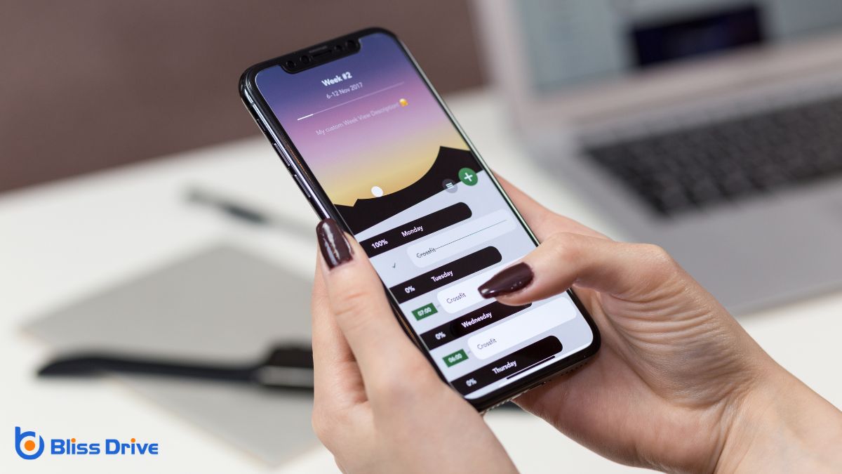
As mobile devices come in various sizes, adapting navigation menus for diverse screens is vital for a seamless user experience. You need to guarantee your website or app is accessible and functional, whether it's viewed on a smartphone, tablet, or large desktop monitor.
This involves creating responsive designs that adjust dynamically based on screen size. Prioritize touch-friendly navigation, as users often interact with mobile devices using their fingers.
Consider implementing a collapsible menu, like a hamburger icon, to save space and declutter smaller screens. Test your design across multiple devices to confirm consistency and usability.
When you're designing mobile navigation menus, you're constantly balancing visual appeal and functionality.
It's essential to create a user-friendly design that not only looks good but also enhances the user's experience.
Balancing the visual appeal and functionality of mobile navigation menus can be quite a challenge. You've got to make your menu look good while guaranteeing it works smoothly. A visually appealing menu attracts users, but if it’s not functional, they’ll quickly become frustrated.
Prioritize clarity and simplicity; avoid cluttering your design with unnecessary elements. Too many graphics or animations can slow things down, making navigation difficult. Always consider the user's experience—confirm the menu is intuitive and easy to use.
Also, test your navigation on various devices to verify it looks and works well everywhere. Remember, a clean, streamlined design often provides the best balance, offering both an attractive and functional user experience. Keep tweaking until you find that perfect balance.
Crafting a user-friendly design requires a strategic blend of aesthetics and usability. When you're designing mobile navigation menus, you need to guarantee that they’re not just visually appealing but also easy to use.
A seamless experience keeps users engaged and coming back. Here’s how you can achieve this balance:
Although designing mobile navigation menus can be complex, ensuring accessibility for all users is essential to create an inclusive digital experience. You should prioritize elements like screen reader compatibility and keyboard navigation.
Make sure your menu is easy to navigate with assistive technologies, allowing everyone to access content seamlessly. Use clear labels and avoid jargon to help users understand options quickly.
Consider color contrast as well, ensuring text is readable against different backgrounds. Don’t forget about touch targets—keep them large enough for users who may have motor impairments.
When it comes to mobile navigation menus, optimizing load speed and performance is essential for retaining user engagementThe level of interaction and involvement users have with social media content.. Users expect quick, seamless interactions, and any delay can leadA potential customer referred by an affiliate who has shown interest in the product or service but h... to frustration and site abandonment.
To guarantee your navigation menu performs at its best, consider these strategies:
After ensuring your mobile navigation menu loads swiftly, it's time to tackle the challenge of handling complex information architecture.
You've got a vast array of content, and organizing it efficiently is essential. Start by prioritizing the key sections users need most. Create a hierarchy that guides them smoothly from broad categories to more specific topics.
Avoid overwhelming users with too many options at once; instead, use nested menus or expandable sections to manage complexity.
Use clear, concise labels for menu items, ensuring they’re easily understood. Think about user behavior and the path they’ll take through your content.
Test different navigation structures and gather user feedback. Remember, your goal is to make navigation intuitive, keeping users engaged and helping them find what they need effortlessly.
Embracing responsive designA web design approach that makes web pages render well on a variety of devices and window or screen ... techniques is vital as you aim to provide a seamless user experience across various devices.
Mobile navigation menus present unique challenges, and making sure they're effective is critical. Responsive design adapts your menu's layout to fit different screen sizes and orientations, making your site accessible and user-friendly.
To help you tackle this, consider focusing on:
Implementing these techniques will enhance your mobile navigation experience.

To create an intuitive mobile experience, integrating touch-friendly interactions is vital. You need to guarantee that buttons and links are large enough for easy tapping without causing accidental clicks.
Design gestures like swipes and pinches that feel natural and intuitive, enhancing user engagementThe interactions that users have with a brand’s content on social media.. Simplify navigation with clear, concise icons and labels, so users can quickly find what they need.
Prioritize testing your design on various devices. It’s important to identify how different screen sizes and resolutions affect interaction.
Don’t underestimate the significance of feedback; animations or color changes can indicate successful taps, providing reassurance to users. By focusing on these elements, you’ll create a smoother experience, making users more likely to engage with your app or website and return frequently.
Maneuvering mobile menus can be tricky, but you can master the challenges with the right approach. Focus on adapting to diverse screen sizes and balancing aesthetics with usability. Guarantee accessibility for all users while optimizing load speed and performance. Tackle complex information architecture by incorporating responsive design techniques. Finally, prioritize touch-friendly interactions to enhance user experience. By addressing these areas, you’ll create a seamless and efficient mobile navigation experience for everyone.


