

Learn More About Us

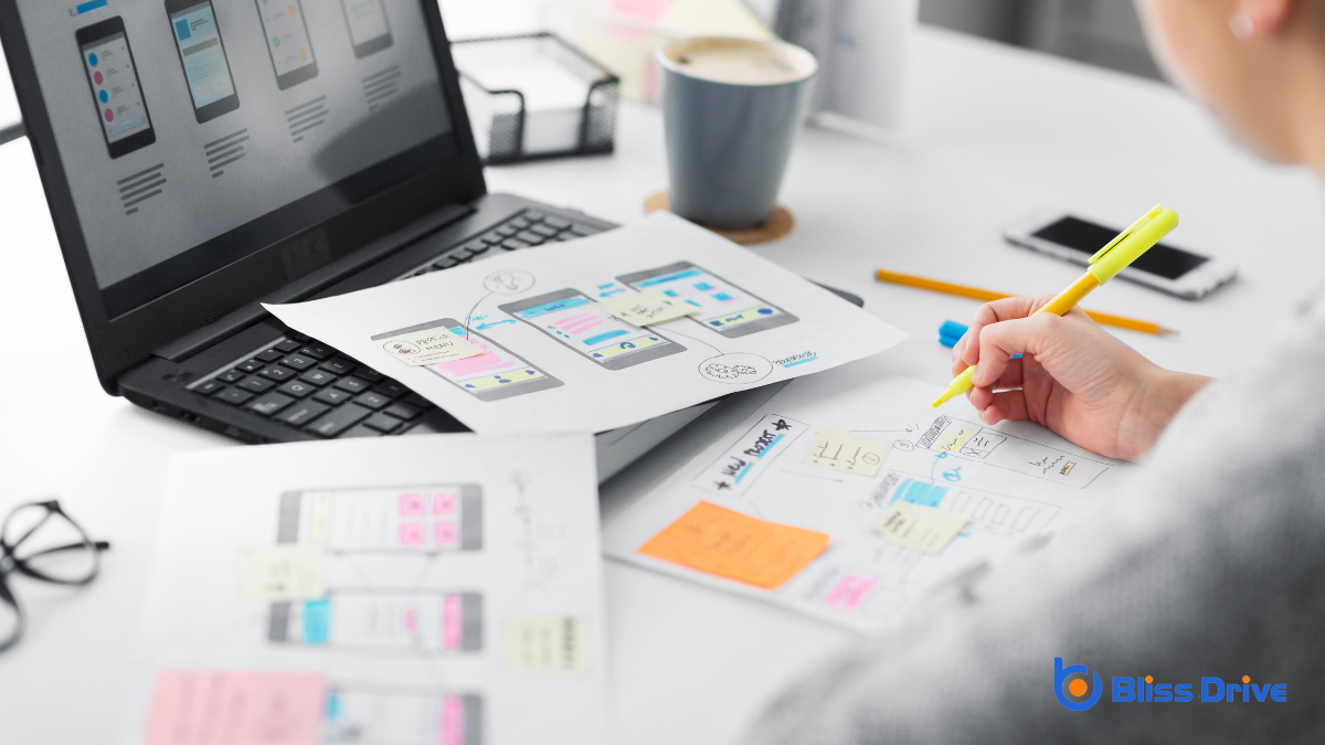
When it comes to web design, our primary focus should be on the user experience. By prioritizing intuitive and accessible interfaces, we're setting the stage for a successful digital product. It's crucial to understand user behaviors and motivations through research and usability testingEvaluating a website's ease of use by testing it with real users and gathering their feedback.. Creating a seamless experience involves simplicity, visual hierarchyThe arrangement of elements on a webpage in a way that guides users' attention to the most important..., and mobile responsiveness. But what are the key principles that truly make a website effective and welcoming for everyone? Let's explore.
When we design with a user-centric approach, we prioritize the needs and experiences of our audience above all else.
We focus on understanding their behaviors, motivations, and goals to create a seamless interaction. By putting ourselves in their shoes, we guarantee our designs are intuitive and accessible.
We conduct research to uncover user needs, employing surveys, interviews, and usability testing.
This data guides our decisions, allowing us to craft interfaces that truly resonate with users. Our goal is to make navigation effortless and the overall experience satisfying.
Having a user-centric design mindset naturally leads us to contemplate the simplicity of our web interfaces.
Simplicity isn’t about removing features; it’s about making interactions intuitive and effective. When users land on a website, they shouldn’t feel overwhelmed by complexity. We must focus on what truly matters to guide them effortlessly to their goals.
Simplicity minimizes distractions and helps users find the information they need quickly. By reducing clutter, we enhance user experience, making navigation smooth and satisfying.
We prioritize essential elements and remove anything that doesn’t serve a clear purpose. When we design with simplicity in mind, we create sites that aren't only visually appealing but also functional and efficient, keeping users engaged and satisfied.
When we think about visual hierarchy in web design, assigning visual priority is essential for guiding users through content.
Let's focus on using contrast effectively to highlight important elements and create clear pathways for navigation.
Although frequently overlooked, visual priority is essential in web design, guiding users effortlessly through a site. When we design a webpage, we need to take into account how each element catches the eye. Visual priority helps us organize content so users can easily identify the most important parts.
To achieve effective visual priority, we should:
Building on the importance of visual priority, contrast plays a pivotal role in establishing a clear visual hierarchy on a webpage. We use contrast to guide our audience’s eyes, ensuring they focus on what’s most important.
By varying elements like color, size, and texture, we create a distinct separation between different parts of our design. This separation helps users quickly identify key information, improving their overall experience.
Let’s consider color contrast—choosing colors that stand apart (like black on white) makes text more readable.
But contrast isn’t just about bold differences. We can also apply subtle contrasts to highlight details without overwhelming the viewer.
As we shift our focus to prioritizing mobile responsiveness, we must remember that mobile compatibility is essential in today's digital landscape.
Let's guarantee our designs adapt seamlessly to various screen sizes, providing users with a superior experience regardless of their device.
In today's fast-paced digital world, ensuring mobile compatibility is essential for any web design project.
Our audience often engages with content on their smartphones, so let's discuss why mobile compatibility matters.
First, it enhances user experience. Nobody wants to pinch and zoom to read content.
Second, it boosts SEO rankingsThe position at which a website appears in the SERP.. Search engines favor mobile-friendly sites, improving visibility.
Third, it increases conversionThe completion of a desired action by a referred user, such as making a purchase or filling out a fo... rates. A seamless mobile experience can drive sales and engagementThe interactions that users have with a brand’s content on social media..
We've highlighted the significance of mobile compatibility, and now let's focus on adapting our web designs to various screen sizes. As we create websites, it's vital to guarantee they look great and function smoothly on any device, be it a smartphone, tablet, or desktop.
By employing responsive designA web design approach that makes web pages render well on a variety of devices and window or screen ... techniques, we allow our sites to automatically adjust to different screen dimensions, enhancing user experience.
To achieve this, we can utilize flexible layouts, scalable images, and CSS media queries. These tools help us maintain design integrity across devices, making sure our content remains accessible and visually appealing.
Embracing mobile-first design principles also guarantees we prioritize essential features for smaller screens, then progressively enhance them for larger displays. This approach keeps our websites versatile and user-friendly.

While designing a website, we can't overstate the importance of ensuring fast load times. A speedy site keeps users engaged and enhances their experience.
Let's explore three critical strategies to achieve this:
A cohesive brand identityThe visible elements of a brand, such as color, design, and logo, that identify and distinguish the ... plays an essential role in web design, where every visual and textual element must align to communicate who we are effectively. By maintaining consistency in colors, fonts, and imagery, we guarantee our visitors recognize and remember us.
It’s about crafting a unified experience that reflects our values and mission, creating a lasting impressionWhen an ad is displayed on a user’s screen.. When consistency is maintained, our audience can easily identify our brand across different platforms, fostering trust and loyalty.
Brand elements like logos and taglines should be strategically placed to strengthen our identity. We must make certain that every piece of content reinforces our brand message. By doing so, we build credibility and make navigation through our website intuitive, allowing users to focus on the content we offerThe specific product or service being promoted by affiliates..
Maneuvering a website should feel as natural as flipping through the pages of a favorite book. We want our users to glide effortlessly through content without confusion. To achieve this, let's focus on crafting intuitive navigation.

Just as intuitive navigation guides users seamlessly through a website, accessibility and inclusivity guarantee that every visitor can engage with our content effortlessly.
We must make certain our designs cater to diverse needs, including those with disabilities. Using clear fonts, high-contrast colors, and alt textDescriptions added to images to help search engines understand the content of images. for images are vital steps in this direction. Accessible design empowers all users, regardless of ability, to interact meaningfully with our site.
Inclusivity extends beyond accessibility, embracing diverse cultural and social contexts. We should use language that resonates with a wide audience and avoid stereotypes.
As we endeavor for excellence in web design, testing and iteration become our allies in continuous improvement.
To create a user-friendly experience, we must embrace a cycle of feedback and refinement.
Let’s break it down:
In web design, we can't stress enough how essential it is to put the user first. By embracing simplicity, visual hierarchy, and mobile responsiveness, we're ensuring that users engage effortlessly with our sites. Let's not forget the power of consistent branding and intuitive navigation, which keeps our audience coming back. Accessibility and inclusivity should be at the heart of our designs. Through continuous testing and iteration, we’ll create an outstanding user experience that resonates with everyone.


