Learn More About Us
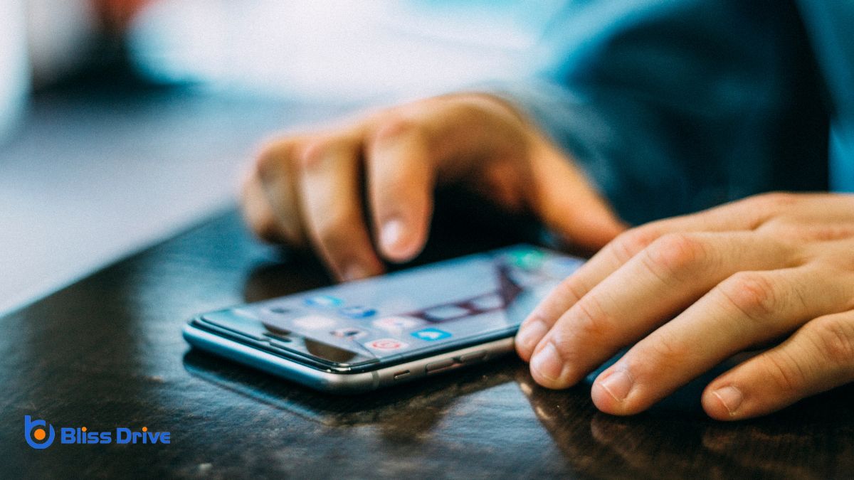
To make buttons touch-friendly on mobile devices, guarantee they're at least 44x44 pixels for easy tapping, and provide 8-10 pixels of spacing to prevent errors. Opt for rounded corners for a modern look and choose contrasting colors for visibility. Your designs should be consistent and adaptable across all devices and orientations to enhance usability. Paying attention to these elements improves the interface considerably, and there's even more you can discover about optimizing buttons.
When designing mobile interfaces, understanding the importance of button size and spacing is essential for creating a user-friendly experience. You want users to interact easily without frustration, so consider their finger size and dexterity.
If buttons are too small or too close together, it increases the chances of tapping the wrong one, leading to errors and dissatisfaction.
Think about how users hold their devices. They often use their thumbs, which require a comfortable reach and adequate space. Proper spacing helps avoid accidental taps and enhances usability.
Also, consider the visual appeal; well-sized buttons with ample spacing make the interface look clean and inviting.
When designing touch-friendly buttons, you should aim for the ideal button size to guarantee ease of use on mobile devices.
It's essential to maintain adequate spacing between buttons to prevent accidental taps and improve user experience.
Designing buttons for mobile devices requires careful consideration of touch target dimensions to guarantee a seamless user experience. You want to make sure that your buttons are large enough for users to tap comfortably without frustration.
A good rule of thumb is to aim for a minimum size of 44x44 pixels, as recommended by Apple’s Human Interface Guidelines. This size accommodates most users' fingers, allowing for accurate and easy interaction.
When designing, remember that larger buttons aren’t just more accessible; they also reduce the chance of accidental taps. Maintain consistency across your app to help users understand interactions intuitively.
Proper spacing between buttons is essential for a smooth and frustration-free user experience on mobile devices. When buttons are too close together, users might accidentally tap the wrong one, leading to errors or unwanted actions. To prevent this, guarantee there's ample space between each button. Aim for at least 8-10 pixels of padding around each touch target. This spacing helps users easily distinguish and accurately select buttons, even on smaller screens.
Be mindful of the overall layout. Balance the need for space with the available screen real estate. If you're dealing with limited space, consider prioritizing essential buttons and using dropdowns or expandable menus for less critical options.
Always test your design on real devices to guarantee that users can effortlessly navigate your interface.
Selecting the right button shape and style is essential for creating a user-friendly mobile experience. Rounded corners on buttons not only provide a modern look but also help prevent accidental touches, making them ideal for mobile interfaces.
Circular or oval buttons can stand out and invite interaction, while rectangular buttons with subtle curves maintain a professional appearance. Your button style should match your app's theme, enhancing the overall aesthetic.
Choose a size large enough for easy tapping but not so big it overwhelms the screen. Flat designs with clean lines can offerThe specific product or service being promoted by affiliates. a sleek, contemporary feel, while slightly raised or shadowed buttons give a sense of depth and tactility.
Always prioritize intuitive shapes that guide users naturally to the desired action.
To guarantee your buttons are both visible and easily distinguishable, consider the importance of contrast in your design. High contrast between the button and its background guarantees it stands out, making it easier for users to find and interact with. Use colors that don’t clash but provide a clear distinction. For example, a dark button on a light background, or vice versa, can be very effective.
Also, think about the text on your buttons. It should contrast well with the button color itself, guaranteeing readability. Avoid using similar shades for text and button backgrounds.
Test your design in various lighting conditions, as glare or dim lighting can affect visibility. By focusing on contrast, you enhance both the visibility and usability of your buttons.
When enhancing accessibility with responsive design, focus on optimizing button sizing to guarantee easy interaction for all users.
It's essential to provide adequate spacing between buttons, preventing accidental taps, especially on smaller screens.
Additionally, adapt your design to different screen orientations to maintain a seamless and user-friendly experience.
While designing mobile interfaces, ensuring buttons are ideally sized is essential for enhancing accessibility and user experience. You want users to interact with your app effortlessly. Aim for a minimum button size of 44x44 pixels, which aligns with Apple's guidelines, ensuring most fingers can comfortably tap without errors.
It’s not just about size, though; consider the visual appeal. Maintain consistency across your app, so users know what to expect. Use contrasting colors and borders to make buttons stand out distinctly.
Spacing is a crucial element in mobile design that often goes unnoticed but plays a significant role in accessibility and usability. When you're designing touch-friendly buttons, guarantee there's adequate space between each one. This prevents accidental taps, making navigation smoother for users.
You should aim for a minimum of 8-10 pixels of space around buttons to give users a clear target area. It reduces the chance of pressing the wrong button, especially on smaller screens. Remember, crowded interfaces frustrate users and can leadA potential customer referred by an affiliate who has shown interest in the product or service but h... to errors.
Additionally, spacing helps in guiding the user's eye, improving overall readability and interaction flow. By maintaining consistent spacing, you create a more aesthetically pleasing design and enhance the user experience, making your mobile app or site more accessible.
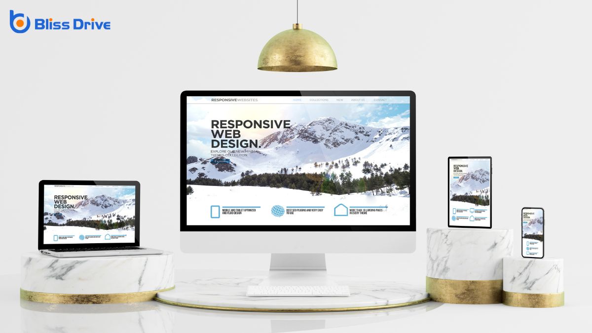
As mobile devices are used in various orientations, adapting your design to seamlessly shift between portrait and landscape modes is crucial. You must guarantee that buttons remain accessible and functional regardless of how the device is held.
Use media queries in your CSS to adjust button sizes and layouts based on the screen orientation. This guarantees buttons are always easy to tap, preventing user frustration.
When designing, prioritize a flexible grid system that can rearrange elements naturally as the orientation changes. Test your design in both modes to confirm that button placement and size are ideal.
Testing button usability across different devices often reveals surprising insights into user interaction. It’s essential to guarantee buttons work seamlessly on various screen sizes and resolutions.
Start by testing on popular mobile devices, such as iPhones, Android phones, and tablets. This helps you identify any inconsistencies in button size, placement, or responsiveness.
Simulate real-world conditions by testing in portrait and landscape modes. See how different lighting affects screen visibility. Don’t rely solely on emulators; use actual devices whenever possible to spot nuances that may go unnoticed otherwise.
Gather feedback from diverse users, as they’ll have different hand sizes and dexterity levels. Conduct usability tests to observe how easily users can tap buttons without accidental clicks.
This approach guarantees a smooth and accessible user experience.
To make buttons touch-friendly on mobile devices, focus on the ideal size and spacing to guarantee easy tapping. Use appropriate shapes and styles, and maintain good contrast for visibility. Always incorporate responsive design to enhance accessibility. Test buttons across various devices to ascertain consistent usability. By doing so, you'll create a seamless user experience, making navigation intuitive and frustration-free for your audience. Remember, a little attention to these details goes a long way in improving user satisfaction.