Learn More About Us

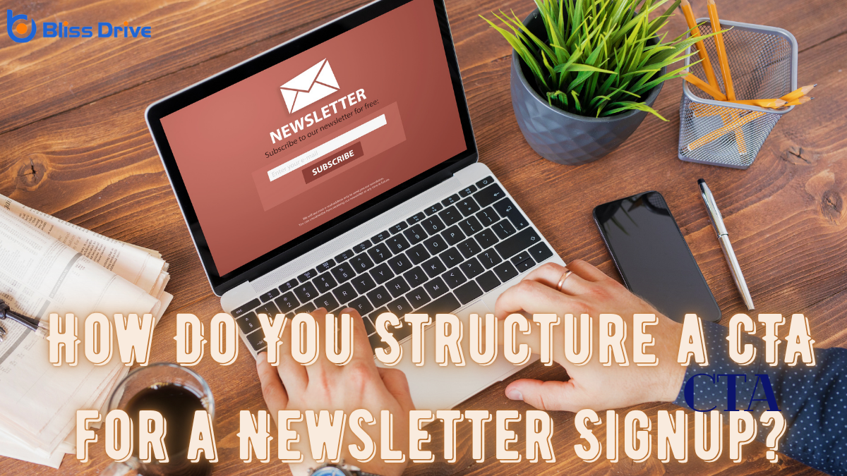
When crafting a CTA for a newsletterA regularly distributed email containing news, updates, and content relevant to subscribers. signup, start by understanding its core purpose and aligning it with your audience's needs. A compelling value propositionA statement that clearly explains the benefits of a product or service and why it is better than the... is essential, highlighting unique benefits like exclusive content. The language should resonate, whether casual or formal, and the button must stand out visually. Adding elements of social proofThe influence that other people’s actions have on one's own behavior, often seen in likes, shares,... and urgency can greatly boost engagementThe interactions that users have with a brand’s content on social media.. Curious about optimizing these elements to maximize conversions?
When crafting a Call to Action (CTA)A prompt that encourages users to take a specific action, such as "Buy Now" or "Sign Up." for your newsletter signup, understanding its purpose is essential. A clear purpose guides your CTA’s effectiveness, making it more than just a button or link.
You want to encourage action, and that means knowing what action you’re prompting. Is it to entice readers with exclusive content, keep them updated, or build a community around your brand? Identifying this will help you tailor your approach.
Your CTA should be direct and engaging, drawing the reader's attention and prompting a response. It’s not just about clicking—it's about aligning their needs with your offerings.

Once you’ve pinpointed the purpose of your CTA, it's time to focus on crafting a compelling value proposition. Your proposition should resonate with your audience's desires and needs. Highlight the unique benefits they’ll gain by subscribing. This connection is crucial; it creates motivation and urgency.
Consider these emotional triggers to make your value proposition stand out:
These elements will help you create a value proposition that speaks directly to your audience’s emotions and drives them to take action.
Selecting the right language and tone for your CTA is essential in capturing your audience's attention and encouraging them to act. You want your message to resonate, so consider who you're speaking to. Are they casual readers or industry professionals?
Use language they easily understand and find relatable. For a friendly tone, opt for words like “join” or “let’s,” making the action feel inviting. If your audience leans more formal, use direct and precise language.
Avoid jargon that could confuse or alienate potential subscribers. Instead, convey what’s in it for them clearly, whether it’s exclusive tips or insightful updates.
Be authentic and guarantee your tone aligns with your brand’s voice. This connection builds trust and motivates action.
How can you guarantee your CTA catches the eye and inspires action? Start by focusing on design elements that enhance visibility and impact.
First, make sure your CTA button stands out. Use contrasting colors and bold typography to draw attention.
Second, prioritize placement. Position your CTA where users naturally look, like the top or center of a page.
Third, create a sense of space around your CTA. Surround it with white space to make it pop and avoid clutter.
Finally, make your CTA interactive. Adding hover effects or animations can engage users and encourage clicks.
Here's a quick checklist:

While designing an eye-catching CTA is essential, incorporating social proof and urgency can further enhance its effectiveness.
Let potential subscribers know they're joining a community by highlighting the number of people who’ve already signed up. Phrases like “Join 10,000 others who love our insights” create social proof, making them feel part of a larger group.
Adding urgency can also prompt immediate action. Use time-sensitive language such as “Sign up now to get our exclusive guide” or “Limited spots available!” This encourages users to act quickly, fearing they might miss out.
To guarantee your CTA is as effective as possible, you'll need to embrace the process of testing and optimization.
Start by understanding that every audience is unique, and what works for one may not work for another. A/B testingA method of comparing two versions of a web page or app against each other to determine which one pe... allows you to experiment with different versions of your CTA, helping you discover what truly resonates.
Focus on these steps:
To effectively structure a CTA for a newsletter signup, focus on aligning it with your audience's needs and highlighting the unique benefits they'll gain. Use engaging language and a tone that resonates with them. Guarantee the CTA button is visually striking and strategically placed. Incorporate elements of social proof and urgency to create a sense of community and urgency. Continuously test and optimize your approach to maximize signups and keep your audience engaged.
