

Learn More About Us
To optimize your news website for mobile, embrace responsive web design for seamless adaptation across devices. Prioritize page speedThe time it takes for a webpage to load, affecting user experience and conversion rates. by compressing images and leveraging browser caching. Streamline navigation with logical menus and search functionality. Enhance readability with accessible fonts and colors, and integrate ads naturally to engage without disrupting content. Analyzing user behavior offers insights to refine these strategies. Discover more tips to elevate your site's mobile experience.

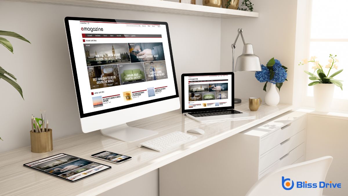
To guarantee your news website performs well on all devices, embrace responsive web design. This approach guarantees your site automatically adjusts to fit screens of various sizes, providing a seamless experience for users on smartphones, tablets, and desktops.
You don't want readers squinting or struggling with navigation; instead, let them enjoy easy access to articles and features.
Start by using flexible grids and layouts. They allow content to resize smoothly, maintaining readability and aesthetics.
Also, incorporate fluid images that scale correctly without losing quality. Test your website on different devices to identify any display issues and fix them promptly.
When it comes to keeping your audience engaged, page speed and performance are essential. Fast-loading pages guarantee your readers don’t lose interest or move on to another site.
You should compress images and leverage browser caching to reduce load times. Minify your CSS, JavaScript, and HTML files to streamline your site’s performance further.
Consider using a content delivery network (CDN)A system of distributed servers that deliver content to users based on their geographic location. to distribute your content efficiently across various global locations, reducing latency for users everywhere.
Regularly test your site’s speed with tools like Google PageSpeed Insights to identify and fix bottlenecks. Don’t forget to optimize server response times by choosing a reliable hosting provider.
A seamless user experience hinges on intuitive navigation, ensuring visitors can easily find the content they’re looking for. To achieve this on your news website, streamline your menu by organizing categories logically. Use clear, concise labels so users know exactly where each link will take them.
Make sure your navigation bar is accessible from every page, allowing readers to jump between sections without hassle. Consider a sticky menu that stays visible as users scroll, providing constant access to navigation options.
You should also include a search function prominently so users can quickly locate specific articles. Avoid overcrowding your navigation with too many options; simplicity is key. By making your site’s structure straightforward, you’ll keep readers engaged and coming back for more.
Images and multimedia content are essential for engaging your audience and enhancing the storytelling on your news website.
To optimize them for mobile users, make certain your images are responsive, so they adjust to different screen sizes without losing quality. Compress images to reduce loading times without sacrificing clarity. Tools like TinyPNG or ImageOptim can help with this.
For videos, use formats like MP4 for broad compatibility and consider embedding videos from platforms like YouTube to save bandwidth. Also, enable lazy loading, which loads images and videos only when they're in the viewport, improving initial load speed.
Don’t forget to include descriptive alt textDescriptions added to images to help search engines understand the content of images. for all images, which aids in SEO and helps users with visual impairments understand your content better.
To enhance readability and accessibility on your news website, start by optimizing the font and layout to guarantee that text is easy to read on small screens.
Improve navigation design so users can effortlessly find what they're looking for, minimizing frustration.
Additionally, choosing accessible colors will make your content more inclusive for readers with visual impairments.
While optimizing a news website for mobile users, focusing on font and layout is essential to enhance readability and accessibility.
Start by choosing a clean, legible font that's easy on the eyes, such as sans-serif, and guarantee the font size adapts well to various screen sizes. Don't make users squint or zoom in to read content.
Keep paragraphs short and use ample line spacing to avoid clutter.
Design your layout with mobile scrolling in mind. Employ a single-column format to prevent horizontal scrolling, and prioritize important content at the top.
Use headings and subheadings to structure articles effectively, making scanning easier. Incorporate white space strategically to reduce visual strain, guiding readers smoothly through your content.
This approach guarantees a comfortable reading experience for mobile users.
Effective navigation design is essential for ensuring a seamless user experience on mobile news websites. You want users to find content quickly, so make sure your menu is intuitive and easy to use.
Use a simple, collapsible menu that doesn’t overwhelm viewers. Prioritize important sections like the latest news or popular storiesA feature on platforms like Instagram and Facebook where users can post photos and videos that disap..., and keep options clear and concise.
Incorporate search functionality prominently, allowing users to find specific topics with ease. Breadcrumbs can also help users know where they are on your site and navigate back if needed.
Avoid using too many clicks to reach content; users should get what they want in two or three taps. Remember, streamlined navigation not only boosts readability but enhances overall accessibility, keeping users engaged and informed.
There's a reason why some websites are easier to read than others: accessible color choices.
When enhancing your news website for mobile, picking the right colors is essential for readability and accessibility. Poor color contrast can make your content hard to read, alienating users, especially those with visual impairments.
Here's how to choose accessible colors:
How can you enhance your news website's mobile performance and user experience? One effective way is to leverage Accelerated Mobile Pages (AMP).
AMP is a Google-backed project designed to speed up web page loading times on mobile devices. By implementing AMP, you guarantee that your news articles load almost instantly, keeping impatient readers engaged. It strips down HTML, uses streamlined CSS, and prioritizes content, which reduces lag and bounce rates.
To get started, convert your existing pages into AMP HTML format. Use AMP components for images, videos, and ads to maintain a consistent look and feel.
Validate your AMP pages with Google's AMP Validator to guarantee compliance. By adopting AMP, you’ll provide faster, more efficient access to your content, enhancing user satisfaction and retention.
When placing ads on your mobile news site, you should prioritize viewability and engagement.
Ads that are too intrusive can frustrate users and drive them away, so it's important to avoid formats that disrupt their experience.
Instead, opt for ads that integrate seamlessly with your content, ensuring they capture attention without being obtrusive.
To truly enhance the user experience on mobile devices, you should prioritize viewability and engagement by focusing on mobile-friendly ad placement.
Position ads where they naturally fit within the content and don't disrupt the reading flow. You'll want to guarantee that ads load quickly, as slow-loading ads can frustrate users and leadA potential customer referred by an affiliate who has shown interest in the product or service but h... to higher bounce rates.
Incorporate responsive design techniques so ads adjust to various screen sizes seamlessly. Consider user behavior and design ad placements that complement how users interact on mobile devices.
Building on the importance of viewability and engagement, it’s crucial to steer clear of intrusive ad formats that can disrupt the user experience on mobile devices.
When ads take over the screen or block content, they frustrate users and lead to higher bounce rates. Instead, integrate mobile-friendly ad placements that complement, not overwhelm, your content.
Opt for formats like in-article ads or native adsAds that match the look and feel of the platform on which they appear, providing a more seamless use... that blend seamlessly with your news site's design.
Keep ad sizes responsive to guarantee they fit well on various screen sizes.
Prioritize ads that load quickly to maintain site speed.
Remember, the goal is to enhance user experience, not hinder it.

Understanding user behavior is essential for optimizing your news website for mobile users. By monitoring and analyzing how visitors interact with your site, you can identify what works and what doesn’t.
Use analytics tools to track key metrics and gain insights into user preferences and habits. Here’s how you can get started:
To summarize, by embracing responsive web design, you’re ensuring your news site looks great on any device. Prioritizing page speed keeps readers engaged, while intuitive navigation makes finding stories a breeze. Don't forget to optimize images and multimedia for faster loading. Boost readability and accessibility to reach a wider audience, and leverage AMP for lightning-fast pages. Keep ads mobile-friendly, and always monitor user behavior to refine and enhance the mobile experience. Your readers will thank you!


