

Learn More About Us

To optimize your website for mobile, focus on responsive web design, guaranteeing layouts adapt across devices. Speed matters, so compress images and streamline load times. Simplify navigation with clear labels and easy-to-tap menus. Design touch-friendly interfaces with ample spacing and size-friendly buttons. Prioritize content visibilityThe extent to which content is discoverable by the target audience., choose modern image formats, and guarantee cross-browser compatibility. Integrate mobile-specific features like click-to-call and location-based services. Discover more strategies to enhance your user experience.
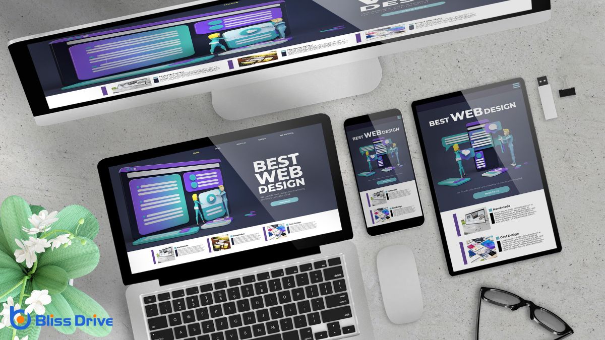
When building a mobile-optimized website, implementing responsive web design is essential. You want your site to look great and function flawlessly on any device, whether it's a smartphone, tablet, or desktop.
Start by using flexible grid layouts that adjust seamlessly to different screen sizes. Incorporate media queries to fine-tune your design for various devices, ensuring elements like text and images adapt accordingly.
Don’t forget to optimize touch targets, making buttons and links easy to tap on smaller screens. Prioritize simplicity and intuitive navigation, allowing users to find what they need quickly.
Want to make your mobile website faster?
Start by minimizing image sizes to reduce load times, so your visitors don't wait around.
Plus, enable browser caching to let returning users load pages even quicker.
One essential step in enhancing your website's page load speed is minimizing image sizes. Large images can considerably slow down your site, frustrating mobile users who expect quick access.
Start by compressing your images without losing quality. Tools like TinyPNG or JPEGmini can help reduce file sizes efficiently, making your pages load faster. Also, consider using modern image formats like WebP, which offerThe specific product or service being promoted by affiliates. improved compression rates.
To further optimize your images:
Following these steps will improve the user experience.
To enhance your website's page load speed, enabling browser caching is an essential strategy. When visitors return to your site, caching allows their browsers to store and reuse static resources like images, scripts, and stylesheets instead of downloading them again. This reduces the data load and speeds up the user's experience greatly.
You can set expiration dates for different types of content, ensuring that the browser only updates resources at appropriate intervals. Implementing browser caching involves modifying your server configuration or using plugins if you're on platforms like WordPress.
Don’t forget to test your settings to confirm everything works smoothly. By leveraging browser caching, you're not just improving speed but also enhancing user satisfaction, encouraging them to stay longer on your site.
When it comes to streamlining mobile navigation, simplifying your menu design is essential for a seamless user experience.
You should focus on enhancing user accessibility by ensuring that navigation elements are easy to find and use.
Ever wondered how a streamlined mobile menu can enhance user experience? When users land on your site, a clutter-free, intuitive menu design can make all the difference.
Simplifying your menu isn't just about aesthetics; it's about functionality. Users will appreciate a menu that’s easy to navigate, helping them find what they need quickly.
Here's how you can achieve that:
While mobile web browsing continues to dominate, making sure your site is accessible to all users is essential. Start by streamlining mobile navigation to create a seamless user experience. Implement a clean, intuitive menu design that’s easy to tap, even with a thumb.
Prioritize essential links and use recognizable icons to guide users effortlessly. Verify that text is legible without the need to zoom, and buttons are large enough to avoid accidental clicks.
Don’t forget about users with disabilities. Enable screen reader compatibility and offer alt textDescriptions added to images to help search engines understand the content of images. for images. Use high-contrast colors for better visibility and make certain all interactive elementsElements that require user interaction, such as buttons, forms, and sliders. are accessible via keyboard navigation.
Always test your site on various devices and operating systems to guarantee a consistent experience for everyone.
Designing touch-friendly interfaces is essential for creating a seamless mobile experience. You want users to navigate your site effortlessly, so it’s important to take into account how they interact with touchscreens.
Make sure buttons and links are big enough to tap without difficulty. A minimum size of 44x44 pixels is recommended for touch targets. Use ample spacing between interactive elements to prevent accidental taps and make certain of smooth navigation.
Here are the key elements to take into account:
These strategies enhance user satisfaction and drive engagementThe interactions that users have with a brand’s content on social media..
To create a mobile-optimized website that truly engages users, you must prioritize content hierarchy effectively. Start by identifying your most important information. Make certain it stands out at the top of the page or screen, where users can quickly find it.
Use clear headings and subheadings to break down content into digestible sections. This approach helps users navigate your site easily and find what they need without frustration.
Consider how users naturally scroll through content on mobile devices. Place essential information “above the fold” to capture attention immediately.
Use bullet points and lists to present information concisely. Keep paragraphs short and to the point. By doing so, you’ll guarantee your website is user-friendly, keeping visitors engaged and more likely to explore further.
Effective image and media optimization is essential for a seamless mobile browsing experience. You need to guarantee that your images and media load quickly and display properly on mobile devices.
Start by compressing images to reduce file sizes without sacrificing quality. Use formats like JPEG or WebP for images and MP4 for videos to balance quality and file size.
Keep these tips in mind:
While optimizing images and media enhances the mobile experience, guaranteeing that your website functions seamlessly across different browsers is equally important. You don’t want users to experience issues like broken layouts or unclickable buttons just because they’re using a different browser.
Start by testing your site on popular browsers like Chrome, Safari, Firefox, and Edge. Use tools like BrowserStack or CrossBrowserTesting to simulate various browser environments and identify potential issues.
Next, focus on using web standards and avoid browser-specific code as much as possible. Implementing responsive designA web design approach that makes web pages render well on a variety of devices and window or screen ... principles will help maintain consistency.
Confirm your CSS and JavaScript are compatible with the browsers you’re targeting. Regular testing and updating your code will help you stay ahead of browser updates and maintain a polished user experience.

When enhancing your website for mobile users, integrating mobile-specific features can greatly elevate the user experience. Users expect seamless navigation and quick access to information.
Start by including touch-friendly elements, so users can effortlessly interact with your site. Features like these make your mobile site more engaging and accessible:
These elements not only improve usability but also encourage users to return, boosting customer satisfaction and loyalty.
By focusing on these key components, you'll create a mobile-optimized website that impresses users and boosts engagement. Implement responsive design to guarantee seamless experiences across devices, and enhance page load speed to keep visitors on your site. Streamline navigation for easy access and design touch-friendly interfaces for intuitive interaction. Prioritize content hierarchy to highlight essential information, optimize images for speed, ensure cross-browser compatibility, and integrate mobile-specific features to meet users' needs effectively.


