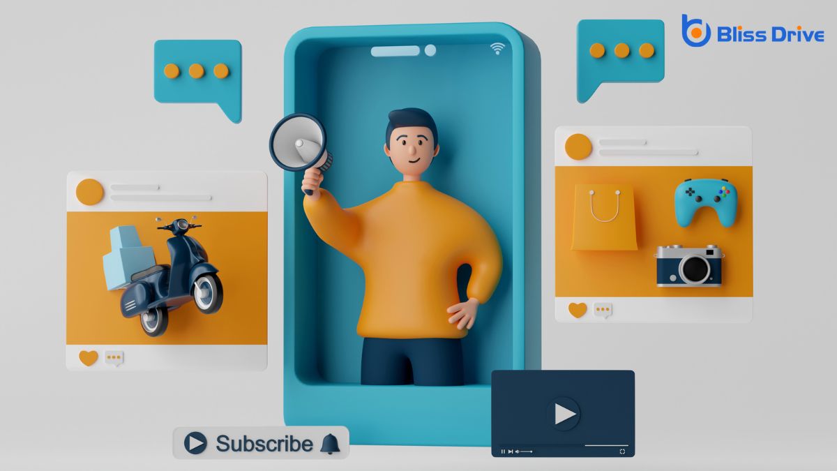
When we talk about the big four in digital marketing, we're referring to the essential components that drive a successful online strategy: SEO, Content Marketing, Social Media Marketing, and Email Marketing. These elements work together to boost visibility, engage audiences, and foster conversions. But how exactly do they interact, and what makes each one indispensable? Let's explore how these pillars form the backbone of any effective digital marketing plan.
When it comes to digital marketing, understanding Search Engine Optimization (SEO) is essential for success. We all know that SEO is about improving our website's visibility on search engines like Google.
But how do we achieve this? First, we must focus on keywords. Identifying the right keywords that our target audience uses is vital. We should incorporate these naturally throughout our content.
Next, we need to pay attention to on-page elements such as titles, meta descriptions, and headers. These elements should be optimized to make our content more attractive to search engines.
Finally, let's not forget about backlinks. Quality backlinks from reputable sites boost our credibility and rankings.

While SEO enhances our visibility, content marketing plays an essential role in engaging and retaining our audience. We create valuable, relevant content that resonates with our readers, fostering trust and loyalty. By understanding their needs and addressing their pain points, we guarantee our content isn't just informative but also actionable.
Our content strategy involves crafting articles, videos, blogs, and more, tailored to our audience’s preferences. This approach helps us position ourselves as industry experts, encouraging our audience to return for more insights. Engaging content also encourages sharing, expanding our reach further.
Ultimately, content marketing is about building relationships. By consistently delivering high-quality content, we nurture a community that values our brand, turning readers into loyal customers over time.
Social media marketing has undeniably transformed how we connect with our audience, offering a dynamic platform to engage and interact in real time. We can share our brand's story, showcase products, and build a community around our values.
By leveraging platforms like Facebook, Instagram, and LinkedIn, we reach diverse demographics and tailor our messages to resonate deeply.
It’s essential to craft authentic content that reflects our brand's voice and encourages interaction. Engaging visuals, timely posts, and responding to comments can foster relationships and boost trust.
We should analyze metrics to understand what resonates, allowing us to refine our strategies. Let’s harness social media's potential to expand our reach and elevate engagement, ensuring our marketing efforts are both effective and meaningful.
As we explore the domain of email marketing, it's clear that this tool remains one of the most powerful ways to engage with our audience directly.
Crafting effective emails requires understanding our audience’s needs and preferences. We should personalize content, using segmentation to tailor messages to specific groups. By doing so, we enhance relevancy and engagement.
Timing also plays a critical role. Sending emails when our audience is most likely to open them increases the chances of interaction.
Let’s not forget the importance of a compelling subject line—our gateway to capturing attention. Including clear calls-to-action guides readers toward desired outcomes.
Finally, we should always analyze the results. Tracking open rates and click-through rates helps us refine our strategy for better performance.

Let's explore how we can combine strategies from the Big Four to maximize our digital marketing efforts.
By integrating these key components, we'll enhance our digital synergy and create a more cohesive approach.
Together, we'll access new potential for success in our campaigns.
When we integrate the Big Four in digital marketing—SEO, content marketing, social media marketing, and paid advertising—we unleash a powerful synergy that enhances each strategy's effectiveness.
By combining these strategies, we guarantee our message reaches the right audience at the right time. For instance, we can optimize content for search engines to increase visibility while using social media to engage and build relationships.
Paid advertising then amplifies our reach, bringing in targeted traffic. Each component supports the others, creating a cohesive and efficient marketing plan.
Our goal is to create a seamless experience for our audience, guiding them from awareness to conversion. By strategically aligning these elements, we maximize impact and guarantee our digital marketing efforts lead to success.
To truly enhance digital synergy, we must seamlessly integrate the Big Four—SEO, content marketing, social media marketing, and paid advertising—into our marketing efforts. Each component plays a crucial role, but their collective power drives maximum impact.
By aligning these strategies, we create a more cohesive and effective marketing approach. Here's how we can achieve this:
As we navigate the digital marketing landscape, let's be mindful of common pitfalls like overcomplicating our campaign strategies.
It's essential to stay focused on our target audience's needs and not lose sight of the valuable insights data can offer.
Although digital marketing offers endless possibilities, one common pitfall is overcomplicating campaign strategies. It’s easy to get caught up in the latest trends and tools, but we must remember that simplicity often leads to success.
Let’s focus on avoiding complexity by considering these key points:
Understanding our target audience is essential for any successful digital marketing campaign, yet many of us make the mistake of overlooking this important component.
We might assume we understand what our audience wants, but without truly grasping their needs, preferences, and behaviors, our efforts can fall flat. When we ignore their needs, our messages may miss the mark, leading to low engagement and poor results.
We need to prioritize audience research to tailor our content and strategies effectively. Let’s ask ourselves: Who are we trying to reach? What problems do they face? How can our products or services provide solutions?
While understanding our target audience is paramount, we must also harness the power of data to inform our strategies. Neglecting data-driven insights can lead us astray in today's competitive digital landscape.
By embracing data, we can make informed decisions that enhance our marketing efforts. Here are three common mistakes to avoid:
Evaluating the performance of our digital marketing efforts is essential for refining strategies and maximizing returns. When we measure success, we need to focus on key performance indicators (KPIs) like conversion rates, click-through rates, and return on investment (ROI).
These metrics help us understand what’s working and where we need improvement. Let’s not forget about the importance of customer engagement and brand awareness, which can be gauged through social media metrics and web traffic analysis.
We must use analytics tools to track these metrics effectively. By doing so, we guarantee our strategies align with our goals and adapt to changing needs.
Regularly reviewing these insights allows us to make informed decisions, optimize campaigns, and ultimately drive better results for our digital marketing efforts.

How do we stay ahead in the ever-evolving landscape of digital marketing? We need to adapt swiftly to emerging trends and technologies to maintain our competitive edge.
Let’s explore some key actions:
1. Continuous Learning: We must regularly educate ourselves on industry shifts.
Attending webinars, reading articles, and taking online courses keep us informed and ready for change.
2. Embrace Innovation: Adopting new tools and technologies can drive better results.
Whether it's AI-driven analytics or the latest social media platform, being open to innovation helps us reach our audience effectively.
3. Monitor Competitors: Keeping an eye on competitors' strategies offers insights into what's working within our industry.
This awareness allows us to refine our approaches and stay relevant.
To build a future-ready digital marketing strategy, we must anticipate shifts in consumer behavior and technological advancements. By staying informed, we can adapt and thrive in a constantly evolving landscape.
First, let’s focus on data analytics. Leveraging data helps us understand trends and make informed decisions.
Next, embracing AI and automation can enhance personalization, making interactions smoother and more relevant. Additionally, adopting a mobile-first approach guarantees our content reaches users effectively, wherever they are.
We also need to prioritize ethical practices, fostering trust and transparency with our audience.
Regularly reviewing and adjusting our strategies is essential to remaining agile. By being proactive and open to change, we’re better equipped to meet future challenges and seize new opportunities in digital marketing.
To summarize, we've explored the Big Four pillars of digital marketing: SEO, Content Marketing, Social Media Marketing, and Email Marketing. By effectively integrating these elements, we can create a dynamic strategy that boosts awareness, engagement, and conversions. Let’s remember to avoid common pitfalls, measure our success, and stay adaptable to emerging trends and technologies. Together, we'll build a future-ready digital marketing strategy that keeps us ahead of the curve and drives our success.
Creating a CTA that reduces friction starts with understanding the user's journey and removing any potential obstacles. You should focus on crafting a clear, concise message that directs users toward a specific action. By emphasizing the value proposition and streamlining the decision-making process, you can minimize distractions. But how can you guarantee these strategies truly resonate with your audience? There's more to explore in crafting an effective and seamless CTA experience.
When it comes to creating effective CTAs, understanding the role of friction is essential.
You've got to recognize that friction refers to anything in the user experience that slows down or complicates their decision-making process. It could be extra steps, confusing language, or even poor design. Friction can make users hesitate, lose interest, or abandon their actions altogether.
To reduce friction, focus on streamlining the path to completion.
Think about how you can make the CTA process as smooth and intuitive as possible. Are there unnecessary fields in your form? Is the button easy to find and click?
By minimizing obstacles, you help users feel confident and encouraged to proceed.

As you work to reduce friction in your CTAs, focus on defining clear and concise messaging. When your message is straightforward, users know exactly what to expect and what action to take.
Start by using simple language that aligns with your audience's understanding. Avoid jargon or complex phrases that might confuse or overwhelm them.
Be specific about the action you want them to take. Instead of vague terms like "click here", use direct language like "get your free guide". This approach eliminates uncertainty and guides users smoothly.
Highlighting the value proposition is essential in crafting a compelling CTA that users can't resist. By clearly communicating what users gain, you can effectively capture their attention and reduce friction.
Here's how you can emphasize your value proposition:
Although decisions can often be overwhelming, simplifying the user's decision-making process is essential to creating an effective CTA. Start by providing clear, concise information that answers any immediate questions. When users understand what you're offering quickly, they're more likely to proceed.
Use visuals to guide them, making sure navigation feels intuitive. Don’t overwhelm them with too many options; instead, highlight the most relevant choice. This focus helps users feel confident and reduces hesitation.
Next, reduce steps in the process. Fewer clicks or form fields mean less chance for second-guessing. Make your CTA stand out, so users know exactly what action to take next.
Once you've simplified the user's decision-making process, it's time to focus on the power of words with action-oriented language. By choosing words that prompt immediate action, you create a sense of urgency and motivation.
Here’s how you can do it:
These techniques help reduce friction and drive engagement.
A successful call-to-action (CTA) isn't just about the words—it’s also about the design that captures attention and guarantees accessibility.
Focus on using contrasting colors that make your CTA stand out while making certain readability. Avoid overcrowding; a clean, uncluttered design can enhance comprehension and engagement.
Don't forget about size—make sure your CTA button is large enough to click easily but not overwhelming.
Accessibility is key, so use a readable font and make certain your design meets online accessibility standards, like the Web Content Accessibility Guidelines (WCAG). This includes providing text alternatives for images and making certain keyboard navigation is smooth.
To truly connect with your audience, tailor your CTAs to resonate with their specific needs and preferences. This personalization builds a stronger relationship and reduces friction.
Start by understanding your audience's demographics, interests, and behaviors. Use this insight to craft CTAs that speak directly to them.
Here's how you can personalize CTAs effectively:

After personalizing your CTAs to resonate with your audience, it's important to evaluate their impact. Start by conducting A/B tests to see which versions perform best. Alter elements like color, wording, or placement, and measure the results.
Use analytic tools to track click-through rates and conversion rates. These metrics reveal how effectively your CTAs engage users and prompt desired actions.
Don’t forget to look at the bigger picture—analyzing user behavior can provide insights into how CTAs fit within the overall user journey.
Regularly review and adjust your CTAs based on data findings to optimize their effectiveness. By continually testing and analyzing, you guarantee your CTAs remain compelling and reduce friction, consequently driving better results for your business.
Social proof and trust signals are powerful tools in enhancing your CTA's effectiveness. When people see others engaging with your brand, they're more inclined to follow suit.
Here’s how you can leverage these elements:
Implement these strategies to enhance trust, reduce friction, and improve your conversion rates.
When you incorporate urgency and scarcity tactics into your CTA, you create a compelling reason for potential customers to act immediately. By emphasizing limited availability or time-sensitive offers, you tap into the fear of missing out, which can drive quicker decision-making.
Words like “limited stock” or “only 24 hours left” add pressure, encouraging users to prioritize your offer.
Ensure your messaging is genuine; false urgency can erode trust. Use countdown timers or highlight how many items are left to visually reinforce scarcity.
It’s essential to clearly communicate the benefits of acting now. When potential customers understand that waiting could mean losing out, they’re more likely to convert.
Done right, urgency and scarcity can greatly reduce friction and enhance your CTA’s effectiveness.
To create a CTA that truly reduces friction, focus on clarity and simplicity. Use straightforward language that highlights your value proposition, guiding users effortlessly. Design your CTA to stand out visually, ensuring it's both eye-catching and easy to understand. Limit decision-making steps and personalize your message for your audience. Incorporate elements like urgency and social proof to boost trust and encourage quick action. By doing so, you'll enhance user experience and drive better results.
When considering the right call-to-action for a pricing page, you should focus on clarity and motivation to guide potential customers. Action-oriented language like "Get Started" or "Buy Now" can create urgency. Design elements such as contrasting colors and ample whitespace guarantee the CTA stands out effectively. But what truly makes a CTA irresistible? There's a subtle psychology at play that influences conversion rates, and understanding this could be the key to your success.
A well-crafted CTA on a pricing page isn't just a button—it's the pivotal bridge between your potential customer and your product. You need to guide users effectively, guaranteeing they know what action to take next. A clear, concise CTA eliminates confusion and encourages decision-making.
It’s important you use action-oriented language, like “Get Started” or “Buy Now,” reflecting the immediacy and benefits of your offer. Your CTA should also stand out visually, drawing attention without overwhelming the page.
Consider the color contrast and placement to guarantee it's easily noticed. Remember, the goal is to create an intuitive path from curiosity to commitment. By crafting a CTA that aligns with your audience’s needs and expectations, you’re more likely to convert interest into action.

When crafting effective CTAs, understanding the psychology behind decision-making is essential. Your audience is driven by emotions and cognitive biases.
Capitalize on urgency and scarcity to create a sense of FOMO (fear of missing out), prompting immediate action. Use action-oriented verbs like “Get” or “Try” to engage their desire to act.
Utilize social proof to build trust. Highlight testimonials or the number of people who've already taken action. People are more likely to follow a path others have taken successfully.
Keep your language simple and clear to avoid overwhelming them with too much information. Personalization can make a difference, too. Addressing your audience directly with "you" or their name can create a connection, making them feel the CTA is tailored just for them.
Crafting a high-converting CTA requires a strategic blend of clarity, urgency, and relevance. You need to guarantee your CTA is easy to understand at a glance. Use specific, action-oriented language that tells your audience exactly what to do. Words like "Get Started" or "Download Now" make actions clear and straightforward.
Inject urgency by using time-sensitive phrases like "Limited Offer" or "Sign Up Today," motivating immediate action. Ascertain the CTA resonates with your audience by tailoring it to their needs and desires.
It's vital that the CTA aligns with your pricing page's overarching message, offering value and relevance. By combining these elements, you'll create a CTA that not only captures attention but also encourages conversions effectively.
Building on the foundation of high-converting CTAs, let's explore how to craft copy that's both clear and compelling.
First, focus on using direct, action-oriented language. Your CTA should tell visitors exactly what to do, like "Start Your Free Trial" or "Get Started Now". It's essential to communicate value in your copy, ensuring users understand the benefit they gain by clicking.

Although the right words can powerfully influence user action, the visual design of your CTA is equally vital in grabbing attention and driving conversions.
You should focus on colors that stand out yet complement your overall design. A contrasting color for your CTA button can make it pop on the page, drawing the eye directly to it.
Make sure the button size is noticeable without overwhelming the user. A well-chosen font that's easy to read at a glance is indispensable, ensuring users don't have to squint to understand your message.
Don't underestimate the power of whitespace; it can help emphasize your CTA by reducing visual clutter.
To truly understand how effective your CTA is, you need to engage in testing and optimization. This process guarantees your pricing page resonates with potential customers and encourages conversions.
A/B testing is a powerful tool that lets you compare different versions of your CTA to see which performs best. Focus on:
Use language that resonates with each group, ensuring you speak to their specific needs and priorities.
By doing so, you make your CTAs more relevant and appealing, increasing the likelihood of conversions.

Crafting effective CTAs is essential, but many businesses trip over common pitfalls that can derail their success. You might think your CTA is clear, but if customers aren't clicking, something's amiss.
Avoid these mistakes to keep your CTAs on track:
While avoiding common CTA mistakes is key, ensuring those CTAs resonate across multiple platforms elevates your strategy further. You need to maintain consistency in messaging while adapting the design to suit each platform's unique characteristics.
Start by understanding where your audience spends their time. For instance, a CTA on social media might thrive with vibrant visuals and concise text, whereas an email CTA should prioritize clarity and directness.
Consider the user's journey. CTAs should guide them seamlessly from one platform to another, creating a cohesive experience. Use analytics to track performance across platforms, tweaking CTAs as needed.
An effective CTA can be the difference between a mere website visit and a conversion. To craft a compelling CTA for your pricing page, take inspiration from successful examples. Analyze these CTAs to pinpoint their strengths and adaptability to your strategy.
Look for those that resonate with you and your audience’s needs.
Consider these key elements found in successful CTAs:
You've got the insights to create a standout CTA for your pricing page. Remember, it's about clarity and urgency—use action-oriented language and vibrant design to guide potential customers. Avoid common pitfalls, like cluttered designs or vague messaging. Tailor your CTA to resonate with different buyer personas and guarantee it shines across all platforms. By understanding these elements, you're well on your way to crafting a high-converting CTA that turns interest into action.
When crafting a CTA for a newsletter signup, start by understanding its core purpose and aligning it with your audience's needs. A compelling value proposition is essential, highlighting unique benefits like exclusive content. The language should resonate, whether casual or formal, and the button must stand out visually. Adding elements of social proof and urgency can greatly boost engagement. Curious about optimizing these elements to maximize conversions?
When crafting a Call to Action (CTA) for your newsletter signup, understanding its purpose is essential. A clear purpose guides your CTA’s effectiveness, making it more than just a button or link.
You want to encourage action, and that means knowing what action you’re prompting. Is it to entice readers with exclusive content, keep them updated, or build a community around your brand? Identifying this will help you tailor your approach.
Your CTA should be direct and engaging, drawing the reader's attention and prompting a response. It’s not just about clicking—it's about aligning their needs with your offerings.

Once you’ve pinpointed the purpose of your CTA, it's time to focus on crafting a compelling value proposition. Your proposition should resonate with your audience's desires and needs. Highlight the unique benefits they’ll gain by subscribing. This connection is crucial; it creates motivation and urgency.
Consider these emotional triggers to make your value proposition stand out:
These elements will help you create a value proposition that speaks directly to your audience’s emotions and drives them to take action.
Selecting the right language and tone for your CTA is essential in capturing your audience's attention and encouraging them to act. You want your message to resonate, so consider who you're speaking to. Are they casual readers or industry professionals?
Use language they easily understand and find relatable. For a friendly tone, opt for words like “join” or “let’s,” making the action feel inviting. If your audience leans more formal, use direct and precise language.
Avoid jargon that could confuse or alienate potential subscribers. Instead, convey what’s in it for them clearly, whether it’s exclusive tips or insightful updates.
Be authentic and guarantee your tone aligns with your brand’s voice. This connection builds trust and motivates action.
How can you guarantee your CTA catches the eye and inspires action? Start by focusing on design elements that enhance visibility and impact.
First, make sure your CTA button stands out. Use contrasting colors and bold typography to draw attention.
Second, prioritize placement. Position your CTA where users naturally look, like the top or center of a page.
Third, create a sense of space around your CTA. Surround it with white space to make it pop and avoid clutter.
Finally, make your CTA interactive. Adding hover effects or animations can engage users and encourage clicks.
Here's a quick checklist:

While designing an eye-catching CTA is essential, incorporating social proof and urgency can further enhance its effectiveness.
Let potential subscribers know they're joining a community by highlighting the number of people who’ve already signed up. Phrases like “Join 10,000 others who love our insights” create social proof, making them feel part of a larger group.
Adding urgency can also prompt immediate action. Use time-sensitive language such as “Sign up now to get our exclusive guide” or “Limited spots available!” This encourages users to act quickly, fearing they might miss out.
To guarantee your CTA is as effective as possible, you'll need to embrace the process of testing and optimization.
Start by understanding that every audience is unique, and what works for one may not work for another. A/B testing allows you to experiment with different versions of your CTA, helping you discover what truly resonates.
Focus on these steps:
To effectively structure a CTA for a newsletter signup, focus on aligning it with your audience's needs and highlighting the unique benefits they'll gain. Use engaging language and a tone that resonates with them. Guarantee the CTA button is visually striking and strategically placed. Incorporate elements of social proof and urgency to create a sense of community and urgency. Continuously test and optimize your approach to maximize signups and keep your audience engaged.
You might wonder how CTA personalization can boost your conversions. By tailoring calls-to-action to align with individual user preferences, you're not just enhancing relevance but also building trust and connection. This approach taps into the psychology of reciprocity, encouraging more meaningful user engagement. Curious about how to leverage user data effectively and craft messages that truly resonate? There's a lot more to explore on this path to transforming user interactions.
When you explore the basics of CTA personalization, you’ll realize how it transforms user engagement. You start by identifying your audience segments, understanding their unique preferences and behaviors. This knowledge lets you craft tailored calls-to-action that resonate with each user group.
Don’t just use generic messages; instead, align CTAs with individual interests or past interactions. By doing so, you’re making each user feel valued and understood.
Personalization goes beyond just inserting a name. It requires leveraging data about user history, preferences, and needs. This approach increases the likelihood of action because users see relevant, appealing content.
As you implement personalized CTAs, you’ll notice higher conversion rates, as users are more inclined to engage when they perceive a personalized touch.

Understanding the psychology behind personalized CTAs reveals why they’re so effective in driving conversions. When you incorporate personalization, you tap into the human desire for relevance and connection. People are naturally drawn to messages that speak directly to them, making personalized CTAs more engaging. By addressing specific needs or interests, you increase the likelihood that someone will take action.
Personalization also builds trust. When users feel understood, they’re more inclined to respond positively. Imagine seeing a CTA that reflects your preferences; it feels like a tailored invitation rather than a generic pitch.
This approach leverages the principle of reciprocity, as users may feel compelled to engage as a response to your thoughtful targeting. Ultimately, personalized CTAs create a sense of belonging, prompting higher conversion rates.
To effectively personalize CTAs, analyzing user data is essential. You need to explore metrics like click-through rates, time spent on pages, and user demographics. By understanding these details, you can tailor CTAs to specific preferences and behaviors, increasing their relevance and impact.
Look at patterns in how users interact with your website or app, and identify what content grabs their attention.
Use tools like Google Analytics or heatmaps to gain insights. These tools help you see where users are clicking and what they're ignoring.
It’s vital to segment your audience based on interests or behaviors. This segmentation allows you to create targeted CTAs that speak directly to each group.
Although crafting messages that truly resonate with your audience might seem challenging, it's all about speaking their language and addressing their needs directly.
Start by understanding their pain points, aspirations, and preferences. This knowledge allows you to tailor messages that feel personal and relevant. Use clear and engaging language that mirrors their vocabulary and tone. Avoid jargon that might confuse or alienate them.
You should also focus on emotional triggers. Tap into their desires and fears to create a sense of urgency or excitement. Authenticity is key—be genuine and transparent to build trust.
Test different message variations and listen to feedback. This helps you refine your approach, ensuring your messages are effective and your audience feels understood and valued.

When you implement dynamic CTAs across platforms, you're tapping into a powerful tool that can greatly boost engagement and conversions.
Dynamic CTAs adapt based on user behavior, preferences, and the specific platform they're on, creating a seamless and personalized experience. By showing the right message at the right time, you cater to individual needs, which increases the likelihood of conversion. You can use data from previous interactions to tailor CTAs, making them more relevant and compelling.
Think about how users interact differently on social media, emails, or your website. By adjusting your CTAs accordingly, you guarantee that your message resonates, regardless of the platform.
This strategic approach helps maintain consistency and enhances user experience, ultimately leading to higher conversion rates.
Testing and optimizing personalized CTAs is essential for maximizing their effectiveness and ensuring they truly resonate with your audience.
You need to make sure your CTAs are always performing at their best. Here’s how you can enhance them:
To truly harness the power of personalization at scale, leveraging technology is key. You can’t manually personalize content for each individual when dealing with large audiences, but advanced tools simplify this process.
Use AI-driven platforms to analyze user behavior and preferences, allowing you to tailor CTAs to specific segments. Automation software can dynamically adjust content based on real-time interactions, ensuring your messaging stays relevant.
Integrating CRM systems helps you utilize customer data effectively, personalizing experiences across multiple channels. By adopting these technologies, you’ll not only save time but also create a more engaging user experience.

Understanding the effectiveness of personalized CTAs is essential for optimizing your marketing strategy. When you measure their impact, you'll uncover insights that guide your future efforts.
Start by tracking key performance indicators (KPIs) that reveal how well these CTAs resonate with your audience. Here’s what to focus on:
Regularly analyzing these metrics guarantees your CTAs drive maximum conversions.
Having pinpointed the metrics that matter, it's time to explore how companies are leveraging personalized CTAs to boost their marketing results.
Netflix, for instance, uses personalized CTAs by recommending shows based on your viewing history, turning casual browsers into dedicated viewers.
Amazon also excels by analyzing your shopping habits, offering tailored product suggestions that tempt you to hit that "Add to Cart" button.
HubSpot saw a 202% increase in conversions by customizing CTAs according to a visitor's lifecycle stage, ensuring the right message hits at the right time.
Airbnb personalizes CTAs based on user location and preferences, enhancing the booking experience.
By embracing CTA personalization, you can greatly boost your conversion rates. When you tailor messages to resonate with your audience's unique needs and preferences, you create a stronger emotional connection and build trust. Utilizing user data and dynamic CTAs, you'll craft impactful interactions that not only engage users but also motivate them to take action. Remember, testing and optimizing are key to refining your approach and ensuring successful outcomes. Start personalizing your CTAs and watch your conversions soar.
When you're crafting a call-to-action (CTA), trust is key. You want your audience to feel confident about clicking that button, and it all starts with clear, concise language. Use action-oriented verbs like "Get Started" or "Join Us" to address their needs directly. It's also vital to maintain consistency with your brand's voice and design. But there's more to it than just words and aesthetics. How can you guarantee your CTA truly resonates and builds trust?
When crafting trustworthy CTAs, employing clear and concise language is essential. You're aiming to guide users effortlessly, so eliminate any ambiguity or complexity. Use direct action verbs like "Download," "Subscribe," or "Get Started" to make your intent unmistakable.
Avoid jargon or overly technical terms that might confuse or alienate your audience. By keeping your message straightforward, you make it easy for users to understand exactly what you're offering and what their next steps should be.
In addition, clarity fosters trust. When users know what to expect, they're more likely to engage with confidence. A well-phrased CTA reduces hesitation and increases the likelihood of conversion.

Design plays a pivotal role in making your CTA both visually appealing and credible. When you craft your CTA, focus on color, contrast, and typography to grab attention. Use colors that align with your brand but stand out enough to draw the eye. High contrast guarantees readability, especially on different devices and screens.
Choose fonts that are clear and professional, avoiding overly decorative styles that might distract or confuse. Consistency is key—keep your CTA design in harmony with the overall look and feel of your website. A well-integrated CTA builds trust by showing users that you’ve paid attention to detail.
Additionally, make certain elements like buttons are easy to find and interact with, creating a seamless experience that instills confidence.
Understanding the psychology of trust can greatly enhance the effectiveness of your CTAs. When users feel like they can trust you, they're more likely to take the action you want. Start by being transparent in your messaging. Clearly convey what users can expect when they click. Use language that resonates with them, addressing their needs and concerns directly. Avoid ambiguity; people appreciate honesty and straightforwardness.
Consistency is another key element. Guarantee your brand voice and message are consistent across all platforms. This creates a sense of reliability.
Additionally, making your CTAs personal by using words like "you" and "your" can establish a connection. The more personal it feels, the more likely users are to engage.
Building trust with your audience sets the foundation, and now it's time to leverage social proof to boost confidence in your CTAs.
Social proof reassures people that others have made the same decision and found it beneficial. Here's how you can effectively incorporate it:
Leverage these elements to create CTAs that feel reliable and trustworthy.

When it comes to crafting effective CTAs, ensuring consistency across platforms and messages is essential. You want your audience to recognize your brand instantly, and consistent messaging helps achieve that. Whether they're visiting your website, scrolling through social media, or reading an email, the tone and style of your CTAs should remain uniform. This builds trust and familiarity, making your audience feel comfortable taking the next step.
Start by aligning your brand’s voice and design elements. Use the same colors, fonts, and phrasing across different platforms.
Consistency doesn’t mean you can’t tailor messages to suit each platform’s audience. Just make sure the core message stays the same. This approach reinforces your brand identity, fostering a reliable and trustworthy connection with your audience.
In crafting a trustworthy CTA, you should focus on using clear, concise language that speaks directly to your audience's needs. Design with credibility in mind, ensuring your message aligns with your brand's voice and maintains consistency across all platforms. Use social proof to build confidence and trust, incorporating testimonials or relevant statistics. By personalizing your approach and understanding the psychology of trust, you'll foster a genuine connection, ultimately encouraging engagement and action from your audience.
You might suspect your call-to-action is underperforming, but how do you confirm it? Start by examining key metrics like click-through and conversion rates. If they fall short of industry standards, it’s a red flag. A high bounce rate might also indicate a disconnect between your message and landing page. But that’s not all; there are other factors to contemplate that could reveal hidden insights about your CTA’s effectiveness.
How can you effectively determine if your CTA is pulling its weight? Start by analyzing the click-through rate (CTR). This metric shows how often people click your call-to-action compared to how many see it.
To gauge effectiveness, calculate your CTR by dividing the number of clicks by the number of impressions, then multiplying by 100 to get a percentage. A higher CTR suggests your CTA is compelling and relevant.
Next, compare your CTR with industry benchmarks to see if it aligns with standard expectations. If it's lower, consider tweaking your CTA's design, wording, or placement. Ascertain it's clear, concise, and engages your audience.
When evaluating your CTA's performance, monitoring conversion rates is essential since it shows how effectively clicks translate into desired actions. Every click on your CTA should ideally lead to a conversion, whether it’s a purchase, signup, or download. You need to track these conversions to understand if your CTA is truly effective. If your conversion rate is low, it’s a clear sign that something might be off with your message or landing page.
Review your conversion data regularly. Use tools like Google Analytics to measure the percentage of visitors completing the action. This insight helps you identify patterns and areas needing improvement.
While monitoring conversion rates gives you insight into the effectiveness of your CTA, evaluating bounce rates provides another essential piece of the puzzle.
A high bounce rate might indicate that visitors aren't finding what they expected after clicking your call-to-action. It could mean your messaging doesn't align well with the landing page content, or perhaps the page doesn't load quickly enough.
Consider these emotional triggers when addressing bounce rates:
Curiously, what truly keeps users engaged after they click on your CTA? It’s all about the experience you provide.
Start by examining the path users take once they land on your page. Are they finding value in your content, or are they leaving quickly? Use metrics like time on page, pages per session, and scroll depth to gauge their interest. If users stick around, it’s a sign your content resonates.
Encourage interactions with elements like comments, social shares, or forms. Pay attention to feedback—both direct and indirect—through user reviews or session recordings. This information helps you understand their behavior and improve their journey.
Keep refining until your users consistently find your content engaging post-CTA click, ensuring higher conversion success.
One of the most effective methods to evaluate your CTA's performance is by reviewing A/B test results.
These tests allow you to compare two variations of your CTA to see which one resonates more with your audience. As you explore your results, pay attention to these key emotional triggers:
Understanding where your traffic originates is essential for evaluating your CTA's effectiveness. You need to track the sources to determine which channels drive the most visitors to your site.
Are they coming from social media, search engines, or email campaigns? Use analytics tools to identify these sources precisely. This data tells you where your audience is engaging with you most and helps you see if certain channels consistently lead to conversions.
If one source sends a lot of traffic but results in few conversions, your CTA mightn't be resonating with that audience. By pinpointing traffic origins, you can adjust your strategy, focusing on high-performing channels and optimizing underperforming ones, ensuring your CTA achieves maximum impact.
How can you make sure your CTA hits the right note with your audience? Start by considering audience segmentation. By understanding distinct groups within your audience, you can tailor your CTA to resonate more effectively.
Imagine the power of speaking directly to what each segment values most. Here's how segmentation can evoke emotions and drive action:
Consider the differences in demographics, interests, and behaviors. A generic message won't appeal to everyone.
Where should you place your CTA for maximum impact? The position of your call-to-action (CTA) greatly affects its performance.
Ideally, you want it where visitors naturally look or interact. Placing it above the fold guarantees visibility without scrolling, capturing attention immediately.
However, context matters. If your page requires more engagement before a decision, placing the CTA at the end of content can be beneficial. It's about guiding users through information first, then prompting action.
Consider eye-tracking data and user behavior analytics to identify hotspots on your page. These insights can reveal unexpected places where a CTA might perform well.
Testing different placements and analyzing results helps you find the sweet spot, guaranteeing your CTA doesn't underperform due to poor positioning.

When it comes to evaluating your CTA's effectiveness, focusing on design and copy elements is vital. These components can greatly impact whether your audience takes action or scrolls past.
Pay attention to the visual appeal and clarity of your message. A well-designed CTA should be eye-catching and easy to understand, evoking a sense of urgency and importance.
Consider the following elements to guarantee your CTA resonates with your audience:
Each aspect plays a vital role in capturing your audience's attention and driving conversions.
To guarantee your CTA performs at its best, regularly review key metrics like click-through rates, conversion rates, and bounce rates. These indicators help pinpoint if your CTA are compelling enough and aligned with your landing page content. Don't forget to assess user engagement, traffic sources, and audience segmentation. A/B test results offer insights into what resonates best. Also, examine your CTA's placement, design, and copy. By staying proactive, you'll boost user interaction and drive desired actions.
You've likely heard that color influences behavior, but have you ever considered how this impacts your call-to-action (CTA) buttons? Testing CTA colors for conversions isn't just a trendy marketing tactic—it's grounded in psychology and data analysis. By tweaking hues, you can potentially boost click-through rates and conversions. Curious about how different colors might affect your audience's actions? There's more to uncover that could transform your approach.

When you consider the impact of colors on user psychology, it's clear they play an essential role in influencing emotions and decisions.
Colors evoke specific feelings and associations, which can affect how users perceive your brand and interact with your content. For instance, blue often symbolizes trust and calmness, making it a popular choice for financial institutions. Red, on the other hand, can signal urgency or excitement, potentially driving users to take immediate action.
Understanding these nuances allows you to select colors that align with your desired message and audience's emotional triggers.
Although it might seem straightforward, choosing the right color for your Call to Action (CTA) buttons is a science that involves careful testing and analysis. You can't rely on intuition alone; instead, you need to employ A/B testing to compare different colors and measure their impact on conversions.
By isolating variables, you gain insights into how each color influences user behavior. Keep in mind that your audience's cultural background and personal preferences can affect how they perceive colors.
Use data analytics to track click-through rates and conversion metrics, identifying which colors drive the most engagement. Don’t guess—test! This scientific approach helps you make data-driven decisions, ensuring your CTAs are as effective as possible in capturing attention and driving action.
To maximize the effectiveness of your Call to Action (CTA), you must understand the key factors that can make or break its impact.
First, clarity is essential. Your CTA should clearly communicate what action you want users to take. Ambiguity can lead to confusion and missed opportunities.
Next, consider the placement. A strategically positioned CTA catches attention and encourages clicks. It should be easily visible without overwhelming your content.
Additionally, the wording matters. Use compelling, action-oriented language that inspires urgency or excitement.
Finally, consistency with your brand’s message and design guarantees your CTA feels like a natural part of your content.
Exploring real-world case studies offers invaluable insights into how different CTA designs can influence conversions.
Imagine you've got a website with a blue CTA button. One day, you decide to test a bold red button instead. This isn’t just a hypothetical scenario; companies have seen conversion rates jump by simply changing button colors.
For instance, HubSpot famously increased conversions by 21% by switching from a green to a red CTA. It’s about understanding human psychology: red can evoke urgency and grab attention.
Another case showed that a contrasting color can outshine a brand color if it stands out more.
While color is a powerful tool in your design arsenal, it works best when harmonized with other design elements. To create an effective CTA, consider these key aspects:
Although choosing the right color for your CTA is crucial, it’s important to test how these colors perform in real-world scenarios.
You can use A/B testing tools like Google Optimize or Optimizely to compare different CTA colors on your page. These tools let you create variations of your CTA, randomly showing them to different visitors. Track which color leads to more conversions.
Heatmap tools like Hotjar or Crazy Egg can also provide insights into user behavior. They show you where users click the most, helping you see if your CTA grabs attention. Use these insights to refine your strategy.
Always make sure you test one element at a time to clearly understand its impact on conversions.
Once your tests are complete, how do you effectively evaluate the results and make informed decisions? Start by focusing on the data you've gathered. Here’s how to proceed:
To sum up, you should definitely test CTA colors for conversions to make the most of your marketing efforts. By understanding the role of color in user psychology and leveraging real-world insights, you'll optimize your CTAs for better results. Don't forget to balance color with other design elements and use the right tools and methods for testing. By evaluating results carefully, you can make informed decisions that drive higher conversion rates and improve your overall strategy.
When crafting a CTA for your lead magnet offer, consider what action you want your audience to take. A compelling CTA should be clear, direct, and relevant to their needs. Think about phrases like "Get Your Free Ebook Today" or "Access Exclusive Tips Now." You might be wondering how to make your CTA even more effective and whether urgency or personalization could play a role. Let's explore the nuances of this essential element further.

When you create a lead magnet, understanding the role of CTAs is essential. You’re not just placing a button on your webpage; you’re guiding potential leads toward taking a specific action.
CTAs act as a bridge between your content and the user's commitment. They motivate users to engage, download, or subscribe, making them feel the value you offer.
To guarantee effectiveness, make sure your CTA is clear and compelling. Use action-oriented language that resonates with your audience's needs. You want them to feel that clicking will benefit them directly.
Understanding the importance of CTAs in lead magnets sets the foundation, but aligning them with your marketing goals takes the strategy further.
To craft effective CTAs, first identify what you want to achieve. Are you aiming to boost newsletter sign-ups, increase product trials, or enhance brand awareness? Your CTA should reflect this goal clearly.
Use action-oriented language that resonates with your audience. For instance, if your goal is newsletter sign-ups, a CTA like "Join Our Community" can foster connection. Tailor the message to fit your target audience's needs and preferences.
Always test different versions to see which performs best. By aligning your CTAs with your goals, you enhance their effectiveness, making them a powerful tool in your marketing arsenal.
Creating a sense of urgency with time-limited offers can greatly boost your lead generation efforts. When you introduce a deadline, you tap into a psychological trigger that encourages immediate action.
By using phrases like “Only 24 hours left!” or “Get it before it’s gone!”, you create a fear of missing out (FOMO), prompting potential leads to act quickly. This urgency pushes them to make a decision rather than procrastinate.
You should verify that your offer is genuinely time-sensitive. If your audience senses it’s a marketing ploy, trust could be eroded.
Regularly changing your offers and sticking to deadlines reinforces authenticity. Don’t overcomplicate; keep your message straightforward and clear. This approach not only captures attention but can also greatly increase conversion rates.
To maximize the effectiveness of your lead generation efforts, tailor your call-to-action (CTA) to fit specific audience segments. Understanding your audience’s unique needs and preferences is key.
By segmenting your audience based on factors like demographics, interests, or behavior, you can craft CTAs that resonate more deeply. For instance, if you’re targeting young professionals, use language that speaks to their career aspirations.
Meanwhile, for a tech-savvy crowd, highlight innovation and efficiency. Personalizing your CTA shows you understand your audience, increasing the likelihood they’ll respond positively.
Don’t underestimate the power of addressing concerns or desires directly. This approach fosters connection and relevance, making your offer more compelling.
Energize your lead magnets with action-oriented language to boost engagement. When you use strong, direct verbs, you guide your audience to act immediately. Phrases like "Download Now," "Get Your Free Guide," or "Start Your Journey" clearly tell your audience what they should do next. This approach reduces ambiguity and encourages swift responses.
Action verbs create a sense of urgency and excitement, making your offer more compelling. You’ll find that individuals are more likely to engage when they know exactly what to expect and how to proceed.
Avoid passive phrases that leave your audience wondering. Instead, empower them with clear, concise instructions. By choosing dynamic language, you’ll enhance your lead generation efforts and see a noticeable improvement in engagement rates.
While a well-crafted message is essential, the visual design of your Call-to-Action (CTA) can greatly enhance its effectiveness.
Start by selecting a bold, contrasting color that stands out against your webpage. This makes your CTA pop and draws immediate attention. Use clear, legible fonts, ensuring your text is easy to read at a glance.
Size matters, too—your CTA should be large enough to notice but not overpower the rest of your content. Including visual elements like icons or arrows can guide the viewer’s eyes to your CTA, subtly reinforcing its importance.
Although creating a visually appealing CTA is vital, testing and optimizing your CTAs guarantees they're performing at their best. You should regularly conduct A/B tests to see which versions resonate most with your audience.
Change one element at a time—like color, text, or placement—to identify what drives conversions. Keep an eye on metrics such as click-through rates and conversions to measure success.
It’s essential to analyze these results and refine your CTAs based on data. Don't forget to test on different devices and screen sizes to guarantee a seamless experience for all users.

Testing and optimizing your CTAs guarantees their effectiveness, but how you integrate them into your lead magnet content can make all the difference. You want your CTA to feel like a natural part of the content, not an intrusive add-on.
Start by aligning the CTA with the overall message of your lead magnet. Use language that matches the tone and style of your content to maintain a cohesive experience.
Place CTAs strategically, like after delivering valuable insights or at key junctures, ensuring they’re relevant and timely. Make them stand out visually, but avoid disrupting the flow.
Consider using buttons or links that catch the eye but don’t overwhelm the reader. Seamlessness encourages engagement and drives action without feeling forced.
To maximize your lead magnet's effectiveness, focus on crafting a CTA that's clear, action-oriented, and resonates with your audience. Use urgency to spur action and personalize messages for different segments. Make sure your CTAs are visually appealing and seamlessly integrated into your content. Regularly test and optimize them to see what works best. By aligning your CTAs with your marketing goals, you'll drive better engagement and conversion rates, ultimately enhancing your lead generation efforts.
When crafting a CTA for Google Ads landing pages, you must focus on clarity and alignment with user intent. A well-designed CTA can greatly impact conversion rates by guiding visitors towards your desired action. Consider phrases like "Get Started Today" or "Shop Now," which are both clear and purposeful. It's also crucial to create a sense of urgency to motivate quick action. But how do you guarantee your CTA truly resonates with your audience?
While steering through the world of digital marketing, it’s crucial to grasp the purpose of a Call to Action (CTA). A CTA isn't just a button or a link; it's your invitation for users to take the next step. You’re guiding them toward an action that aligns with your goals—whether it’s subscribing, purchasing, or learning more. A well-crafted CTA can turn curiosity into conversion.
Understand that a CTA is your moment to engage, motivating users to move from passive browsing to active participation. It should be clear, compelling, and aligned with your message.
Use strong, actionable language like “Discover,” “Join,” or “Get Started.” By making your CTA prominent and enticing, you’re enhancing the user experience and driving desired outcomes effectively.
To create effective CTAs, it's essential to align them with user intent. You need to understand why users are visiting your landing page and what they hope to achieve. Are they looking for information, ready to purchase, or just browsing?
Tailor your CTA to match these intentions. By aligning CTAs with user intent, you can create a more seamless experience and improve conversion rates.
Consider the following:
Aligning CTAs guarantees you're meeting user needs effectively.
Crafting CTAs that resonate with user intent is just the beginning. You need clear and compelling language to truly drive action.
When writing a CTA, clarity is your best friend. Use straightforward words that leave no room for doubt about what action you want the user to take. Avoid jargon or complex phrases that might confuse. Instead, focus on simplicity and directness.
Compelling language captures attention and encourages clicks. Use strong, action-oriented verbs that spark interest, like "Discover," "Unlock," or "Join." Keep your message concise; too many words can dilute the impact.
Creating a sense of urgency in your CTA can considerably boost engagement and conversion rates. By encouraging users to act quickly, you tap into the fear of missing out, compelling them to make a decision sooner.
Here’s how you can create urgency effectively:
While urgency can drive immediate action, the visual design of your call-to-action (CTA) plays a pivotal role in capturing attention and guiding users toward conversion.
Start by selecting a button color that contrasts with your landing page's background, making it impossible to miss. Use bold, readable fonts and keep the text concise but compelling. Words like "Get Started" or "Claim Your Offer" can make a significant impact.
Make sure your CTA button is large enough to click easily on all devices, including mobile. Surround it with white space to emphasize its importance. Icons or arrows can subtly guide the eye towards your CTA, enhancing its visibility.
Understanding how your CTA performs is essential to optimizing your landing page's success. You can't just set it and forget it; instead, you need to test and analyze.
Start by using A/B testing to compare different CTAs and identify which version resonates better with your audience. Measure performance by tracking key metrics like click-through rates and conversion rates.
Here's what you should focus on:

Given the variety of devices available today, tailoring your CTA for different screen sizes and functionalities is essential. You need to guarantee your call-to-action is responsive and easy to interact with, regardless of whether your audience is on a smartphone, tablet, or desktop.
For mobile users, make the CTA button large enough to tap easily, and ensure it’s visible without excessive scrolling. On desktops, consider placing your CTA above the fold where it's immediately noticeable.
Use concise, action-oriented language that’s clear and compelling on any device. Remember, the functionality of your CTA should be seamless across all platforms.
Test how your CTA looks and performs on different devices to provide a consistent and engaging user experience.
In summary, crafting an effective CTA for your Google Ads landing pages is essential for driving conversions. Focus on aligning your CTAs with user intent and use clear, compelling language to guide them towards the desired action. Don’t hesitate to create a sense of urgency to prompt quick responses. Use visual design to make your CTAs stand out and always test different versions to see what works best. Remember, adapting your CTAs for different devices guarantees a seamless user experience.
When you're designing product pages, the placement of the call-to-action (CTA) can make or break conversions. Positioning it above the fold guarantees visitors see it immediately, tapping into their curiosity without any scrolling needed. But this isn't the only strategy. Aligning CTAs with product descriptions can heighten user engagement by reinforcing value at the right moment. So, what's the ideal placement to boost your conversion rates? Let's explore the possibilities.
Although it might seem minor, the placement of a call-to-action (CTA) on a product page considerably impacts user engagement and conversion rates.
You mightn't realize it, but where you position your CTA can either encourage visitors to take action or leave them scrolling away. Think of the CTA as a guide directing your visitor’s journey. Placing it strategically means understanding your users’ behavior and anticipating their needs.
If your CTA is buried under a mountain of text or hard to find, you’re missing out on potential sales. A well-placed CTA should be visible and compelling enough to prompt immediate interaction.
Positioning your call-to-action (CTA) above the fold instantly grabs your visitor's attention and encourages them to act without delay.
When a potential customer lands on your product page, you want to make it as easy as possible for them to engage. Keeping the CTA visible without scrolling guarantees it's the first thing they see.
This placement capitalizes on your visitor’s initial curiosity and willingness to explore further.
When you align CTAs with product descriptions, you create a seamless user experience that naturally guides visitors toward taking action.
Imagine reading about a product’s standout features and immediately seeing a “Buy Now” button. It feels intuitive, right? By placing CTAs within the context of detailed descriptions, you reinforce the value of your products at the moment of peak interest. You’re not interrupting the reader’s journey; instead, you’re enhancing it.
Think about the flow: a potential customer reads about the benefits, envisions the product in their life, and then sees a clear path to purchase.
This approach respects their decision-making process and nudges them gently toward conversion. It’s all about timing and relevance, making CTAs feel like a natural next step.
Striking the right balance between design and user experience is essential for effective CTAs on product pages. You want your CTA to stand out without overwhelming the user.
Consider the page's color scheme: a bold, contrasting color can draw attention, but make sure it complements the overall design. Use whitespace effectively to guide the eye naturally towards the CTA.
Placement matters too; it should be easily accessible without requiring excessive scrolling. Think about mobile users, as well—ensure that the CTA is prominent and clickable on smaller screens.
Consistency in button style throughout the site can reinforce familiarity and trust. Ultimately, your goal is to create a seamless experience where the CTA feels like a natural step in the journey.
Understanding how consumers interact with your product page is key to optimizing your call-to-action (CTA). You need to tap into consumer behavior trends to make informed decisions.
Pay attention to how visitors navigate through your page. Do they scroll immediately, or do they linger on certain elements? These insights can guide you in placing your CTA effectively.
Consider these factors:

To maximize the effectiveness of your CTA, it’s important to test and optimize its position on your product page. Start by using A/B testing to compare different placements. This method lets you see which position encourages more clicks and conversions.
Don't assume the first spot you choose is the best; user behavior varies, so it’s vital to gather data and analyze results.
Also, consider using heatmaps to understand where visitors focus their attention. This tool helps identify whether your CTA is in a high-engagement area.
After gathering insights, adjust your CTA position accordingly. Remember, the goal is to make sure it’s visible and compelling without disrupting the user experience.
Continuous testing and optimization will lead to improved performance and a higher conversion rate.
To boost your product page’s effectiveness, position your CTA above the fold to grab attention instantly. Pair this with in-context CTAs that align with product descriptions to enhance the user experience and reinforce value. Don’t forget to balance design with usability and keep analyzing consumer behavior. Regular A/B testing is key to finding the ideal setup. By doing this, you’ll engage visitors more effectively and drive higher conversion rates.
When designing a webpage, you face the age-old question: Should calls to action (CTAs) go above or below the fold? Positioning CTAs above the fold can grab immediate attention, potentially boosting conversions. However, placing them below allows users to engage with your content first, possibly leading to more informed decisions. So, what's more effective for your audience? Let's explore the nuances and strategies that can help you decide.

In the domain of digital design, understanding the concept of the "fold" is vital for creating effective user experiences. You might wonder what the "fold" is. Simply put, it’s the portion of a webpage visible without scrolling.
Think of it as the first impression your site makes. It’s essential to place key elements, like navigation and engaging content, above the fold to capture immediate attention.
However, remember that the fold isn’t fixed; it varies depending on screen size and device. Stay aware of these differences when designing.
Although often overlooked, understanding the psychology of user attention can greatly enhance your digital design strategy. When users land on a webpage, their attention is immediately drawn to the most visually prominent elements. You want to use this knowledge to guide them toward important actions.
Simplicity, contrast, and strategic placement are your allies in capturing user attention. Recognize that users often scan rather than read, searching for information that serves their immediate needs. The human brain is wired to prioritize certain stimuli, so using eye-catching designs can direct focus effectively.
When it comes to maximizing user engagement, placing CTAs (Call to Actions) above the fold offers significant advantages. By positioning CTAs where users immediately see them, you capture attention right away. People often make split-second decisions based on the content they first encounter.
An above-the-fold CTA guarantees users don’t miss the opportunity to take action, especially if they’re quickly skimming through. Additionally, it provides a seamless user experience by reducing the need for excessive scrolling.
You want to make the desired action clear and accessible. An above-the-fold placement is perfect for highlighting key offers, driving conversions, or gathering leads. Remember, the easier you make it for users to engage, the more likely they’ll respond positively to your CTA.
While placing CTAs below the fold might seem counterintuitive, it actually offers its own set of benefits. When you strategically position CTAs below the fold, you're allowing users to absorb more information before making a decision.
This setup lets users engage deeply with your content, which can lead to more informed actions. Here’s why this might work in your favor:
Understanding user intent is essential in determining the ideal placement of your CTAs. When you grasp what your audience seeks, you can position CTAs where they’ll be most effective.
If visitors come to your site ready to purchase, place CTAs above the fold, ensuring quick access to action. However, if users need more information before committing, position CTAs below the fold, allowing them to explore content first.
It’s important to reflect on what your users want and where they are in their journey. By aligning CTA placement with user intent, you not only enhance the user experience but also increase the likelihood of conversions.
Always test different placements to find what resonates best with your audience and drives desired actions.
As you assess where to place your CTAs, consider how content complexity plays an essential role. When your content is intricate, your audience might need more time to digest the information before they're ready to act.
Placing CTAs below the fold can give them the space to understand and engage fully. On the other hand, if your content is straightforward, placing CTAs above the fold can capture immediate interest.
Think about:
Choose your placement wisely to align with content complexity.
Evaluating the complexity of your content is just one piece of the puzzle when deciding CTA placement.
Analyzing conversion data helps you understand where your audience is more likely to engage. Explore your analytics to track how users interact with your page. Look for patterns indicating where they linger or quickly convert.
If you notice higher engagement with CTAs below the fold, it might suggest your audience prefers processing information before taking action. Conversely, frequent above-the-fold conversions indicate readiness to act without further prompting.
When determining the ideal placement for your calls-to-action (CTAs), A/B testing is a powerful strategy that lets you experiment with different positions to see what drives better engagement.
You’ll want to create several versions of your page, each with the CTA placed differently. This helps you understand which position encourages the most user interactions.
Consider testing:
Monitoring user behavior with each variation provides valuable insights, enabling you to optimize CTA placement for maximum impact.

Understanding where to place your CTAs is just the beginning; how you implement them is equally important for driving user engagement.
Start by keeping your message clear and concise. Use action-oriented language that tells users exactly what you want them to do.
Make certain your CTA stands out visually. Use contrasting colors or bold fonts to draw attention without overwhelming the design.
Test different placements—above, below, or alongside content—to find what works best for your audience.
Make sure your CTA is mobile-friendly, as many users access content on smaller screens.
Finally, create a sense of urgency with phrases like "Limited Time Offer" or "Get Started Now" to encourage immediate action.
When deciding where to place your CTAs, consider both user intent and content complexity. Above the fold grabs attention quickly, while below the fold encourages deeper engagement. Analyze your conversion data to see what works best for your audience. Don’t shy away from A/B testing to gather insights into user behavior. Ultimately, balancing these factors will guide you to a CTA placement that boosts conversions and enhances the overall user experience.