As we explore the possibility of paying someone to design our website, we're stepping into a world where professional expertise meets our unique needs. A skilled web designer can transform our vision into a functional and visually appealing reality, sparing us the complexities of DIY attempts. But how do we guarantee we're making the right choice and investing wisely in our online presence? Let's uncover the benefits and considerations together.

When we explore the role of a web designer, it’s essential to understand that their job goes beyond just creating visually appealing websites. They bridge the gap between aesthetics and functionality, ensuring that users navigate our sites effortlessly.
As web designers, they focus on user experience, crafting intuitive layouts and seamless interactions. They must stay current with design trends and technologies, adapting our sites to new devices and platforms.
We should appreciate that web designers also collaborate closely with developers, content creators, and clients. They translate our ideas into reality, ensuring our brand's message is clear and engaging.
Their role involves problem-solving, creativity, and technical expertise, which are all significant in delivering a website that meets our specific needs and expectations. Understanding this helps us better appreciate their indispensable contributions.
Hiring a professional web designer can transform our online presence into a powerful tool for success. They know how to create visually appealing and user-friendly websites that capture our brand's essence.
With their expertise, we save time and avoid the frustration of figuring out complex design tools ourselves. Professional designers stay updated on the latest trends and technologies, ensuring our site isn’t just attractive but also functional across all devices.
Moreover, they understand search engine optimization (SEO) principles, which helps improve our site’s visibility. This can lead to increased traffic and potential customers.
Before we hire someone to design our website, let's identify our target audience and establish the key features we need.
Understanding who'll visit our site helps us tailor the design and content to meet their needs.
Why is identifying our target audience so essential when designing a website?
It’s because understanding who we’re speaking to helps tailor our content and design to meet their specific needs.
When we understand our audience, we can create a user-friendly experience that resonates with them.
Think about it: a website aimed at young professionals will look and feel different from one targeting retirees.
To create a website that truly serves our business or personal objectives, we need to establish its key features by clearly defining our needs and goals.
First, let’s consider the primary purpose of the website. Do we want to sell products, share information, or perhaps build a community? Understanding our main objective helps us prioritize features.
Next, we should think about user experience. How do we want visitors to interact with our site? Navigation should be intuitive, and content should be easy to find.
Finally, consider any specific functionalities like contact forms, e-commerce, or multimedia integration. By outlining these elements, we can effectively communicate our vision to a designer, ensuring our website aligns with our expectations and serves its intended purpose.
When commencing a website design project, understanding the financial aspects is essential to its success.
We need to guarantee that our budget aligns with our objectives, allowing us to make informed decisions throughout the process.
Let's break down the key components to evaluate:
When we're considering hiring a web designer, evaluating their portfolio quality is vital to guarantee their style aligns with our vision.
We should also prioritize open communication and check their availability to confirm they can meet our project deadlines.
A web designer's portfolio is often the best indicator of their skills and style, making it crucial for us to examine it closely.
By reviewing a portfolio, we can gain insights into whether a designer’s work meets our needs and expectations.
Here’s what to focus on:
While searching for a web designer, we must prioritize effective communication and consistent availability. These elements guarantee our project's success and that our vision aligns with theirs.
Open lines of communication mean we can share ideas, provide feedback, and address concerns promptly. A designer who's accessible and responsive respects our time and helps prevent misunderstandings that could delay progress.
We should look for designers who respond quickly to inquiries and are willing to schedule regular check-ins. Their ability to explain technical concepts in simple terms is also vital, as it helps us make informed decisions about our website.
Looking to hire the perfect web designer? Let's explore some great places to find talent that matches your needs.
Finding a skilled web designer can seem intimidating, but we've got some reliable sources to help you get started.
1. Freelance Platforms: Websites like Upwork and Fiverr offer a wide range of designers.
You can browse portfolios and check reviews to find someone who fits your style and budget.
2. Professional Networks: Platforms such as LinkedIn connect us to professional web designers.
We can view their work history and recommendations, which helps guarantee a good fit.
3. Design Communities: Websites like Behance and Dribbble showcase designers' work.
These platforms are perfect for finding someone whose style resonates with our vision.
Before diving into a partnership with a web designer, what key questions should we ask to guarantee a successful collaboration?
First, we should inquire about their experience and portfolio. This gives us insight into their style and capability.
Next, let’s ask about their design process. Understanding their workflow helps us align our expectations.
We should also discuss timelines and deadlines to confirm they can meet our schedule.
Don’t forget to ask about their pricing structure and any potential additional costs. Clarifying this upfront avoids surprises later.
Finally, we must ask for client references or testimonials to gauge their reliability.
To collaborate effectively with our web designer, we should maintain open and consistent communication throughout the project. This guarantees that our vision is understood and any potential issues are addressed promptly.
Here are three key steps to enhance our collaboration:

After collaborating closely with our web designer, it's time to assess the finished product to confirm it aligns with our initial goals and vision.
Let's begin by examining the site's aesthetics. Does the design reflect our brand's personality?
Next, we'll navigate through the pages, making sure everything functions smoothly and intuitively. Are the loading times quick? Are the links working correctly?
We should also test the website's responsiveness on various devices like smartphones and tablets. It's essential to guarantee the content is clear and engaging, effectively communicating our message.
Finally, let's review the search engine optimization (SEO) elements. Are the keywords strategically placed?
To sum up, we can’t overstate the benefits of hiring a professional web designer to create a standout online presence for our business. By understanding our needs, setting a realistic budget, and asking the right questions, we’ll find the perfect designer to bring our vision to life. Let’s collaborate closely, ensuring our site meets our goals and impresses our audience. Together, we’ll build a website that not only looks great but also drives success.
In today's digital age, we can definitely create stunning websites without having to write a single line of code. With drag-and-drop website builders and visual design tools, the process has become more accessible and efficient. These platforms offer pre-designed templates and customizable layouts, allowing us to focus on creativity and aesthetics. But how do these tools really work, and what are the best practices for using them effectively? Let's explore further.

While traditional coding skills can be intimidating for many, drag-and-drop website builders offer a user-friendly alternative that empowers anyone to create stunning websites with ease.
These tools allow us to focus on design and functionality without the need to learn complex coding languages. We simply drag elements like text boxes, images, and buttons to our desired locations on a webpage.
This simplicity lets us experiment with various layouts and styles to find what works best for our vision. These builders provide an intuitive interface where we can visualize changes instantly.
They're perfect for beginners and professionals alike, allowing us to customize our sites without any programming knowledge. By embracing these tools, we can bring our creative ideas to life efficiently and effectively.
When creating a website, pre-designed templates can be a game-changer, offering us a solid foundation to build upon. They free us from starting from scratch, letting us focus on personalizing our site to reflect our unique vision.
These templates cater to various needs and styles, ensuring we find one that resonates with our brand.
Here are some benefits of using pre-designed templates:
Embrace the ease of pre-designed templates for a streamlined web design journey.
As we venture into the domain of web design, visual design tools become invaluable in releasing our creativity. These tools empower us to craft stunning websites without needing to write a single line of code.
By using intuitive interfaces and drag-and-drop functionality, we can easily manipulate elements such as images, colors, and fonts to match our vision.
Visual design tools like Canva, Figma, and Adobe XD provide us with the flexibility to experiment with various layouts and styles. They allow us to see real-time changes, making the design process interactive and engaging.
By harnessing these tools, we can focus on creativity and aesthetics, ensuring our web designs are both functional and visually appealing.
Let’s embrace these resources to transform our ideas into reality.
Building on the creativity released by visual design tools, we can further streamline our web design process by utilizing content management systems (CMS).
These powerful platforms allow us to maintain and update our websites without needing to code, offering a user-friendly interface that simplifies content creation and management. By using a CMS, we can focus more on crafting engaging content and less on technical details.
Here are some benefits of using a CMS:
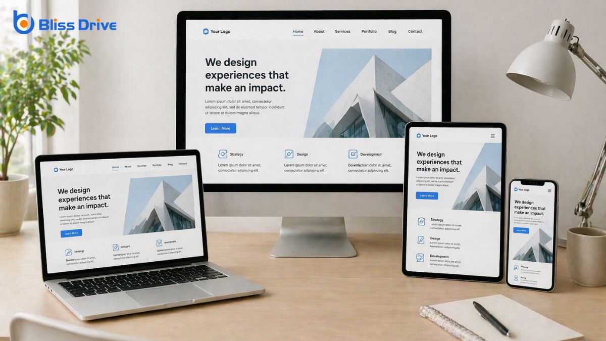
Responsive design has become essential for creating websites that look great on any device, and thankfully, we don't need to know how to code to achieve it.
With intuitive website builders like Wix, Squarespace, and WordPress, we can easily guarantee our sites automatically adjust to different screen sizes. These platforms offer responsive templates and drag-and-drop features, making design adjustments simple and accessible.
We should focus on selecting templates that are inherently responsive and previewing our designs on various devices. By doing this, we guarantee a seamless user experience.
Additionally, many builders provide an option to switch between desktop, tablet, and mobile views, allowing us to make specific tweaks as needed. Embracing these tools empowers us to craft visually appealing, functional websites without diving into code.
To sum up, we can confidently say that web designing without coding is entirely possible and accessible to everyone. By embracing drag-and-drop website builders, leveraging pre-designed templates, and utilizing visual design tools, we can create stunning, responsive websites with ease. Content management systems further simplify the process, allowing us to focus on creativity and user experience. Let’s embrace these tools and start building beautiful websites without getting bogged down by complex coding languages.
In our journey to create a successful website, we'll navigate through the seven phases of web design. These stages begin with project planning, where we establish goals and objectives. Then, we move on to information architecture, designing the site’s structure. Design and layout come next, followed by development and coding. After testing and quality assurance, we proceed to launch and deploy. But the process doesn't end there; maintenance and updates guarantee ongoing success. Curious about each step's intricacies?

Project planning is the critical first step in the web design process, setting the foundation for everything that follows.
As we set out on this journey, we need to identify project goals and define our target audience. This helps us guarantee that the website aligns with user needs and business objectives. We should gather input from stakeholders to understand their expectations and requirements.
Next, we outline the project scope, detailing what'll be included and, importantly, what won't. This prevents scope creep and keeps us on track.
We also establish a timeline, setting milestones to monitor progress. Budgeting is essential, too, as it helps us allocate resources effectively.
With a clear plan in place, we’re ready to move forward confidently.
With our project plan established, we now turn our attention to crafting the Information Architecture (IA) of our website. IA is a significant phase where we organize and structure content so users can easily find what they need.
We start by outlining the hierarchy of information, defining how different pages and sections relate. We'll create a sitemap, a visual representation of this structure, helping us visualize navigation paths.
By focusing on user needs and expectations, we guarantee the site's content flows logically. This phase requires us to understand user behaviors and preferences, allowing us to prioritize information effectively.
Let's remember, a well-structured IA not only enhances usability but also supports our website's overall goals, making it an essential step in web design.
In the fourth phase of our web design journey, we plunge into the Design and Layout process, where creativity meets functionality. This stage is all about translating our ideas into visually compelling and user-friendly layouts. We select colors, typography, and imagery that reflect the brand's identity and guarantee a cohesive look.
Our goal is to create a visually appealing interface that guides users effortlessly through the site. We begin by sketching wireframes to establish a structure, then move to high-fidelity mockups for a detailed design.
It's essential that our designs aren’t just attractive but intuitive, allowing users to navigate easily. We focus on responsiveness, making sure our design adapts seamlessly across devices. This phase lays the foundation for successful user interaction.
Now that we've designed our layout, it's time to focus on development and coding.
We'll choose the right tools that align with our project needs and help us implement the design elements effectively.
As we immerse ourselves in the development phase of web design, it’s imperative to equip ourselves with the right tools to guarantee a smooth coding process.
Selecting the appropriate software can make a significant difference in efficiency and productivity. Here are some essential tools we should consider:
Let's plunge into the exciting phase of implementing design elements, where our creative visions start coming to life through coding. We take our designs from static images to interactive, functional websites. This is where HTML lays the foundation, CSS adds style, and JavaScript brings dynamic elements to the forefront.
We guarantee that every design choice translates seamlessly into the digital space, maintaining the integrity of our original vision.
As we build, we focus on user experience and accessibility. Our goal is to make certain that the website looks great and functions smoothly on all devices.
We test rigorously, iterating on feedback to refine performance. This phase is a blend of creativity and technical skill, where our designs evolve into a tangible reality.
When we move into the testing and quality assurance phase of web design, we guarantee that everything functions flawlessly before launch.
This phase confirms our website is ready for users and performs as intended. We focus on identifying and fixing potential issues through extensive testing.
Here’s how we do it:
The final phase of web design is launch and deployment, where everything we've worked on comes to fruition. At this stage, we're ready to introduce our website to the world.
Before going live, we'll guarantee our site's files are uploaded to the hosting server correctly. It's vital that we double-check all configurations and DNS settings to avoid any surprises.
Once everything is in place, we can officially launch. This involves making the site accessible to users and guaranteeing it's indexed by search engines for visibility.
We’ll announce the launch through our chosen channels, whether that’s social media, newsletters, or press releases. The deployment marks a significant milestone, transforming our design efforts into a functional, engaging platform ready for its audience.

Now that our website is live, we can't forget the importance of ongoing maintenance and updates.
Regular software updates keep everything running smoothly, while content refresh strategies guarantee our site stays relevant.
Let's also make security monitoring a priority to protect our users and data.
Regular software updates are an essential phase of web design that we can't overlook. They guarantee our site remains secure, functional, and up-to-date with the latest features.
Let’s discuss why regular updates are vital:
As we keep our websites secure and functional through regular software updates, it’s equally important to focus on content refresh strategies to maintain relevance and engagement.
We should regularly assess our content to guarantee it aligns with current trends and audience interests. Let's prioritize updating outdated information, adding fresh visuals, and revisiting our messaging to better connect with our visitors.
User feedback is invaluable; it highlights areas needing improvement and offers insights into what our audience finds engaging. We can also employ analytics to track content performance, helping us refine our approach.
Proper security monitoring practices are essential to maintaining a safe and reliable website. We must remain vigilant to protect our sites from potential threats. By regularly monitoring security, we can quickly identify vulnerabilities and address them before they become serious issues. Here are four key practices to consider:
In wrapping up our journey through the seven phases of web design, we hope you’ve gained a clearer understanding of the process from start to finish. We’ve covered everything from project planning to maintenance, ensuring a seamless user experience. Remember, each phase is integral to creating a successful website. As you commence your own web design projects, keep this roadmap in mind to guide you through each stage efficiently and effectively. We’re excited to see what you create!
As we explore the connection between web design and SEO, it's vital to reflect on how these elements work together to enhance a website's visibility and functionality. We often wonder if web design inherently includes SEO practices, or if they remain distinct disciplines. Let's examine how integrating SEO into web design from the start can lead to a more effective online presence, enticing users and search engines alike.
When we explore the world of web design, it's essential to grasp its core components to create a successful online presence. First, we need to focus on layout and structure, as they guarantee our content is organized and accessible.
Visual aesthetics, including color schemes and typography, play a significant role in attracting and engaging users. Functionality is another important component, making certain our site is user-friendly and performs efficiently across different devices.
We can't overlook the importance of navigation, allowing visitors to easily find information. Finally, we should prioritize responsive design, as it adapts our site to various screen sizes.
When we think about boosting our website's visibility, SEO plays an essential role in attracting more traffic by enhancing our search rankings.
By optimizing our content and structure, we can guarantee that search engines rank our site higher, making it more accessible to users.
Let's explore how effective SEO strategies can transform our online presence and drive more visitors to our site.
To truly understand SEO's impact on traffic, we must recognize its crucial role in enhancing website visibility. When search engines like Google recognize our site's relevance and authority, they rank it higher in search results. This means potential visitors are more likely to find us when searching for related topics.
By strategically using keywords and optimizing content, we guarantee our website appears prominently, increasing the likelihood of clicks and visits.
SEO doesn't just attract more visitors; it attracts the right ones. By aligning our content with users' search intent, we're likely to engage visitors genuinely interested in what we offer.
This targeted traffic means higher chances of conversions, whether we're aiming for sales, sign-ups, or any other goal. Fundamentally, effective SEO drives meaningful traffic.
Improving search rankings is essential for boosting our website's visibility, and SEO plays a foundational role in this enhancement. By optimizing our site's content, structure, and performance, we can make it more appealing to search engines. This means using relevant keywords, creating high-quality content, and ensuring fast load times.
When we focus on SEO, we're fundamentally communicating to search engines that our site is valuable and relevant to users' queries.
Moreover, incorporating on-page and off-page SEO strategies helps us build authority and trustworthiness. On-page SEO involves elements like meta tags and internal linking, while off-page SEO focuses on backlinks from reputable sites.
As we explore web design, it’s important to integrate key SEO elements right from the start. Doing so guarantees that our website doesn't just look good but also performs well in search engine rankings.
First, let's focus on keyword research. We should identify relevant keywords and naturally incorporate them into titles, headers, and content. This helps search engines understand our site's purpose.
Next, creating a clear site structure is essential. It allows for easy navigation, improving user experience and search engine crawling.
Additionally, optimizing images by using descriptive file names and alt tags can boost visibility.
Finally, let's not forget about fast load times. A speedy website keeps visitors engaged and satisfies search engines, both critical for SEO success.
In today's digital age, more than half of all web traffic comes from mobile devices, making mobile-friendly design an indispensable aspect of web development.
We need to guarantee our websites are responsive, meaning they adapt seamlessly to different screen sizes. This isn't just about aesthetics; it greatly impacts our SEO. Search engines prioritize mobile-friendly sites because they enhance user experience.
By focusing on a responsive design, we can improve loading times and site navigation, which are both vital for retaining visitors and reducing bounce rates.
Moreover, using mobile-optimized images and minimizing unnecessary elements can enhance performance.
Let's make certain our design isn't only visually appealing but also functional across devices. This approach will lead to better rankings and increased visibility.
Ensuring our web design is mobile-friendly sets the stage for the next crucial element in our digital strategy: user experience (UX).
UX isn't just about aesthetics; it's about how our visitors interact with our site. A seamless, intuitive experience can greatly improve our SEO efforts. When users find our site easy to navigate, they're more likely to stay longer, reducing bounce rates and signaling to search engines that our content is valuable.
In addition, positive user experiences often lead to more social sharing and return visits, amplifying our site's authority and relevance. Let's remember that search engines prioritize user satisfaction.
A handful of common web design mistakes can considerably hurt our SEO efforts.
First, neglecting mobile responsiveness is a significant error. With most users accessing websites via mobile devices, our sites must adapt seamlessly to different screen sizes.
Second, slow loading times can deter visitors and search engines alike. Optimizing images and scripts helps improve speed.
Third, overlooking metadata, such as title tags and meta descriptions, can diminish our visibility in search results. These elements guide search engines in understanding our content.
Fourth, using large images or excessive multimedia without optimization may slow down our site.
Finally, failing to implement proper header tags can confuse search engines about our content hierarchy.
Avoiding these mistakes guarantees a better SEO foundation.

While avoiding common web design mistakes is essential for maintaining good SEO, working closely with SEO experts can elevate our website's performance even further.
By fostering open communication, we guarantee both design and SEO priorities align, creating a seamless user experience that search engines love. Let’s schedule regular meetings where designers and SEO experts can share insights and updates. This approach helps us anticipate potential issues and adapt our strategies accordingly.
We should also encourage knowledge sharing. When designers understand SEO principles, they can make informed design choices that naturally support optimization.
Similarly, SEO experts benefit from understanding design constraints. Using collaborative tools like shared project boards keeps everyone informed and aligned, ultimately crafting a website that’s both visually appealing and highly searchable.
In wrapping up, we’ve seen how essential it is to integrate SEO into web design. By focusing on elements like keyword optimization, mobile responsiveness, and clear site structure, we can boost visibility and user experience. Let’s not forget that a well-designed site should also drive engagement and conversions. By collaborating effectively, designers and SEO experts can create websites that are not only visually appealing but also optimized for search engines. Together, we’ll guarantee our websites truly succeed.
When we think of web design, we often talk about the trio of HTML, CSS, and JavaScript. These are the core languages that shape the structure, style, and interactivity of a webpage. HTML lays the groundwork, CSS adds the flair, and JavaScript brings it all to life. But do we ever consider the roles of server-side scripting or database management in this mix? Let's explore how these elements come together in web design.

Although we often take it for granted, HTML is the backbone of every web page we encounter. It stands for HyperText Markup Language and provides the essential structure of a website.
When we view a web page, what we see is the result of HTML elements working in harmony. These elements, such as headings, paragraphs, and links, define the content and its organization. By using tags, we can tell browsers how to display text, images, and other media.
We should think of HTML as the skeleton of a web page. It doesn't involve any design or style decisions, but it guarantees that content is properly laid out and accessible.
As we develop or explore web pages, understanding HTML helps us appreciate how the internet functions.
With HTML laying the foundation, it's time to dress up our web pages using CSS, or Cascading Style Sheets. CSS allows us to add style and flair, transforming plain structures into visually appealing designs.
We use it to control colors, fonts, spacing, and layout, giving each element its own unique look. By separating style from content, CSS guarantees our code remains clean and organized.
Let's think of CSS as the artist's palette for our web designs. We can create responsive layouts that adjust seamlessly to different devices, assuring a consistent experience for users.
As we plunge into JavaScript, we access the power to turn static web pages into dynamic and interactive experiences. JavaScript enables us to create elements that respond to user actions like clicks, hovers, and keystrokes. This language allows us to update content in real-time without reloading the page, enhancing user experience.
We can use JavaScript to validate forms, animate elements, and even create complex applications. By manipulating the Document Object Model (DOM), we can change HTML and CSS on the fly, making our websites feel alive and responsive.
Understanding JavaScript opens up endless possibilities for creativity and functionality. It’s not just about aesthetics; it’s about engaging users and providing them with a seamless, interactive journey through our web pages.
PHP, a powerful server-side scripting language, allows us to build robust web applications by generating dynamic content. When we use PHP, we can create pages that interact with databases, handle forms, and maintain user sessions effectively.
This language runs on the server, meaning it processes requests before sending HTML back to the client’s browser. Its flexibility and ease of integration with HTML make it a staple in web development.
We appreciate PHP for its vast array of built-in functions and extensive library support, which simplify complex tasks. With PHP, we can connect to popular databases like MySQL, enabling us to manage data seamlessly.
Additionally, the open-source nature of PHP fosters a supportive community, offering resources and solutions for developers at all levels.
Though often overshadowed by its more widely known counterparts, Ruby stands out as a dynamic and versatile web programming language. It’s renowned for its elegant syntax, making it accessible and enjoyable to use.
We appreciate how Ruby prioritizes simplicity and productivity, allowing us to focus on solving problems rather than wrestling with complex code structures.
Ruby's true power shines when paired with the Ruby on Rails framework. This combination accelerates web development by offering pre-built templates and a convention-over-configuration philosophy.
It simplifies repetitive tasks and encourages best practices, which means we can build robust applications efficiently.
For web developers seeking a language that emphasizes clarity and efficiency, Ruby offers a compelling option.
Let's embrace Ruby’s capabilities and explore how it can enhance our web projects.
Let's explore how Python's versatility makes it a powerhouse in web development.
With robust frameworks like Django and Flask, we can build scalable and efficient web applications.
Python also shines in backend development, providing the tools we need to manage databases, user authentication, and server-side logic seamlessly.
When it comes to web development, Python's web frameworks offer unmatched versatility and efficiency. They provide a solid foundation for building dynamic and scalable web applications.
We can streamline our development process and focus on creating engaging user experiences. Python's frameworks are popular due to their simplicity and powerful capabilities.
Here are a few reasons why they stand out:
While exploring web development, it's clear that Python plays a crucial role in the backend, offering both power and versatility. Its simplicity and readability make it accessible, even for beginners.
We can leverage Python's extensive libraries and frameworks, such as Django and Flask, to create robust and scalable applications. These tools streamline handling databases, manage user authentication, and guarantee smooth communication between the server and client.
Python's popularity isn't just due to ease of use; it's also about performance. With features that support asynchronous programming, we can build applications that handle multiple tasks efficiently, providing faster responses.
Companies like Instagram and Spotify trust Python for their backend, highlighting its reliability. Let's embrace Python's capabilities to craft dynamic, efficient web applications.
SQL, or Structured Query Language, is the cornerstone of managing databases effectively, and it empowers us to interact with and manipulate data seamlessly.
In the world of web design, SQL plays a significant role by enabling us to perform various database operations easily.
Let’s explore some key functions:
XML, or Extensible Markup Language, is a versatile tool we use to structure data in a way that's both human-readable and machine-processable. It allows us to define our own tags, making it perfect for organizing complex data. By using XML, we can create a clear hierarchy, which helps when exchanging data across different systems.
Imagine we're building a website that needs to share data with various platforms. XML acts as a bridge, allowing smooth data transfer and integration.
It's not just about displaying data; it's about ensuring that data remains accessible and understandable. Its simplicity and flexibility make XML a go-to choice for many web developers.
TypeScript offers a powerful enhancement to JavaScript by introducing optional static types, helping us catch errors early in the development process. This feature enables us to write more robust and maintainable code, which is essential for complex web design projects.
By incorporating TypeScript, we can transform our JavaScript code into a more reliable and efficient form.
With TypeScript, we can enjoy:

While developing iOS web apps, Swift stands out as a robust and intuitive programming language that can greatly enhance our design process. Swift's syntax is clean and expressive, making it easier for us to write and maintain code. Its safety features, like optionals and error handling, help prevent common programming errors, ensuring our apps run smoothly.
As we design, Swift's powerful libraries provide us with tools to create responsive and visually appealing interfaces.
Moreover, Swift's interoperability with Objective-C means we can seamlessly integrate existing code, preserving our previous efforts. We also benefit from Swift's active community, offering resources and support as we tackle complex design challenges.
In web design, we rely on a harmonious blend of technologies to create engaging and functional experiences. HTML lays the groundwork for our webpages, while CSS beautifies them with vibrant styles. JavaScript breathes life into our sites, making them interactive. Beyond the basics, languages like PHP, Ruby, and SQL handle server-side needs and data management. XML, TypeScript, and Swift further enrich our toolkit, ensuring we deliver dynamic, responsive, and tailored web experiences for every user.
When it comes to building a website, we often find ourselves asking, "Do we need a web designer or a developer?" The answer isn't always clear-cut and depends on our project's specific needs. Are we aiming for a visually stunning site, or do we need complex functionality? Let's explore how to make the right choice and guarantee our website not only looks great but also performs seamlessly.
When it comes to building a website, it's crucial to understand the distinct roles of web designers and developers. We might wonder, what's the difference?
Web designers focus on the visual aspects, crafting a site's look and feel. They make certain our site is visually appealing and user-friendly. Designers use tools like Photoshop and Sketch to create layouts and color schemes.
On the other hand, web developers bring these designs to life. They write the code that makes our website functional. Developers work with programming languages like HTML, CSS, and JavaScript.
They guarantee everything runs smoothly, from navigation menus to contact forms.
How do we determine what kind of website we need? First, let's identify our website's primary purpose. Are we looking to showcase our portfolio, sell products, or provide information? Our goals will guide the features and functionality required.
Next, consider our target audience. Who'll visit our site, and what do they expect? Understanding their needs helps us prioritize content and design elements.
Let’s also think about scalability. Will our website need to grow as our business expands? This consideration impacts the technology and platforms we choose.
Finally, budget and timeline play vital roles. Knowing how much we can spend and when we need the site ready helps us decide between essential features and potential enhancements.
Having a clear vision for our website sets the stage for the next big decision: choosing between DIY platforms and hiring professionals.
DIY platforms like Wix, Squarespace, and WordPress offer user-friendly interfaces that allow us to build sites without coding knowledge. They're cost-effective and provide customizable templates to fit our needs.
However, they might limit our site's uniqueness and functionality if we lack design expertise.
On the other hand, hiring professionals can bring our vision to life with custom designs and advanced features.
Web designers and developers possess the skills to create tailored solutions that align perfectly with our brand.
While this option often costs more, it provides a personalized touch and technical expertise that DIY platforms may not offer.
Let's weigh our priorities and decide accordingly.
Why is determining our budget and resources essential in the decision-making process?
It helps us make informed choices, guaranteeing that we align our project's goals with our financial and material capabilities. Knowing our limits prevents overspending and guides us toward the most suitable option.
Here's how we can effectively assess our budget and resources:
Understanding these aspects guarantees our project remains feasible and successful.

Choosing between a web designer and a developer for our project can feel overwhelming, but clarity comes with understanding our project's specific needs.
Let's start by asking ourselves: Is our focus more on aesthetics or functionality? If we need an engaging visual layout that captures our brand, a web designer is crucial. They craft user-friendly interfaces that enhance user experience.
However, if our project requires complex features, databases, or backend support, a developer is our go-to. They build the infrastructure that powers our site.
Sometimes, projects demand both skills. In such cases, hiring a team or a full-stack developer who bridges the gap can be beneficial.
In deciding whether to hire a web designer or developer, we need to assess our project's unique needs. If we're aiming for an eye-catching design and smooth user experience, a designer's touch is vital. For complex features and backend work, a developer's skills are essential. Balancing aesthetics and functionality might require both, or a versatile full-stack developer. Ultimately, let's consider our goals, resources, and budget to make the best choice for our website's success.
When we talk about SEO and web design, we're exploring two interconnected elements that shape a website's success. SEO, or Search Engine Optimization, focuses on making content discoverable and relevant to search engines. Meanwhile, web design guarantees a site is visually appealing and user-friendly. Together, they enhance online visibility and engagement. How do we effectively integrate these strategies? Let's uncover the secrets behind this dynamic duo.
When diving into the world of SEO, we must first grasp its fundamental principles, as they form the backbone of successful online visibility.
SEO, or Search Engine Optimization, is the art and science of enhancing a website's presence on search engines like Google. Understanding how search engines work is key. They use algorithms to rank websites based on relevance and quality. Our goal is to align our content with these algorithms.
Keywords are essential. They’re the terms people use to find information. By incorporating them naturally into our content, we improve our chances of appearing in search results.
We should also focus on creating valuable, engaging content that meets users' needs. This approach helps build credibility, encouraging search engines to rank our site higher.
To achieve effective SEO, we must focus on several key components that work together to enhance our website's performance.
It’s important to create a seamless experience for our users while also catering to search engine algorithms.
Let's explore a few vital elements that can help us succeed:
When we talk about the role of keywords in SEO, we can't overlook the importance of thorough keyword research.
By focusing on long-tail keywords, we can tap into more specific search queries that often lead to higher conversion rates.
Let's also consider how strategic keyword placement throughout our content can boost our site's visibility and effectiveness.
How exactly do keywords shape the landscape of SEO? Keywords are the foundation of our SEO strategy. They connect us with our audience, guiding search engines to our content. Without the right keywords, our efforts might go unnoticed.
By researching keywords, we can understand what our audience is searching for and tailor our content accordingly. This guarantees we’re reaching the right people at the right time.
To make keyword research more effective, consider these aspects:
Many might underestimate the power of long-tail keywords, but they play an essential role in refining our SEO strategy. By focusing on these more specific phrases, we can target niche audiences who are often further along in their buying journey. This means higher conversion rates because users searching for long-tail keywords typically know exactly what they want.
Long-tail keywords face less competition, making it easier for us to rank higher in search results. They also offer the advantage of better reflecting user intent.
Although selecting the right keywords is essential, their placement within our content is what truly maximizes their effectiveness in SEO.
We need to be strategic about where we insert these keywords to improve our search rankings. Let's explore some key places:
When we consider how search engines rank websites, three key elements come into play: keywords, backlinks, and user experience.
Keywords help search engines understand our content's relevance, while backlinks from reputable sites boost our credibility.
Meanwhile, user experience factors like site speed and mobile-friendliness guarantee visitors stay engaged, influencing our site's ranking.
Understanding the importance of keywords is essential for getting our websites noticed by search engines. Keywords act as the bridge between what people are searching for and our content. When we effectively incorporate relevant keywords, we’re signaling to search engines that our site has valuable information.
But how do we choose the right ones? Here are some key considerations:
Backlinks play an essential role in how search engines rank our websites. When another site links to ours, it's like a vote of confidence. Search engines see these links as endorsements of our content's quality and relevance.
The more high-quality backlinks we have, the more authority our website gains, which can improve our search engine rankings. However, not all backlinks are created equal. Links from reputable, relevant websites carry more weight than those from less credible sources.
We should focus on earning backlinks naturally. Creating valuable, shareable content encourages others to link to us. Additionally, engaging in guest blogging and participating in online communities can also help us build quality backlinks.
Although search engines evaluate various factors to rank websites, user experience (UX) has become increasingly critical. When we focus on UX, we’re not just enhancing the aesthetic appeal; we’re directly influencing how search engines perceive and rank our site.
Let’s explore some key UX factors:
When we talk about web design, user experience (UX) is essential because it directly impacts how visitors interact with a site. If users can't easily navigate or find information, they'll likely leave, increasing bounce rates.
UX design considers layout, color scheme, and site speed to enhance usability. It's about making our site intuitive, ensuring visitors have a seamless journey from start to finish.
We must remember that a good UX not only retains users but also builds trust and credibility. When visitors enjoy their interaction with a site, they’re more likely to return and recommend it to others.
UX is integral to achieving our goals, whether it's boosting conversions, growing traffic, or enhancing brand reputation. Let's prioritize UX to create meaningful, lasting connections with our audience.
Crafting a well-designed website involves several key elements that work together harmoniously.
We want our site to be visually appealing, easy to navigate, and engaging for visitors. A strong design doesn't just look good; it functions seamlessly too.
Let's break down the essential components:
In today's digital landscape, the fusion of SEO and web design is essential for building a successful online presence. When we integrate these two elements, we create websites that aren’t just visually appealing but also optimized for search engines.
Effective SEO targets not only keyword placement but also site structure, speed, and user experience. A well-designed website guarantees that content is organized and accessible, making it easier for search engines to crawl and index pages.
We must prioritize elements like responsive design and intuitive navigation, as they directly impact how users interact with our site. By focusing on both design and SEO, we can enhance visibility and engagement.
Let’s build websites that attract and retain visitors, guaranteeing our digital presence is strong and competitive.
How critical is mobile optimization in today's digital age? It's absolutely essential. With the majority of users accessing websites via smartphones and tablets, we can’t afford to ignore mobile optimization.
A mobile-friendly site guarantees a seamless user experience, which directly impacts our site's performance and search rankings.
Consider these key points:
When it comes to enhancing both SEO and web design, selecting the right tools and techniques is vital. We need to focus on tools that streamline our workflow and boost website performance.
For SEO, tools like Google Keyword Planner and SEMrush help us identify keywords to attract the right audience. On the web design front, platforms like WordPress and responsive design frameworks guarantee our sites are visually appealing and user-friendly.
Techniques such as optimizing images, improving site speed, and guaranteeing mobile responsiveness are essential. Let’s also not overlook the power of clean coding and intuitive navigation.
After equipping ourselves with the right tools and techniques for SEO and web design, it’s natural to ask how we determine if our efforts are paying off.
By diving into analytics and metrics, we gain insight into our strategies' effectiveness. Let’s focus on a few key metrics that help us measure success:
In our journey to explore SEO and web design, we've seen how these elements work together to enhance a website's performance. By focusing on strategic keyword use, intuitive navigation, and mobile optimization, we can guarantee a seamless user experience. Let's not forget the importance of monitoring our success with analytics and metrics. By integrating these strategies, we're not just improving search engine rankings, but also creating a more engaging and effective online presence for our audience.
As web designers, we blend creativity with technical expertise to craft websites that captivate and inform. Our role goes beyond aesthetics; we focus on user experience and interface design, ensuring seamless navigation and accessibility across all devices. Collaborating closely with clients, we adapt our designs to align with their vision and needs. Curious about the tools and trends shaping our field? There's so much more to explore in the dynamic world of web design.
When we immerse ourselves in the world of web design, creativity takes center stage. It’s the heartbeat that drives our work, empowering us to craft visually appealing and functional websites.
We rely on creativity to transform abstract ideas into engaging digital experiences. By balancing aesthetics with functionality, we guarantee that every design element serves a purpose and speaks to our audience's needs.
We constantly draw inspiration from various sources, merging innovative ideas with technical skills. This creative process is dynamic, requiring us to adapt and evolve with changing trends.
Our designs tell a story, communicating a brand's message and values clearly and effectively. Ultimately, creativity in web design isn’t just about making things look good; it’s about creating meaningful connections with users.
As web designers, we recognize the importance of placing users at the heart of our design process.
By focusing on user-centric design principles, we guarantee that our websites are intuitive and accessible.
Incorporating interactive visual elements further enhances the user interface, making the online experience engaging and memorable for our audience.
Although web design can be complex, focusing on user-centric principles allows us to create more intuitive and effective websites. These principles prioritize users' needs and experiences, ensuring our designs aren't only visually appealing but also functional.
By understanding our audience, we can tailor the layout, navigation, and content to meet their expectations. We aim to provide a seamless journey, where users can easily find information and complete tasks.
To achieve this, we emphasize simplicity and consistency. Our designs should guide users naturally, minimizing the need for explanations.
We also value feedback, as it helps us refine our approach and adapt to users' evolving preferences. By prioritizing user-centric design, we enhance satisfaction and foster loyalty, making our websites valuable and engaging.
Interactive visual elements are key to enhancing user experience and interface design. As web designers, we focus on creating elements like buttons, sliders, and animations that invite users to engage.
These features aren’t just about aesthetics; they guide users through a site seamlessly, making navigation intuitive and enjoyable.
When we incorporate interactive elements, we're not merely adding flair; we're crafting a journey. Each click, swipe, or hover can improve how users interact with content.
We guarantee these elements are responsive and accessible, making the experience inclusive for everyone.
As web designers, we recognize how vital it's to create a seamless experience no matter what device a user chooses.
Responsive design not only enhances user experience by adapting to various screen sizes but also boosts our site's SEO performance.
Let's explore how mastering this approach can set us apart in an ever-evolving digital landscape.
Responsive design is essential for enhancing user experience, as it guarantees that our websites look great and function well on any device. By using responsive design, we make certain that visitors can easily navigate and interact with our content, whether they're on a phone, tablet, or desktop.
This adaptability reduces frustration and keeps users engaged, which is vital for retaining visitors.
We achieve this by employing flexible layouts, scalable images, and CSS media queries. These tools allow us to adjust the website's appearance based on screen size and orientation.
When our design adapts smoothly, it shows that we value our users' needs and prioritize their experience.
Ultimately, responsive design translates to happier users and a more successful website, which benefits everyone involved.
Building on the foundation of enhancing user experience, adapting to device diversity becomes a key aspect of responsive design.
We must guarantee our websites look great and function well on any device, from desktops to smartphones.
With the variety of screen sizes and resolutions, it's essential we use flexible layouts, images, and CSS media queries to adjust our designs accordingly.
When we talk about improving SEO performance, the importance of responsive design can't be overstated.
As web designers, we recognize that search engines prioritize mobile-friendly sites. A responsive design guarantees our website looks great and functions well on any device, from desktops to smartphones.
This adaptability enhances user experience, keeping visitors engaged and reducing bounce rates, which are essential factors for search engine rankings.
Although seamless communication is essential, collaborating with clients and stakeholders goes beyond mere dialogue; it requires understanding their vision and expectations.
We must actively listen, ask the right questions, and guarantee everyone is on the same page. Our role is to translate their ideas into a functional, aesthetically pleasing design.
By fostering strong relationships, we create a space where creativity thrives and solutions emerge. Here’s how we make it happen:
Together, we can create something truly remarkable.
In today’s rapidly evolving digital landscape, mastering the right tools and technologies is essential to successful web design.
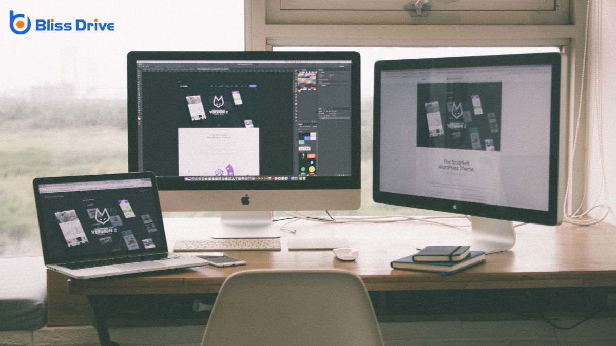
As web designers, we rely on a mix of creative and technical tools to bring ideas to life. Graphic design software like Adobe Photoshop and Illustrator helps us craft stunning visuals. We use coding tools such as HTML, CSS, and JavaScript to build the structure and functionality of websites.
Platforms like WordPress allow us to create dynamic sites with ease, while prototyping tools like Figma and Sketch facilitate effective design planning and collaboration.
To keep pace with the ever-changing digital landscape, we must stay ahead of digital trends or risk falling behind. Our success hinges on understanding the latest shifts in design, technology, and user behavior.
Embracing these changes not only enhances our creativity but also guarantees our relevance in a competitive field. By staying informed, we can create experiences that resonate with users and anticipate their needs.
Here are a few ways we can stay ahead:
In web design, we blend creativity and technical skills to craft websites that are both functional and visually stunning. By focusing on user experience and responsive design, we guarantee that each site is intuitive and accessible. Through collaboration with clients, we adapt and refine our designs to align with their vision. We constantly explore new tools and technologies to stay ahead of digital trends, guaranteeing that we deliver cutting-edge digital experiences. Let's create something exceptional together!
When we think about creating a website, we often hear about web designers and web developers, but what's the real difference between the two? As professionals, we recognize that while designers focus on aesthetics and user experience, developers handle the technical build and functionality. This distinction is essential because it influences the final product. But how do these roles work together to create seamless online experiences? Let's explore the intricacies of this collaboration.
When we think about web design, we're diving into the artistic and user-focused side of website creation. It's about crafting a visually appealing interface that captivates users while ensuring their journey through the site is smooth and intuitive.
As designers, we consider color schemes, typography, layout, and overall aesthetics. Our goal is to create a cohesive visual identity that resonates with a site's purpose and audience.
We use tools like Adobe XD, Sketch, and Figma to bring our ideas to life, prototyping and iterating until we achieve the desired look and feel.
Accessibility and responsiveness are priorities; we want our designs to work seamlessly across all devices. By understanding users' needs, we create engaging experiences that keep them coming back.
As we explore web development, let's understand the vital aspects of web programming that form the backbone of any website.
We'll differentiate between backend and frontend roles, each with its own unique responsibilities and challenges.
Together, we'll also get familiar with the essential development tools that make building and maintaining websites efficient and effective.
Web programming serves as the backbone of web development, turning designs into fully functional websites. It involves writing and maintaining the code that makes our websites tick.
When we plunge into web programming, we engage with languages like HTML, CSS, and JavaScript, which form the pillars of any web project. HTML structures our content, CSS styles it, and JavaScript adds interactivity, making our sites dynamic and engaging.
We can think of web programming as a translator that converts creative designs into a language browsers understand. This process guarantees that users enjoy seamless experiences across devices.
Having grasped the fundamentals of web programming, we can now explore the distinct roles within web development: backend and frontend.
These roles are essential for bringing websites to life, each with its unique focus and responsibilities.
Frontend development is all about what users see and interact with. It involves:
1. Design Implementation: Translating visual designs into code using HTML, CSS, and JavaScript.
2. User Experience (UX): Ensuring intuitive and responsive interfaces.
Backend development, on the other hand, powers the behind-the-scenes functionality.
It encompasses:
3. Server Logic: Managing databases, server-side programming, and ensuring data flows smoothly between server and user.
Steering the world of web development requires a solid set of tools that streamline our workflow and enhance productivity.
First, we rely on code editors like Visual Studio Code or Sublime Text, which offer intuitive interfaces and extensions to boost coding efficiency. Version control systems, such as Git, help us track changes and collaborate seamlessly with others. For debugging, browser developer tools are indispensable, providing insights into performance and errors.
Additionally, task runners like Gulp or Webpack automate repetitive tasks, saving us time. We also use frameworks and libraries like React or Angular to build robust, scalable applications.
Finally, testing tools guarantee our code functions as expected. By mastering these tools, we can develop dynamic web solutions efficiently and effectively.
When venturing into the domain of web design, understanding key skills is vital for creating visually appealing and functional websites.
Our focus should be on mastering these significant areas:
While web designers focus on aesthetics, web developers bring websites to life with functionality and interactivity. To achieve this, we need several essential skills.
First, proficiency in programming languages like HTML, CSS, and JavaScript is critical. These form the foundation of web development, allowing us to create dynamic and responsive sites.
We also need problem-solving skills to tackle challenges and guarantee smooth operation across different browsers and devices. Understanding databases, like SQL, helps manage and retrieve data efficiently.
Familiarity with version control systems, such as Git, aids in tracking changes and collaborating with other developers.
Finally, strong communication skills are fundamental for working with designers and stakeholders, making sure that everyone’s vision aligns and the project meets its goals.
To create visually appealing and user-friendly websites, we rely on a variety of tools and technologies tailored for designers.
These tools help us transform ideas into digital realities and guarantee every design element aligns with user needs.
Here are three essential tools we often use:
When we explore development tools and technologies, it's vital to understand the distinction between design and development tools.
We'll look into the differences between frontend and backend technologies that power websites.
Additionally, discussing popular frameworks and libraries will help us see how they enhance the capabilities of web developers.
The distinction between design and development tools is essential for understanding the unique roles in creating a website.
As web designers, we focus on aesthetics and user experience, using tools that enhance creativity. Our toolbox often includes:
On the development side, web developers turn designs into functional websites. They rely on tools that build, test, and deploy code.
These include:
Understanding these tools helps us appreciate the distinct contributions of designers and developers.
Having explored the tools that differentiate designers from developers, let's focus on the technologies that define frontend and backend development.
Frontend technologies are what users interact with directly. Here, we utilize HTML, CSS, and JavaScript to create the visual and interactive elements of a website. These technologies guarantee that our websites are responsive, user-friendly, and visually appealing.
On the other hand, backend technologies handle the server-side operations that users don't see. This is where we employ languages like PHP, Python, Ruby, and databases such as MySQL to manage data and server logic.
Backend development guarantees that everything functions smoothly behind the scenes, providing a seamless experience for users. By understanding both frontend and backend technologies, we can create thorough, highly functional web applications.
As we plunge into popular frameworks and libraries, let's explore how they streamline the web development process. These tools help us build functional, visually appealing websites more efficiently. They provide reusable code, which speeds up development and reduces errors.
Here are three popular choices:
These tools enhance productivity and deliver seamless user experiences.
When web designers and developers join forces, they create a website that's both visually appealing and highly functional. We must communicate effectively, guaranteeing our design goals and technical capabilities align.
Designers focus on aesthetics, user experience, and branding, while developers concentrate on coding, security, and performance. It's essential to respect each other's expertise and solicit feedback during the process.
We can use collaborative tools like design mockups and version control systems to streamline our workflow. Regular meetings help us address challenges and find solutions together.
Exploring career paths in web design and development opens up a world of opportunities for us.
Whether we’re drawn to the creative side or the technical aspects, there’s something for everyone. As we immerse ourselves in this field, we’ll find a variety of roles that cater to different skills and interests:
With so many career paths in web design and development available, selecting the right professional for our specific needs can make all the difference.
We need to understand what each role entails. A web designer focuses on aesthetics, crafting a site's look and feel. They guarantee that our website is visually appealing and user-friendly.
On the other hand, a web developer takes care of the technical aspects. They bring the designer's vision to life by writing code and guaranteeing functionality.
To choose wisely, let's assess our project requirements. If our priority is a visually stunning, brand-consistent website, we should hire a designer.
If we need complex functionality or backend development, a developer is the right choice. Understanding these roles helps us make informed decisions.
In conclusion, we’ve explored the distinct roles of web designers and web developers, highlighting their unique skills and tools. Designers focus on creating an engaging user experience, while developers bring functionality to life. By collaborating effectively, they guarantee a seamless and visually appealing web presence. When selecting a professional for your project, consider what you need most—creative design or technical development. Together, these experts can craft a website that meets both aesthetic and functional goals.
When we think about web design, we often picture complex software with advanced capabilities. Canva, on the other hand, is primarily known for its user-friendly graphic design features. But does it really fit the bill as a web design tool? While Canva offers an intuitive interface and a host of templates, its limitations might surprise you. Let’s explore whether Canva truly holds its ground in the world of web design.
While we often think of Canva as just a graphic design tool, its core functionality offers much more. We can create stunning visuals with its user-friendly interface, but beyond that, Canva empowers us to design an array of digital content.
From social media posts to presentations, and even simple web layouts, Canva provides versatile templates and elements that cater to diverse needs. Its drag-and-drop feature makes it accessible for beginners, yet powerful enough for experienced designers.
We can easily customize colors, fonts, and images to fit our brand identity, enhancing creativity without needing extensive design skills. Additionally, Canva’s collaboration tools let us work together seamlessly, making it perfect for team projects.
Let's explore Canva's potential beyond traditional graphic design.
When comparing Canva to traditional web design tools, we find distinct differences in capabilities and use cases. Canva shines in its simplicity and accessibility, making it a favorite for users who need quick, visually appealing designs without diving into complex coding.
Traditional tools like Adobe Dreamweaver or WordPress offer robust features for creating fully customized websites, but they demand a steeper learning curve.
For those of us seeking to create professional-level sites with advanced functionality, traditional tools might be the better option. Canva, however, excels in creating graphics, templates, and social media content with ease.
It's perfect for individuals and small teams who want to focus on design aesthetics without the technical hurdles. Ultimately, the choice depends on our specific project needs and skill levels.
As we explore Canva's design capabilities, it's clear that this tool offers an impressive array of features that cater to both novice and experienced designers.
Canva simplifies the design process with its user-friendly interface and extensive library of resources. We can create stunning visuals without the steep learning curve often associated with traditional design software.
Here are some features that stand out:
These capabilities demonstrate Canva's potential as a powerful design tool.
How does Canva stand out regarding user-friendliness and accessibility? First, Canva offers an intuitive interface that helps us dive straight into design without a steep learning curve. Its drag-and-drop functionality makes creating visual content straightforward, even for those new to design.
We find that users can easily navigate through various tools and options, ensuring a smooth experience.
Moreover, Canva's accessibility is impressive. It’s available on multiple platforms, including web browsers, iOS, and Android, so we can design anytime, anywhere.
Its cloud-based nature allows for seamless collaboration, letting us share and edit projects with team members in real-time. Additionally, Canva provides a free tier and affordable premium options, ensuring access for individuals and businesses with varying budgets.

Canva's versatility truly shines in its web design features. As we explore what Canva offers, we find it provides an extensive set of tools that cater to our creative needs.
With its user-friendly interface and robust selection, Canva simplifies the web design process, making it accessible to both novices and experienced designers.
Key features include:
While Canva offers a range of features that streamline web design, it does come with its own set of limitations.
We often find that Canva lacks the advanced customization options that many professional web designers need. Its templates, though visually appealing, can be restrictive when we want to achieve a truly unique design.
The platform doesn’t support responsive design in the same way more specialized tools do, which means our designs mightn't adapt perfectly across different devices.
Additionally, Canva’s export options can limit web developers who require specific file formats for web optimization.
We can't ignore the fact that while Canva simplifies the design process, it may not always meet the technical demands needed for a fully functional and adaptable website.
Understanding these limitations helps us make informed choices.
Although Canva is a powerful tool for creating visually appealing designs, integrating it with other design software can greatly enhance our web design projects.
By combining Canva with specialized tools, we can achieve a more efficient and seamless workflow. Here are some effective ways to integrate Canva with other design software:
Integrating Canva with other design software enhances our capabilities, but it's equally important to understand its practical uses in web design. Canva simplifies tasks like creating visual content, wireframes, and mockups, making it a valuable tool for designers.
We can quickly produce eye-catching graphics, logos, and banners, essential for engaging websites. Its templates provide a foundation for designing consistent site elements, saving time and guaranteeing professional quality.
Moreover, Canva's user-friendly interface allows us to collaborate seamlessly, sharing designs with team members for instant feedback.
When it comes to branding, Canva excels in maintaining style consistency across different web pages. By leveraging its extensive library of fonts, images, and icons, we guarantee our web designs are visually coherent and appealing, enhancing user experience.
What do industry experts say about Canva's role in web design? Many believe Canva is reshaping the way we approach web design by making it accessible to a broader audience.
While Canva lacks some advanced features of dedicated web design software, it still offers significant advantages.
Despite its limitations, Canva is acknowledged for democratizing web design, making it possible for anyone to engage creatively.
As we look to the future, Canva's role in the web design industry seems poised for growth. Its user-friendly interface and continuous updates make it an attractive option for both novice and experienced designers.
With the increasing demand for quick, high-quality design solutions, Canva’s expanding toolkit could become essential. We're seeing it integrate more advanced features, like responsive design capabilities, which are crucial for modern web development.
Moreover, as Canva continues to evolve, it may bridge the gap between simplicity and sophistication, appealing to a broader audience.
The platform's collaborative features also enhance team dynamics, allowing seamless project sharing and feedback. If Canva maintains its momentum and adaptability, it could greatly influence how we approach web design in the coming years.
In summary, while Canva offers a user-friendly experience with its intuitive interface and collaborative tools, it's not a full-fledged web design solution. We can create stunning graphics and social media content with ease, but advanced customization and responsive design remain out of reach. By integrating Canva with traditional web design tools, we can enhance our projects, but it's essential to recognize Canva's limitations. As technology evolves, we hope Canva expands its capabilities to better serve web designers.
As web designers, we rely on a variety of coding languages to bring our creative visions to life. HTML lays the groundwork, structuring our content, while CSS adds flair and style. To create dynamic, interactive experiences, we often turn to JavaScript. Occasionally, we integrate PHP for server-side scripting. With so many tools at our disposal, how do we decide which ones are essential for a successful project? Let's explore this further.
HTML, or Hypertext Markup Language, is the foundational language of web design that allows us to structure content on the web. It acts as the skeleton of every webpage, defining elements like headings, paragraphs, links, and images.
By using HTML tags, we can organize our content logically and semantically, making it easier for both users and search engines to understand.
When we design a webpage, we start with a document structure that includes the doctype declaration, head, and body sections. Each component plays a significant role.
The head contains metadata and links to resources, while the body houses the visible content.
Mastering HTML is essential for anyone interested in web design, as it forms the backbone of how we present information online.
In our journey to create stunning web designs, mastering CSS, or Cascading Style Sheets, is essential. CSS allows us to control the visual presentation of our HTML elements, transforming plain structures into visually appealing web pages. By defining styles for fonts, colors, spacing, and layout, we can craft cohesive and attractive designs.
Learning CSS involves understanding selectors, properties, and values, which are the building blocks for styling our web pages. We should also explore concepts like the box model, flexbox, and grid systems, which offer powerful ways to arrange content.
Media queries enable us to make designs responsive, ensuring they look great on any device. By refining our CSS skills, we can enhance user experience and create visually compelling websites.
While CSS gives our web pages a polished look, it's JavaScript that brings them to life with dynamic interactivity. By incorporating JavaScript, we can create engaging features like dropdown menus, image sliders, and form validations.
It allows our websites to respond to user actions in real-time, making for a more seamless and enjoyable experience. We can manipulate HTML content, adjust styles on the fly, and even communicate with servers without reloading the page.
JavaScript's versatility is unmatched; it empowers us to build complex applications or simple animations with ease. As web designers, understanding JavaScript is essential for crafting websites that aren't just visually appealing but also interactive and user-friendly.
Let's harness its power to elevate our designs to the next level.
Let's explore how PHP can transform our web projects.
With PHP's ability to generate dynamic content, we can create more engaging user experiences.
Additionally, by leveraging PHP's database interaction and efficient frameworks, we'll streamline development and boost our site's functionality.
Harnessing the power of PHP for dynamic content generation transforms static websites into interactive experiences. By using PHP, we can create pages that respond to user inputs, offering a personalized and engaging web presence.
PHP enables us to build content that updates in real-time, such as news feeds or event calendars, enhancing user interaction. We can use PHP to tailor content based on user preferences, making each visit unique.
It allows seamless data manipulation, ensuring that information displayed is always current. PHP's versatility lets us incorporate multimedia elements effortlessly, enriching the visual appeal of our sites.
In essence, PHP empowers us to craft sites that aren't just visited but experienced, fostering a connection with users through dynamic, ever-changing content.
Building on the dynamic capabilities of PHP, interacting with databases elevates our web development projects to new heights. With PHP, we can seamlessly connect our applications to databases like MySQL, enabling us to store, retrieve, and manipulate data efficiently.
This interaction is essential for creating robust, data-driven websites that respond to user input and display real-time information.
We begin by establishing a database connection using PHP's `mysqli` or `PDO` extensions. These tools provide a secure and flexible way to execute SQL queries, handle errors, and fetch results.
Efficiency is at the core of modern web development, and PHP frameworks offer a streamlined way to build robust applications. By leveraging these frameworks, we can write less code while achieving more functionality, ensuring our projects aren't only faster to develop but also easier to maintain.
Frameworks like Laravel, Symfony, and CodeIgniter provide pre-built modules and libraries that simplify complex tasks, such as routing, authentication, and database management.
When we use PHP frameworks, we're able to focus on crafting unique features rather than reinventing the wheel. These tools promote best practices like MVC architecture, which separates logic from presentation, enhancing code organization.
Ultimately, adopting a PHP framework allows us to deliver high-quality web applications efficiently, meeting modern demands with confidence.

When we explore web design projects, Python stands out as a powerful and versatile tool. It offers robust frameworks like Django and Flask, which streamline the development process. These frameworks provide us with the ability to create dynamic, responsive websites efficiently.
With Python, we can handle backend logic, manage server-side tasks, and even incorporate machine learning capabilities to enhance user experience.
Python's readability and simplicity make it accessible for both new and seasoned developers. Its extensive libraries allow us to integrate various functionalities without reinventing the wheel.
Additionally, the vibrant Python community continuously contributes, ensuring we've resources and support at our fingertips.
Let's explore how SQL can enhance our database management skills.
We'll focus on querying data efficiently, structuring databases effectively, and optimizing SQL performance for better results.
As we explore querying data efficiently, leveraging SQL becomes critical for effective database management. SQL, or Structured Query Language, is our go-to tool for retrieving, inserting, updating, and deleting data within databases.
By mastering SQL queries, we can access data quickly and accurately, which is essential in the fast-paced world of web design. We use SELECT statements to fetch specific data, JOINs to combine data from multiple tables, and WHERE clauses to filter results, ensuring we get precisely what we need.
Efficient queries minimize server load and improve application performance. Understanding indexing can further optimize our queries, allowing us to access data faster.
Let’s focus on writing clean, optimized SQL that supports our web design projects seamlessly.
Building on our understanding of efficient data querying, we shift our focus to managing database structures using SQL. As web designers, we often need to create, modify, and organize databases efficiently. SQL provides us with powerful commands to define and manage these structures.
We start by creating tables, where each table represents an entity with various attributes. With the CREATE TABLE command, we specify columns and data types, ensuring our data is stored correctly.
Once tables are set, we utilize ALTER TABLE to modify them, adding or removing columns as needed. This flexibility allows us to adapt to evolving data requirements.
Additionally, we can establish relationships between tables using foreign keys, ensuring our data remains consistent and organized across our database system.
While managing database structures is crucial, optimizing SQL performance is essential for ensuring efficient data handling and retrieval.
We want our databases to run smoothly and quickly. By optimizing SQL, we enhance user experience and reduce server load. Let’s explore practical strategies to achieve this.
When we explore the landscape of web design, Ruby emerges as a powerful ally, offering dynamic capabilities that streamline development processes.
With Ruby, we craft elegant, readable code, which simplifies our workflow and boosts productivity. Its flexibility allows us to build customized web applications efficiently.
As we dive deeper, frameworks like Ruby on Rails come into play, revolutionizing how we approach web projects with their convention-over-configuration philosophy.
Ruby's object-oriented nature gives us intuitive tools for designing robust, scalable solutions. We can focus more on creativity and less on repetitive coding tasks.
Its active community constantly innovates, providing libraries and gems to tackle common challenges.
Therefore, Ruby not only makes our lives easier but also enriches our web design experiences considerably.
As we explore the domain of simplified scripting, jQuery stands out as an indispensable tool, enhancing our web design efforts with its ease of use and versatility. By simplifying JavaScript, jQuery allows us to create dynamic and interactive web pages without getting lost in complex code.
Its cross-browser compatibility saves time and guarantees uniformity across different platforms. Let’s investigate why we might embrace jQuery:
Incorporating jQuery into our projects makes web design both rewarding and efficient.
Responsive design frameworks have transformed how we approach web development by ensuring our websites look great on any device, from desktops to smartphones.
They allow us to create adaptable layouts that automatically adjust to different screen sizes.
As web designers, we save time and effort by using these frameworks because we don't need to manually code for each device.
This efficiency lets us focus on creativity and functionality rather than technical adjustments.
In our journey through web design languages, we've explored how HTML and CSS form the core of structuring and styling, while JavaScript adds dynamic interactivity. We've also touched on PHP and Python for server-side scripting, SQL for database management, and Ruby and jQuery for streamlined coding. By leveraging responsive design frameworks, we guarantee our websites are user-friendly across all devices. Together, these tools empower us to create engaging and functional web experiences.
When it comes to web design, we often find ourselves choosing between Photoshop and Illustrator. Each has its strengths, and the decision isn't always straightforward. While Photoshop shines in detailed photo editing and creating visually rich webpages, Illustrator is unbeatable for designing scalable vector graphics like logos and icons. So, how do we decide which one suits our project best? Let's explore their unique capabilities and find the right fit for our design needs.
When it comes to web design, Photoshop truly showcases its versatility. We can use it to create everything from detailed mockups to intricate graphics.
Photoshop's layer-based editing allows us to manipulate elements with precision. We can easily adjust colors, add effects, and refine images to fit our design needs. The software's robust toolset lets us create and edit raster images, which are essential for vibrant web visuals.
Photoshop's smart objects are a game-changer, enabling us to make non-destructive edits and retain high quality. With its grid and guide features, aligning elements becomes straightforward, ensuring our designs are pixel-perfect.
We appreciate how Photoshop integrates with other Adobe products, enhancing our workflow. Overall, Photoshop remains an essential tool for crafting visually stunning web designs.
Although Photoshop often takes the spotlight in web design, Illustrator offers its own unique advantages that shouldn't be overlooked. As we explore Illustrator's potential, we find its vector-based tools stand out, making it ideal for creating scalable graphics. Vector graphics guarantee our designs look crisp on any screen size without losing quality.
Illustrator excels at crafting logos, icons, and typography with precision. Its artboards allow us to experiment with multiple layouts and designs within a single project, streamlining our workflow. The ability to create and manipulate shapes effortlessly enhances our creativity and efficiency.
Moreover, Illustrator's integration with other Adobe tools lets us seamlessly shift projects, maintaining consistency across platforms. Embracing Illustrator in web design can elevate our projects, offering flexibility and exceptional results.
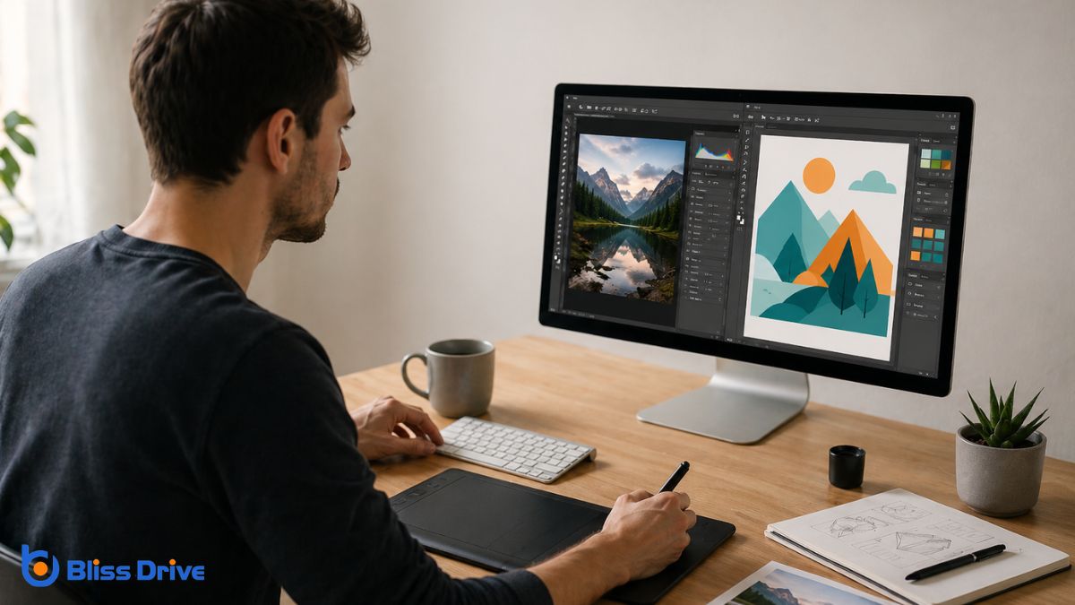
As we consider the strengths of Illustrator in web design, it's important to compare it with Photoshop to understand their distinct roles.
Illustrator excels with vector graphics, which are essential for creating scalable designs like logos and icons. Its precision and ability to maintain quality at any size make it ideal for responsive design.
On the other hand, Photoshop is a raster-based tool, perfect for editing photos and creating detailed, complex images. It shines when dealing with textures and intricate visual effects.
While Illustrator provides crisp lines and versatility, Photoshop offers depth and realism.
Understanding these key differences helps us choose the right tool for each task. By leveraging their unique capabilities, we can enhance our web design projects, ensuring both functionality and aesthetic appeal.
Efficient and flexible workflows are essential in web design, and both Photoshop and Illustrator offer unique advantages.
Let’s explore how each tool contributes to our workflow efficiency and adaptability.
Photoshop excels in pixel-based design, making it ideal for tasks requiring detailed image manipulation. Illustrator shines with vector graphics, perfect for scalable designs.
Here’s how they help us:
When selecting the right software for a web design project, the specific requirements of the project should guide our choice between Photoshop and Illustrator.
If our project demands detailed photo editing or pixel-perfect image manipulation, Photoshop is the go-to tool. Its robust raster capabilities allow us to fine-tune every image detail.
On the other hand, Illustrator excels when we're designing scalable graphics like logos or icons that require vector precision. It offers flexibility in resizing without losing quality, essential for responsive web design.
We should also consider the end goal. If we're creating a visually heavy webpage, Photoshop's layering and effects might be more advantageous.
Conversely, for clean, simple designs, Illustrator’s precision and scalability are unmatched. Understanding these distinctions guarantees we choose the right tool.
In the world of web design, it’s clear there’s no one-size-fits-all answer when choosing between Photoshop and Illustrator. We’ve explored how Photoshop’s strength lies in detailed raster graphics, while Illustrator shines with scalable vector designs. The key is understanding our project’s specific needs and leveraging the unique strengths of each tool. By doing so, we can enhance our workflow efficiency and create ideal design outcomes. Let’s embrace both tools and make informed decisions for our web projects.

