

Learn More About Us

Nonprofits should prioritize mobile optimizationDesigning and formatting web content to ensure it performs well on mobile devices. to engage effectively with their audience. Guarantee responsive designA web design approach that makes web pages render well on a variety of devices and window or screen ... for seamless navigation across devices, and optimize page load speed with compressed images and minimal large files. Enhance user experience with streamlined, touch-friendly navigation and mobile-specific strategies. Maintain data securityMeasures taken to protect data from unauthorized access and data breaches. for donor confidence. Leverage mobile communication channels and analyticsThe systematic computational analysis of data or statistics to gain insights and support decision-ma... for insightful engagementThe interactions that users have with a brand’s content on social media.. Keeping up with mobile technology trends is key to maintaining relevancy and reach. There's more to get into about this topic.

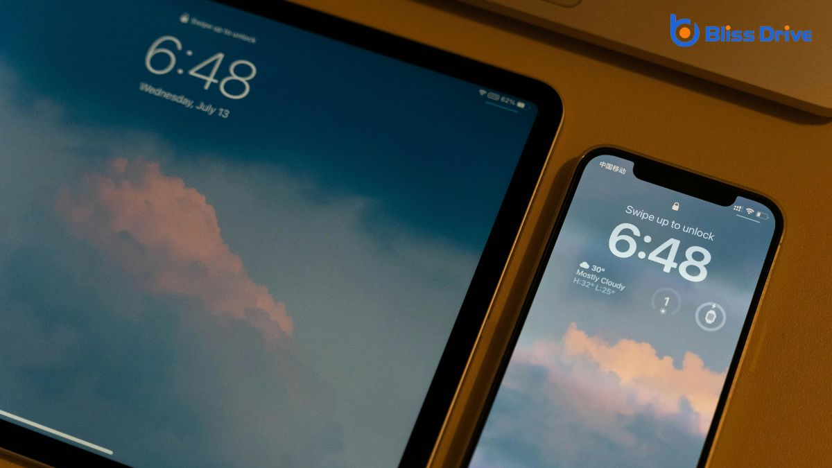
As more people access information on the go, understanding the importance of mobile traffic is essential for nonprofits.
You need to recognize that mobile devices are often the primary way audiences interact with your organization online. Mobile traffic accounts for a significant portion of web visits, and if your site isn’t optimized for these users, you risk losing potential donors and supporters.
Consider how easily someone can navigate your site on a smartphone or tablet. If they can’t find information quickly, they’ll likely leave and not return.
Your goal is to engage visitors effectively, encouraging them to explore your mission, contribute, or participate in events. By prioritizing mobile traffic, you’ll enhance your reach and impact, ensuring your nonprofit’s message is accessible to everyone.
To make the most of mobile traffic, your nonprofit’s website must offerThe specific product or service being promoted by affiliates. a seamless experience across all devices. Start by guaranteeing a responsive design. This means your site automatically adjusts to fit any screen size, whether it’s a phone, tablet, or desktop.
Users shouldn’t have to pinch or zoom to navigate your pages. A clean, adaptable layout enhances accessibility and engagement. Make certain buttons and links are touch-friendly, with enough space to prevent accidental clicks.
Keep your design simple, avoiding clutter that can overwhelm smaller screens. Test your site on various devices and orientations to guarantee consistency.
Prioritize readability with clear fonts and contrasting colors. By doing this, you’ll create a more pleasant and effective user experience for your audience.
While ensuring your website is responsive, don't overlook the importance of optimizing page load speed for a smooth user experience. Mobile users expect quick access to information, and slow load times can leadA potential customer referred by an affiliate who has shown interest in the product or service but h... to frustration and page abandonment.
You can start by compressing images and minimizing large files to reduce load time. Also, consider enabling browser caching so returning visitors don't have to reload your entire site each time they visit.
Use tools like Google's PageSpeed Insights to identify areas for improvement. This tool offers actionable suggestions like deferring JavaScript or optimizing CSS delivery.
When enhancing user experience for mobile users, focus on creating a streamlined navigation design that makes it easy for visitors to find what they need.
Implement responsive layout techniques to guarantee your site looks great on any device.
Additionally, prioritize fast loading times to keep users engaged and prevent them from leaving your site in frustration.
Although mobile users often have different needs from desktop users, streamlined navigation design can greatly enhance their experience. You want your nonprofit's mobile site to be intuitive and easy to navigate, allowing users to find information quickly.
Start by simplifying your menu options, focusing on essential items that connect directly to your core services or content. Use clear, concise labels for menu items to guarantee that users understand where each link will take them.
Consider implementing a sticky menu or a hamburger icon for easy access without cluttering the screen. Prioritize important actions, like donations or event sign-ups, by placing them prominently.
Test your navigation with real users to identify potential pain points. Streamlined navigation not only keeps users engaged but also fosters a positive impressionWhen an ad is displayed on a user’s screen. of your nonprofit.
Responsive design is essential for creating a seamless mobile experience for your nonprofit's audience. By making sure your website adapts to various screen sizes, you make navigation easy and engaging.
Start by using flexible grids and layouts that automatically adjust to a device's dimensions. This approach keeps content accessible, whether users view it on a smartphone, tablet, or desktop.
Don't forget to implement fluid images and media queries. These techniques make certain that visuals scale correctly, maintaining their quality without overwhelming the screen.
Pay attention to touch-friendly elements, like buttons and links, which should be large enough to tap easily. By embracing these responsive layout techniques, you'll provide a consistent and user-friendly experience that encourages visitors to engage more with your nonprofit's mission.
One vital factor in mobile optimization is ensuring your nonprofit's website loads quickly. Slow loading times frustrate users and can lead to high bounce rates. You want visitors to stay engaged, so prioritize speed.
Optimize images by compressing them without losing quality. Use efficient coding practices and minimize redirects. Leverage browser caching to allow returning users faster access. Consider using a content delivery network (CDN)A system of distributed servers that deliver content to users based on their geographic location. to distribute content more efficiently.
Reducing server response time is essential; every second counts when users are on the go. Test your site using tools like Google's PageSpeed Insights to identify and fix issues.
Why should nonprofits care about mobile-specific content strategies?
With the increasing number of users accessing content via smartphones, it's essential to tailor your message for smaller screens.
Mobile-specific strategies enhance engagement, guaranteeing your mission reaches a wider audience.
To get started, focus on these key areas:
With the increasing reliance on smartphones for everyday tasks, optimizing your donation process for mobile users is essential for nonprofits.
Start by guaranteeing your donation page is mobile-responsive. This means it should automatically adapt to different screen sizes, providing an easy and intuitive user experience.
Simplify the process: reduce the number of fields donors must fill out and integrate mobile paymentPayment services operated under financial regulation and performed from or via a mobile device. options like Apple Pay or Google Wallet to expedite transactions.
Don’t forget to guarantee your call-to-action buttons are prominent and easily tappable. A smooth, quick donation process reduces friction and increases the likelihood of completed donations.
Additionally, include options for recurring donations, making it easy for supporters to contribute regularly.
Data-driven decisions can greatly enhance your nonprofit's impact, and mobile analyticsThe practice of measuring and analyzing user interactions and engagement on mobile devices. provides the tools to access such insights.
By tapping into mobile analytics, you can better understand user behavior and optimize your mobile presence. Here’s how you can leverage mobile analytics effectively:
Utilizing these insights guarantees your nonprofit is responsive and strategic, helping you maximize your mobile impact.
To effectively engage your audience, it’s crucial to integrate mobile-friendly communication channels into your nonprofit's strategy.
Start by ensuring your emails are optimized for mobile, with concise subject lines and clear calls to action. Use SMS messaging to reach supporters quickly with updates or urgent appeals.
Leverage social media platforms like InstagramA photo and video-sharing social networking service owned by Facebook. and FacebookA social networking site where users can post comments, share photographs, and links to news or othe..., which are inherently mobile-friendly, to share compelling storiesA feature on platforms like Instagram and Facebook where users can post photos and videos that disap... and visuals.
Consider creating a mobile app if it aligns with your goals, offering users easy access to resources or event information. Enable push notificationsShort messages sent directly to users’ mobile devices from apps to encourage engagement. to keep supporters engaged without overwhelming them.
Prioritize a responsive design for your website so users have a seamless experience regardless of the device.
As mobile technology rapidly evolves, it's essential for nonprofits to stay informed about the latest trends to remain relevant and effective. Leveraging these advancements can enhance your outreach and engagement strategies.
To stay ahead, consider the following:
Embrace these trends to maximize your nonprofit's mobile presence and impact.
To effectively reach and engage your audience, prioritize mobile optimization for your nonprofit. Make certain your website is responsive and loads quickly to enhance user experience. Craft mobile-specific content and simplify donation processes for seamless interactions. Use mobile analytics to gain insights and adjust strategies as needed. Stay current with mobile technology trends to maintain your competitive edge. By focusing on these areas, you’ll create a stronger connection with supporters and drive your nonprofit’s mission forward.


