

Learn More About Us
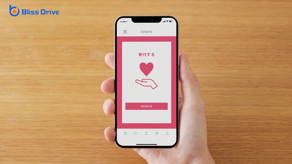
Mobile optimizationDesigning and formatting web content to ensure it performs well on mobile devices. drastically improves your user experience by making your website intuitive, fast, and consistent across all devices. With responsive designA web design approach that makes web pages render well on a variety of devices and window or screen ..., your site adapts to varied screens, while touch-friendly navigation increases accessibility. Enhanced speed keeps users engaged and improves SEO, broadening your audience reach. User-centric content presentation guarantees easy navigation, boosting user satisfaction and brand loyaltyThe tendency of consumers to continue buying the same brand's products or services.. These elements leadA potential customer referred by an affiliate who has shown interest in the product or service but h... to better conversionThe completion of a desired action by a referred user, such as making a purchase or filling out a fo... rates, and there's more to discover about enhancing user engagementThe level of interaction and involvement users have with social media content..

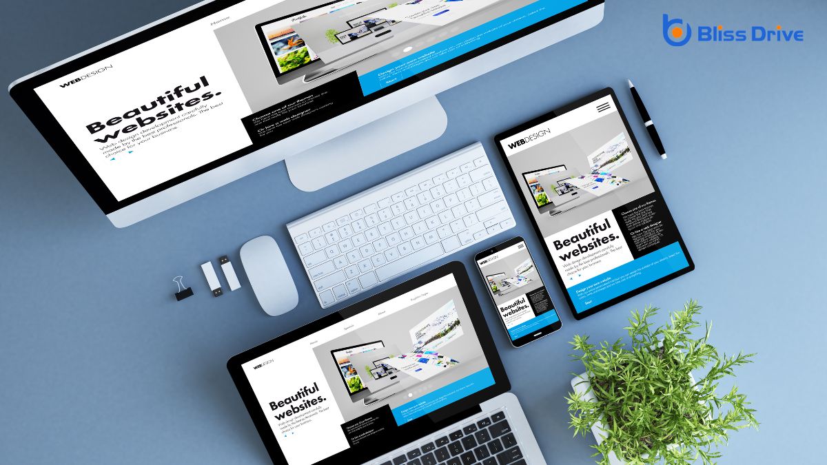
In today's digital landscape, where users access websites from a myriad of devices, ensuring your site has a responsive design is essential.
You want your site to look great and function seamlessly, whether someone views it on a smartphone, tablet, or desktop. A responsive design automatically adjusts your site's layout and elements to fit the screen size, enhancing readability and navigation.
This adaptability not only improves the user experience but also reduces bounce rates, as visitors are less likely to leave a site that’s easy to use.
By implementing responsive design, you're also boosting your site's SEO, as search engines favor mobile-friendly sites.
Don't let your website fall behind; prioritize responsive design to keep your audience engaged and satisfied.
While a responsive design guarantees your site looks great across devices, speed and performance are equally essential to user satisfaction. Imagine tapping a link, only to wait ages for a page to load—frustrating, right? Users expect quick access to information, and slow sites often lead to high bounce rates.
Optimize images, leverage browser caching, and minimize redirects to enhance speed. Faster loading times improve customer engagementThe level of interaction and involvement a customer has with a brand. and retention. Google's algorithms even rank faster sites higher, affecting your visibility.
Use tools like Google PageSpeed Insights to identify performance issues and implement changes. Regularly test your site's speed and make necessary adjustments. By prioritizing speed and performance, you guarantee visitors enjoy seamless interactions, fostering loyalty and encouraging repeat visits.
Don’t let slowness drive users away.
With mobile devices dominating internet usage, guaranteeing touch-friendly navigation is essential for user experience. You want users to easily interact with your site, so designing intuitive, responsive navigation is key.
Avoid tiny buttons or links that frustrate users. Instead, use larger, easy-to-tap targets that accommodate different finger sizes. Implement swipe gestures for smooth shifts between pages or menus, enhancing engagement.
Consider thumb zones—areas comfortably reached while holding a device—to place important navigation elements within easy reach. You should also make sure that menus collapse neatly, reducing clutter and providing a clean look.
You know that optimizing your site for mobile can greatly boost your search engine rankingsThe position at which a website appears in the SERP., making your content more visible and accessible.
When your site ranks higher, you naturally reach a broader audience and attract more potential customers.
Don’t underestimate the power of mobile SEOOptimization techniques to ensure a website performs well on mobile devices. in enhancing your brand's online presence.
Optimizing your website for mobile devices greatly boosts your search engine rankings, as search engines now prioritize mobile-friendly sites in their algorithms. By ensuring your website adapts smoothly on smartphones and tablets, you signal to search engines that you’re providing a seamless user experience. This results in your site being more likely to appear higher in search results, capturing more potential visitors.
Search engines value user-centric designDesigning websites and applications with the needs and preferences of users in mind., and mobile optimization is a key factor. They reward sites with fast loading times, intuitive navigation, and responsive layouts.
These elements not only enhance user experience but also improve your site's overall performance in search rankings. By focusing on mobile SEO, you’re not just meeting search engine expectations; you’re also setting your site up for greater success.
Although mobile SEO is a critical component of modern digital strategies, it does more than just improve search engine rankings; it greatly enhances your site's visibility and reach.
By optimizing for mobile, you guarantee that your website is easily accessible to users on smartphones and tablets. This increased accessibility means that a broader audience can discover your content, products, or services, regardless of their location or device.
Moreover, search engines prioritize mobile-friendly sites, so when users search on their devices, they'll likely encounter your optimized site first. This boosts your chances of attracting more organic trafficVisitors who come to a website through unpaid search engine results..
Don’t underestimate the power of mobile SEO in expanding your reach; it’s key to connecting with an ever-growing mobile audience and staying competitive in today’s digital landscape.
When crafting a mobile-friendly experience, placing the user's needs at the forefront guarantees content isn't only accessible but also engaging.
Focus on user-centric content presentation by making sure your layout is intuitive and easy to navigate. Prioritize clarity and simplicity in your design choices, as this helps users find information quickly without frustration.
Consider the following elements to enhance user experience:
When you optimize your site for mobile, you create a seamless navigation experience that keeps users engaged.
Faster loading speeds guarantee visitors stay on the page, while enhanced visual appeal captures their attention.
These factors work together to boost conversion rates, turning casual visitors into loyal customers.
How often do you find yourself frustrated with a website that’s difficult to navigate on your mobile device? A seamless navigation experience is essential for maintaining user engagement and boosting conversion rates.
When a site’s optimized for mobile, you’ll notice immediate benefits:
When navigation is seamless, users are more likely to stay, explore, and convert.
Don’t underestimate the power of a well-optimized mobile experience.
A seamless navigation experience keeps users engaged, but what happens when they encounter slow loading speeds? Frustration sets in, and users are likely to abandon your site.
In the fast-paced digital world, speed is vital. Mobile optimization guarantees your pages load quickly, enhancing user satisfaction and boosting conversion rates. Users expect instant access to information, and when you deliver, they’re more inclined to stay, explore, and eventually make a purchase.
Optimized mobile sites not only load faster but also rank better on search engines, drawing more traffic. Search engines prioritize speed, rewarding sites that cater to user expectations.
Although speed is essential, you can't overlook the power of visual appeal in mobile optimization. A visually engaging site captures attention and can greatly impact conversion rates. When users find your site aesthetically pleasing, they’re more likely to stay, explore, and eventually convert.
To enhance visual appeal, consider these factors:
When you focus on mobile optimization, you're crafting a seamless user experience that can't be underestimated. By embracing responsive design, you guarantee your site looks great on any device. Prioritizing speed and performance keeps users engaged, while touch-friendly navigation makes interaction a breeze. Don't forget mobile SEO—it's vital for visibility. Presenting content in a user-centric way boosts satisfaction, and ultimately, optimized mobile experiences drive higher conversion rates, benefiting both you and your audience.


