Switching your mobile site to HTTPS markedly boosts your SEO. Google favors secure sites, giving them higher search rankings. This means more traffic and better user experience, thanks to faster indexing and reduced bounce rates. With HTTPS, users trust your site more, enhancing engagement and credibility. Just guarantee a smooth changeover by updating links and handling redirects properly to avoid SEO pitfalls. Discover how this simple alteration can benefit your mobile site even further.

In today's digital landscape, ensuring mobile security is essential, and HTTPS plays a key role in safeguarding data. When you visit websites on your mobile device, HTTPS encrypts the data exchanged between your browser and the web server. This encryption helps prevent unauthorized parties from intercepting sensitive information like passwords or credit card numbers.
Using HTTPS also assures you that the website you're accessing is legitimate and hasn't been tampered with by malicious actors. It provides an additional layer of trust, especially when you're dealing with personal or financial data.
Without HTTPS, your data is vulnerable to attacks, which can lead to identity theft or financial loss. By prioritizing HTTPS, you're taking a proactive step in protecting your mobile security.
Although it mightn't be immediately obvious, using HTTPS can considerably impact your mobile search rankings. Search engines prioritize secure websites, so adopting HTTPS can boost your site's visibility and performance.
Here's how HTTPS affects your mobile search rankings:
Adopting HTTPS not only boosts your mobile search rankings but also plays a significant role in building user trust and engagement. When users see the padlock symbol next to your URL, they know their data is secure, encouraging them to interact more with your site. This security builds credibility, making users more likely to return and recommend your site to others.
Trust is essential, especially on mobile, where users are often cautious about sharing personal information. HTTPS reassures them that their data won't be intercepted, fostering a sense of safety.
Furthermore, secure sites reduce bounce rates as users feel comfortable exploring further. By prioritizing HTTPS, you’re not just protecting data; you’re enhancing user experience and engagement, ultimately driving more traffic and conversions.
To shift your mobile site to HTTPS, start by obtaining an SSL certificate from a trusted Certificate Authority (CA). This certificate guarantees a secure connection, boosting your site's credibility.
Once you have the certificate, follow these key steps:

Switching your mobile site to HTTPS can present several challenges, but with the right strategies, you can overcome them effectively.
First, you might face mixed content issues where some elements still load over HTTP. Make certain all resources are served via HTTPS.
Another challenge is managing redirects. Improper redirects can harm SEO, so use 301 redirects to guide users and search engines correctly.
You might also encounter certificate errors if your SSL certificate isn't properly installed or maintained. Regularly update and check your certificate’s validity.
Finally, page load speed can be affected. Optimize images, enable compression, and leverage browser caching to maintain performance.
By adopting HTTPS for your mobile site, you're not just boosting security; you're also enhancing your search rankings and building user trust. HTTPS is vital for protecting your users' data, which encourages engagement and loyalty. Shifting your site can seem intimidating, but with the right steps and solutions to common challenges, it's manageable. Don't wait—secure your mobile site with HTTPS today to stay competitive and guarantee a safe, trustworthy experience for your users.
Structured data and schema markup enhance your mobile site's visibility by providing search engines with a clear blueprint of your content. They help categorize and display content, boosting chances of appearing in rich snippets, and improve user experience with richer search results. When implemented correctly, they increase click-through rates and highlight critical information. Avoid common mistakes like incorrect schema types for better search visibility. Get ready to discover how to make your mobile SEO more effective.

Structured data and schema markup might seem complex at first, but they’re crucial for enhancing how search engines interpret your mobile site’s content.
You’ll find that structured data is like a map for search engines, guiding them to understand the context of your site’s information. By implementing schema markup, you’re fundamentally labeling your content, helping search engines like Google categorize and display it more effectively.
When you use schema markup, you’re improving the chances of your site appearing in rich snippets. These snippets provide users with quick, informative answers, enticing them to click through to your site.
To start, identify the types of content on your mobile site and match them with the appropriate schema types. This strategic approach guarantees your content is indexed correctly.
Structured data plays an essential role in boosting your mobile site's search visibility by helping search engines better understand your content.
When you use it effectively, it not only improves your rankings but also enhances the user experience by providing richer search results.
It's important for you to integrate structured data into your mobile SEO strategy to stay competitive and meet user expectations.
When optimizing your mobile site for search engines, understanding the role of structured data can give you a significant edge.
By using schema markup, you help search engines understand your content better, making it easier for them to display rich results. These enhanced listings can boost your visibility in search results, leading to higher click-through rates.
Structured data can highlight critical information like reviews, ratings, or events, making your site stand out on a crowded search page. It’s a straightforward way to communicate exactly what your page offers without relying solely on keywords.
Don’t overlook the power of structured data—it’s a tool that can make your mobile site more visible and engaging to potential visitors, driving traffic where you need it most.
While enhancing your mobile site's search visibility is essential, don't underestimate the power of structured data in elevating user experience. By implementing structured data, you streamline the way users interact with your site, making navigation intuitive and efficient. When users quickly find the information they’re after, they’re more likely to stay engaged and explore further.
Structured data helps present information in a user-friendly format. For instance, rich snippets like ratings or product availability appear directly in search results, reducing the need for users to dig deeper. This clarity boosts their trust and satisfaction.
Additionally, structured data guarantees that your mobile content is accessible and adaptable across various devices, creating a seamless experience that keeps users coming back. Prioritize user experience, and watch your audience grow.
Using schema markup on your mobile site can greatly enhance your search visibility by making your content more understandable to search engines.
It also improves the mobile experience by providing users with clear, relevant information at a glance.
Plus, it opens up opportunities for your site to feature rich snippets, which can boost your click-through rates.
Implementing schema markup on your mobile site greatly boosts search visibility, making it easier for search engines to understand and display your content in search results.
By using schema markup, you’re providing context to your content, allowing search engines to present rich snippets, which can attract more clicks. These snippets display additional information like ratings, prices, and availability, which are eye-catching and informative.
When your site appears with these enhanced results, you’ll likely see an increase in organic traffic. Schema markup helps differentiate your content from competitors, giving you an edge in search rankings.
This visibility boost not only attracts more visitors but also enhances your brand's credibility. By improving how search engines interpret your content, you’re ensuring better reach and engagement.
Although mobile users often face challenges with website navigation, schema markup can greatly enhance their experience. By providing search engines with structured data, your site can present information more clearly, making it easier for users to find what they need quickly. This means less frustration and more satisfaction on their end.
Schema markup helps your site load faster on mobile devices, improving overall performance. When your site is optimized for speed, users are more likely to stay and engage with your content.
Moreover, schema markup allows you to highlight crucial details like business hours or contact information right in the search results. This convenience means users can access critical info without digging through multiple pages, making their mobile browsing smoother and more enjoyable.
When you incorporate schema markup into your website, you release the potential for rich snippets, enhancing your visibility in search engine results.
Rich snippets provide users with concise, relevant information directly in the search results, such as ratings, reviews, prices, and more. This not only makes your listing stand out but also markedly increases your click-through rate.
As mobile browsing continues to dominate the digital landscape, incorporating the right types of schema markup on your mobile site is essential for enhancing search visibility.
Leveraging schema markup can improve how search engines interpret your content and boost your site's ranking. Here are four key types to evaluate:
When you're implementing structured data on mobile platforms, consider using mobile-specific schema types to enhance your site's performance on smaller screens.
Make certain your design is responsive so that data is displayed correctly across various devices.
Don't forget to test your mobile data markup to catch any errors before going live.
While enhancing user experience on mobile platforms, utilizing mobile-specific schema types can markedly improve how search engines interpret your site's content.
By implementing these schemas, you guarantee that your content is refined for mobile users, leading to better visibility and engagement.
Here's how you can make use of them:
To effectively implement structured data on mobile platforms, it's crucial to understand responsive design considerations that optimize user experience across devices.
Start by ensuring your structured data adapts seamlessly to different screen sizes. This means your schema markup should be flexible and not interfere with the mobile layout.
Responsive design requires you to test how structured data elements appear on tablets and smartphones. HTML and CSS should be used to maintain consistency in how information is displayed, ensuring schema markup integrates smoothly without disrupting the user experience.
Furthermore, prioritize fast load times, as mobile users expect swift interactions. Structured data mustn't slow down your site.
Before launching your mobile site, verify your structured data markup is thoroughly tested for ideal performance and user engagement. Making sure everything functions smoothly is essential.
Here’s how you can effectively test your mobile data markup:
When you're working to optimize your mobile site, using the right tools for testing and validating schema markup can make a significant impact on your site's performance.
Google's Rich Results Test is a fantastic starting point, allowing you to see if your markup is eligible for rich results. It provides clear feedback on errors and warnings.
Another useful tool is Google's Schema Markup Validator, which checks your structured data against schema.org standards. If you need more insights, consider using Bing Webmaster Tools, which offers a markup validator as well.
Leveraging these tools helps guarantee that your structured data is correctly implemented, boosting your site's visibility and user engagement.
Always keep your tools updated and stay informed about any changes in guidelines.
Although structured data can greatly enhance your site's performance, common mistakes can undermine these benefits. First, avoid using incorrect or outdated schema types. Always guarantee your types align with the latest guidelines.
Second, don’t neglect to update your structured data when your site's content changes. Failing to do so can lead to inconsistencies.
Here’s a quick list of common mistakes to watch out for:
Avoid these pitfalls to maximize the benefits of structured data.
By leveraging schema markup, you can greatly enhance the user experience on your mobile site. Schema markup helps search engines understand your content better, which means users find what they're looking for faster. Imagine a user searching for your business hours or reviews—schema markup can present this information directly in search results, saving them time and effort.
Moreover, schema markup can improve your site's accessibility. When you use structured data to provide clear information about your content, screen readers can interpret and relay this data more effectively to users with disabilities. This enhances their browsing experience and guarantees inclusivity.
Incorporating schema markup also helps you create rich snippets that grab attention. Enhanced search results lead to higher click-through rates, engaging users right from the start.
As you explore successful mobile SEO strategies, real-world case studies highlight the transformative power of schema markup.
By examining these examples, you'll see how businesses effectively boost their visibility and user engagement on mobile platforms.
These examples showcase schema's significant impact on mobile SEO success.

Looking ahead, the landscape of mobile SEO and structured data is set to evolve with emerging technologies and changing user behaviors.
As voice search becomes more prevalent, you’ll need to optimize for conversational queries. Structured data will play an essential role in voice search, helping search engines understand and deliver precise answers.
Additionally, with the rise of AI and machine learning, personalizing search results will become more sophisticated. You should focus on implementing detailed schema markup to guarantee your content is easily accessible and relevant.
Plus, as mobile-first indexing continues, your site's mobile performance and structured data will directly impact your rankings. Staying updated with these trends will keep you ahead in the ever-changing world of mobile SEO.
Incorporating structured data and schema markup on your mobile site is essential for boosting SEO and enhancing user experience. By understanding and implementing the right types of schema, you’ll make your content more accessible and engaging for users and search engines alike. Avoid common pitfalls and continuously adapt to future trends to stay ahead. With these strategies, you’re set to improve visibility, drive more traffic, and achieve better results in mobile SEO. Start optimizing your site today!
Mobile optimization drastically improves your user experience by making your website intuitive, fast, and consistent across all devices. With responsive design, your site adapts to varied screens, while touch-friendly navigation increases accessibility. Enhanced speed keeps users engaged and improves SEO, broadening your audience reach. User-centric content presentation guarantees easy navigation, boosting user satisfaction and brand loyalty. These elements lead to better conversion rates, and there's more to discover about enhancing user engagement.

In today's digital landscape, where users access websites from a myriad of devices, ensuring your site has a responsive design is essential.
You want your site to look great and function seamlessly, whether someone views it on a smartphone, tablet, or desktop. A responsive design automatically adjusts your site's layout and elements to fit the screen size, enhancing readability and navigation.
This adaptability not only improves the user experience but also reduces bounce rates, as visitors are less likely to leave a site that’s easy to use.
By implementing responsive design, you're also boosting your site's SEO, as search engines favor mobile-friendly sites.
Don't let your website fall behind; prioritize responsive design to keep your audience engaged and satisfied.
While a responsive design guarantees your site looks great across devices, speed and performance are equally essential to user satisfaction. Imagine tapping a link, only to wait ages for a page to load—frustrating, right? Users expect quick access to information, and slow sites often lead to high bounce rates.
Optimize images, leverage browser caching, and minimize redirects to enhance speed. Faster loading times improve customer engagement and retention. Google's algorithms even rank faster sites higher, affecting your visibility.
Use tools like Google PageSpeed Insights to identify performance issues and implement changes. Regularly test your site's speed and make necessary adjustments. By prioritizing speed and performance, you guarantee visitors enjoy seamless interactions, fostering loyalty and encouraging repeat visits.
Don’t let slowness drive users away.
With mobile devices dominating internet usage, guaranteeing touch-friendly navigation is essential for user experience. You want users to easily interact with your site, so designing intuitive, responsive navigation is key.
Avoid tiny buttons or links that frustrate users. Instead, use larger, easy-to-tap targets that accommodate different finger sizes. Implement swipe gestures for smooth shifts between pages or menus, enhancing engagement.
Consider thumb zones—areas comfortably reached while holding a device—to place important navigation elements within easy reach. You should also make sure that menus collapse neatly, reducing clutter and providing a clean look.
You know that optimizing your site for mobile can greatly boost your search engine rankings, making your content more visible and accessible.
When your site ranks higher, you naturally reach a broader audience and attract more potential customers.
Don’t underestimate the power of mobile SEO in enhancing your brand's online presence.
Optimizing your website for mobile devices greatly boosts your search engine rankings, as search engines now prioritize mobile-friendly sites in their algorithms. By ensuring your website adapts smoothly on smartphones and tablets, you signal to search engines that you’re providing a seamless user experience. This results in your site being more likely to appear higher in search results, capturing more potential visitors.
Search engines value user-centric design, and mobile optimization is a key factor. They reward sites with fast loading times, intuitive navigation, and responsive layouts.
These elements not only enhance user experience but also improve your site's overall performance in search rankings. By focusing on mobile SEO, you’re not just meeting search engine expectations; you’re also setting your site up for greater success.
Although mobile SEO is a critical component of modern digital strategies, it does more than just improve search engine rankings; it greatly enhances your site's visibility and reach.
By optimizing for mobile, you guarantee that your website is easily accessible to users on smartphones and tablets. This increased accessibility means that a broader audience can discover your content, products, or services, regardless of their location or device.
Moreover, search engines prioritize mobile-friendly sites, so when users search on their devices, they'll likely encounter your optimized site first. This boosts your chances of attracting more organic traffic.
Don’t underestimate the power of mobile SEO in expanding your reach; it’s key to connecting with an ever-growing mobile audience and staying competitive in today’s digital landscape.
When crafting a mobile-friendly experience, placing the user's needs at the forefront guarantees content isn't only accessible but also engaging.
Focus on user-centric content presentation by making sure your layout is intuitive and easy to navigate. Prioritize clarity and simplicity in your design choices, as this helps users find information quickly without frustration.
Consider the following elements to enhance user experience:

When you optimize your site for mobile, you create a seamless navigation experience that keeps users engaged.
Faster loading speeds guarantee visitors stay on the page, while enhanced visual appeal captures their attention.
These factors work together to boost conversion rates, turning casual visitors into loyal customers.
How often do you find yourself frustrated with a website that’s difficult to navigate on your mobile device? A seamless navigation experience is essential for maintaining user engagement and boosting conversion rates.
When a site’s optimized for mobile, you’ll notice immediate benefits:
When navigation is seamless, users are more likely to stay, explore, and convert.
Don’t underestimate the power of a well-optimized mobile experience.
A seamless navigation experience keeps users engaged, but what happens when they encounter slow loading speeds? Frustration sets in, and users are likely to abandon your site.
In the fast-paced digital world, speed is vital. Mobile optimization guarantees your pages load quickly, enhancing user satisfaction and boosting conversion rates. Users expect instant access to information, and when you deliver, they’re more inclined to stay, explore, and eventually make a purchase.
Optimized mobile sites not only load faster but also rank better on search engines, drawing more traffic. Search engines prioritize speed, rewarding sites that cater to user expectations.
Although speed is essential, you can't overlook the power of visual appeal in mobile optimization. A visually engaging site captures attention and can greatly impact conversion rates. When users find your site aesthetically pleasing, they’re more likely to stay, explore, and eventually convert.
To enhance visual appeal, consider these factors:
When you focus on mobile optimization, you're crafting a seamless user experience that can't be underestimated. By embracing responsive design, you guarantee your site looks great on any device. Prioritizing speed and performance keeps users engaged, while touch-friendly navigation makes interaction a breeze. Don't forget mobile SEO—it's vital for visibility. Presenting content in a user-centric way boosts satisfaction, and ultimately, optimized mobile experiences drive higher conversion rates, benefiting both you and your audience.
You can't afford to ignore mobile optimization if you want to stay competitive in today's digital landscape. It directly affects your site's ranking because Google uses mobile-first indexing. Fast-loading, mobile-responsive sites enhance user experience, reduce bounce rates, and improve SEO visibility, drawing more traffic. Make sure your design is easy to navigate with clear menus and large buttons. Enhance your site's speed and watch user retention soar. Discover the benefits of optimizing your site for mobile users.

As the digital landscape evolves, embracing mobile-first indexing is no longer optional—it's essential.
You're likely aware that Google now primarily uses the mobile version of a site for ranking and indexing. This shift means your website's mobile performance directly impacts your SEO. If your site doesn't cater to mobile users effectively, you risk losing visibility and traffic.
To stay competitive, guarantee your site is responsive and loads efficiently on mobile devices. Check that the text is readable without zooming, links are easily clickable, and content fits the screen.
By prioritizing a mobile-first approach, you align with search engine priorities, boosting your chances of achieving higher rankings.
While optimizing for mobile, focusing on user experience is essential to keep visitors engaged and satisfied. You want your site to be easy to navigate, providing clear menus and an intuitive design.
Make certain buttons are large enough for users to tap without frustration and that text is readable without pinching the screen. Visuals should adjust seamlessly to different screen sizes, maintaining quality and clarity.
Consider the journey your users take. You need to streamline the checkout process, minimize form fields, and offer guest checkout options. Fast-loading images and videos enhance engagement, so compress them without sacrificing quality.
Don’t forget about accessibility; use alt text for images, and make certain your content is accessible to all users, including those with disabilities. Prioritizing these elements will elevate the mobile experience.
Even though many factors influence SEO, mobile page speed plays an essential role in determining your site's rankings. A fast-loading mobile site can greatly improve user experience and increase your chances of ranking higher in search results.
When your site loads quickly, it not only pleases your visitors but also search engines like Google, which prioritize speed in their algorithms.
Consider these benefits:
Focus on optimizing your mobile page speed to stay ahead in the SEO game.
You know that a mobile-friendly design isn't just about aesthetics—it's essential for keeping users engaged and lowering bounce rates.
When your site loads quickly and adapts seamlessly to different screen sizes, users are more likely to stick around and explore.
To keep visitors engaged and reduce bounce rates, it's crucial to prioritize mobile-friendly design.
When users land on your site, they expect an intuitive experience that keeps them browsing. A poorly designed mobile site can frustrate users, causing them to leave almost instantly.
Imagine you're visiting a website on your phone:
A swift page load speed is essential for a positive mobile experience, directly affecting your site's bounce rates. When your webpage takes too long to load, visitors get frustrated and leave, often heading straight to your competitors.
You’ve only got a few seconds to capture their attention, so speed matters. Google also considers page load speed in its ranking algorithms, meaning a slow site can hurt your SEO efforts.
Optimizing images, leveraging browser caching, and minimizing redirects are effective ways to enhance load times. By doing so, you guarantee users stay engaged and explore more pages.
This not only improves user satisfaction but also boosts your chances of converting visitors into customers. Don't let sluggish load times drive potential leads away.
While ensuring your website looks great and functions well on all devices, a responsive design can greatly reduce bounce rates. When visitors land on your site, they expect a seamless experience. If your site adapts smoothly to different screen sizes, they’re more likely to stick around. Here’s why:
Since smartphones have become an integral part of daily life, prioritizing mobile optimization for local SEO is crucial. You want your local business to be easily found by potential customers searching on their phones.
Start by making certain your website loads quickly on mobile devices. Slow-loading pages frustrate users and drive them away. Use concise, relevant keywords in your content and meta tags to improve local search visibility.
Don’t forget to claim and update your Google My Business listing with accurate information. This enhances your chances of appearing in local search results.
Additionally, make sure your contact details are clickable so users can quickly call or find you. Leveraging these strategies guarantees you connect with customers right when they need you.
Responsive web design is essential for ensuring your site looks and functions well across all devices. It helps you create a seamless user experience, which is vital for keeping visitors engaged.
When your site adapts smoothly to different screen sizes, you avoid potential issues like distorted images or misplaced text.
Imagine your audience on various devices:
Prioritizing responsive design keeps users happy and search engines satisfied.

Effective mobile usability can greatly boost conversion rates, turning casual visitors into loyal customers. When your site’s mobile interface is intuitive and fast, users find what they’re looking for with ease. A seamless experience encourages them to engage more, leading to higher sales and conversions.
If buttons are too small or the navigation is clunky, you risk frustrating users, causing them to leave without purchasing.
Think about it: if someone visits your site on their phone and struggles to complete a task, they’re likely to abandon the process. But when everything works smoothly, they’re more inclined to trust your brand.
Prioritizing mobile usability not only enhances user satisfaction but also directly impacts your bottom line, driving growth and success for your business.
You need the right tools and strategies to make your website mobile-friendly and boost your SEO.
Start by using essential tools like Google's Mobile-Friendly Test and PageSpeed Insights to identify your site's weaknesses.
Then, focus on strategies such as responsive design and optimizing images to enhance performance.
While the world increasingly turns to mobile devices for browsing, businesses must guarantee their websites are optimized for mobile users.
To achieve this, leverage essential tools that simplify the optimization process and enhance your site's mobile performance.
As mobile browsing becomes the norm, making certain your site performs ideally on mobile devices is essential for maintaining user engagement.
Start by implementing responsive design to make your site adaptable to various screen sizes. Prioritize fast loading times by compressing images and minifying CSS and JavaScript files. Use tools like Google’s Mobile-Friendly Test to identify issues and get actionable insights. Don’t forget to leverage browser caching to reduce server load and speed up page delivery.
Focus on touch-friendly navigation to enhance user experience. Make sure buttons and links are easily tappable. Keep content concise and prioritize readability by using larger fonts and simpler layouts.
Regularly test your site on multiple devices to make sure consistent performance. By optimizing for mobile, you’ll boost user satisfaction and improve SEO rankings.
You can't ignore mobile optimization if you want to boost your SEO. With the shift to mobile-first indexing, it's essential to enhance user experience through faster mobile page speeds and a mobile-friendly design. A responsive web design helps lower bounce rates, and optimizing for mobile can greatly impact local SEO and conversion rates. Use the right tools and strategies to guarantee your site is mobile-ready, and you'll see the benefits quickly.
Smartphone usage has risen exponentially over the past few years. In fact, browsing on mobile devices accounts for over half of all web traffic globally. Due to these trends, search engines are now showing preferences for websites that are mobile-friendly and mobile-optimized, granting them higher rankings on search engine results pages (SERPs).
Squarespace is one of the most common website builders today and was actually the leading software platform for e-commerce shops in 2021. In general, websites on Squarespace are already designed to be viewed and navigated well on any device. Squarespace sites adjust to different browser window sizes through responsive design.
This mobile responsive design ensures that page elements will remain intact, and will adapt to different screen sizes without having anything on the site change. Despite this assurance, there are still a number of things to keep in mind to ensure that you have the most mobile-optimized and customized site of your dreams.
Here are some tips for getting started:
Before anything else, make sure to do your own audit of your Squarespace site. You can manually have a look on your smartphone, but you can also use Squarespace’s Device View for a preview of the site’s display on small screens. Google also has a Mobile-Friendly Test for you to get an overview of your site’s mobile optimization and compatibility.
After checking your site’s Device View, it is still recommended to adjust its font size to your liking. You can do this via custom CSS. In addition to this, you can also adjust your letter spacing to 0px – or even higher to avoid having text overlap.
Devices download the content of a page when a user views it. As such, it’s best to lessen the amount of data on every page. You can minimize how much content is displayed on every page, keeping it below 5 MB. This will ensure faster page load speed, and thus, a better user experience.
Sometimes, spacer blocks look better on desktop view than on mobile. To avoid having excessive empty spaces on your mobile sites, fix your spacer blocks. Instead of using a single spacer, put two blocks side-by-side. This cancels out on Squarespace’s mobile view but will remain as is on desktop view.
Squarespace has an image editor where you can edit the focal points of your photos, especially your banner images. Repositioning the part you want to focus on ensures that users get the best view of your site and all its content, regardless of the device they are using.
Although Squarespace has a number of great built-in features for responsive mobile design, it is important that you do your part to check that every element is mobile-optimized. With all the potential traffic and leads generated from mobile traffic, you won’t want to miss out by having a site that isn’t performing as well as it could be.
Want more tips on mobile SEO? Check out some of our previous posts! Contact Bliss Drive today for all your web design needs.
There’s a reason everyone has a smartphone. Not only are smartphones the go-to tool for keeping in touch with family and friends, but they are quickly replacing the device that was once dominant in Internet browsing: the desktop computer — and by extension, the laptop computer.
According to Statista, mobile browsing now accounts for approximately half of all website traffic worldwide. This statistic has stayed at about 50% since 2017.
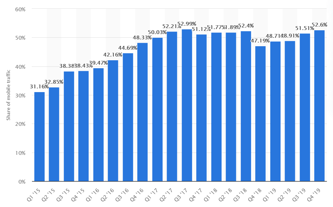
In the United States, that percentage is even higher. ZDNet reported in February 2020 that 3 out of 5 Americans use a mobile device first when surfing the web. They also revealed that 52% of online shoppers purchased through a mobile device.
This shouldn’t be that surprising. It’s much easier to sit back in your armchair and browse the web on your phone than it is to boot up your computer or laptop. Who wants to click with a mouse when you can just tap with your finger?
But this trend also has huge implications for your business, especially if you rely on your website to attract customers, generate leads, or make sales. If you haven’t done so already, it’s past time for you to adapt your website for Mobile SEO.
If you don’t know what mobile SEO is or if you’re unsure if your website is optimized, don’t sweat it. This guide from Bliss Drive expert team will walk you through the basics of how to optimize websites for mobile devices.
Mobile SEO is two things in one. It’s search engine optimization (SEO) combined with a form of website development that generates a flawless viewing experience on mobile devices. In other words, it applies the best practices of SEO concerning your website, but specifically to how people can find and view it on their smartphone.
Most other Internet companies have already adapted to the mobile trend. Google (which is basically synonymous with the Internet these days) is one company that pushed hard for mobile-first optimization.
Google now uses what it calls “mobile-first indexing,” which means the search engine “predominantly uses the mobile version of the content for indexing and ranking,” rather than the desktop version of the content of your website - this is mobile SEO.
That means that if your website doesn’t load properly or contains missing content when it’s viewed on mobile, Google won’t index it properly — it doesn’t matter how well it’s been structured for desktop.
Naturally, this can have huge implications for your site’s Google ranking. You’ve put a lot of time and money into your website. It would be a shame for all of that to go to waste just because it isn’t mobile optimized.
As a first step, just see how your website looks and feels on your mobile device. You can also use the following tools to test your webpage’s load speed and see how it looks on different types of mobile devices:
If content is missing, if images aren’t loading, if the text is so small it’s unreadable, and if it’s taking too long for content to load, your website will need some attention.
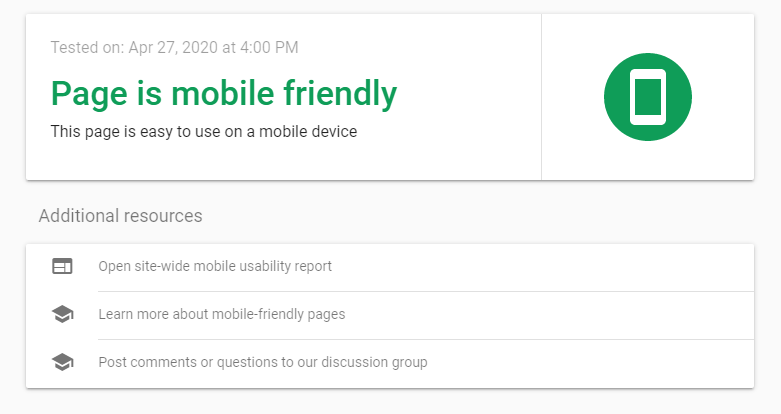
You can also check to see if specific webpages are generally mobile-friendly by using Google’s Mobile-Friendly Test for Mobile SEO tool on Google Search Console. Just plug in the URL, and after a brief analysis period, you’ll get your results.
Hopefully, they should look something like this:
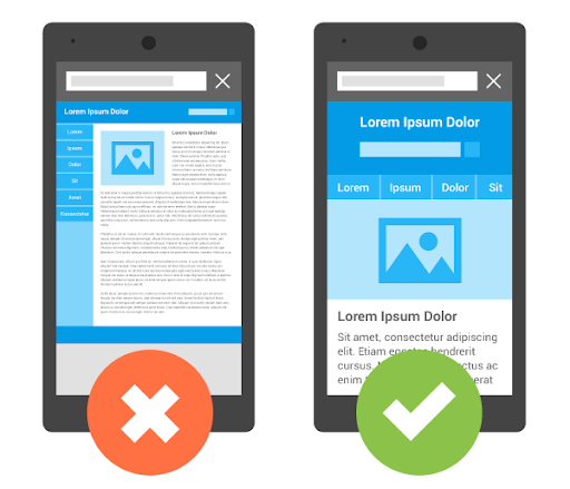
If not, your first objective should be to adapt your site so that it works on mobile devices. There are a few ways to do this, but one method is now preferred over the others: using mobile-responsive design.
Most website building platforms and WordPress themes are now designed to be mobile-responsive. In fact, it’s rare to find one that isn’t. When your website is mobile-responsive, no matter what content you put on your site, it should rearrange itself to fit neatly and logically when being viewed from a smaller screen, such as that of a smartphone or tablet.
In the past, developers would build a “mobile version” of their website to be served dynamically to mobile users, or they would create a separate URL that their site would redirect to when being accessed by a mobile phone. While these two routes technically work, they aren’t good for your mobile SEO.
According to the Search Engine Journal, there is no separate Google Index for mobile, so only the “desktop version” of your website would be indexed, and it wouldn’t be mobile-optimized. Furthermore, Google wouldn’t register that your website is mobile-friendly, which could hurt you in search rankings.
If you’ve created or updated your website recently, you may already be covered. But if you’re using an older website builder or if you hard-coded your website from scratch, you may not have a mobile-responsive design.
Altogether, there are three ways to make your website mobile responsive.
Again, very few WordPress themes aren’t mobile-responsive these days. But if you’ve got one of them, it’s probably time to move on.
This may require you to do some redesign work, but it’s the easiest way to avoid any hiccups when making the switch. The alternatives are to transfer your website to a new platform, or start a new website from scratch.
You can use HTML and cascading style sheets (CSS) to automatically resize, hide, shrink, and enlarge objects on your website. This code only works with a mobile-responsive design and may be necessary if your theme or website building platform doesn’t insert it automatically.
Just insert the following <meta> element to the head of the HTML on all your webpages:
<meta name="viewport" content="width=device-width, initial-scale=1.0">
This instructs the website browser to scale the page’s dimensions based on the size of the user’s screen. If your website isn’t built to be mobile SEO responsive in the first place, this could make the user experience worse if you don’t address the sizing of every element on the page.
For example, images that are displayed with a width wider than the user’s screen will force the user to zoom out or scroll horizontally just to see the entire webpage.
To make an image scale as well, you can set the CSS “width” property to 100%, like this example with “img_1.jpg”:
<img src="img_1.jpg" style="width:100%;">
This will make the image scale either larger or smaller than its original size to fit the screen. Naturally, you don’t want your image to appear giant on your user’s mobile screen. To avoid that possibility, just add the “max-width:100%” property, which allows the images to scale down but not up:
<img src="img_1.jpg" style="max-width:100%;height:auto;">
You can do the same thing with text by adding HTML as well. Here’s how you can scale an H1 tag to “viewport width” or “vw”:
<h1 style="font-size:10vw">Header Text Here</h1>
If you don’t have a mobile-responsive theme, you may have other elements on your website that require your attention, such as buttons and widgets. You may need to add code to each of these elements to make them size correctly on various screen sizes.
If your website is still being hosted by a platform that looks like it hasn’t been updated since 2002, it might be time to find a new home on the Internet for your business. If your current website builder or hosting service doesn’t give you the tools you need to make your website mobile-responsive, they probably aren’t worth your time and money anyway.
The good news is that you should be able to keep your domain.
Do your best to save all your content when making the transfer. You may be able to export your site or even transfer it to a new platform automatically.
Beyond mobile responsiveness, there are a few other elements of mobile SEO you may need to address on your website. Here’s what you can do, step by step.
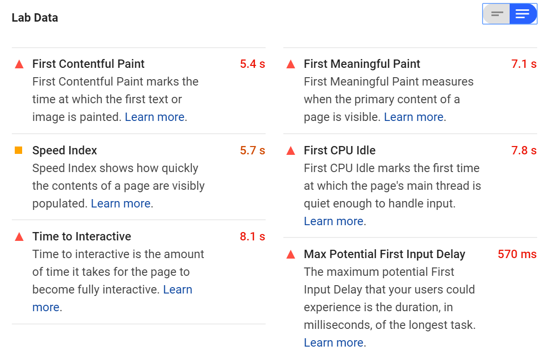
If you haven’t already, try running your homepage through Google’s PageSpeed Insights tool. If you end up with a low speed score, the tool will provide you with plenty of information about what’s slowing your page down.
You can repeat this step for all your webpages to get an idea of which elements are slowing down your website on mobile devices.
You’ll see a detailed examination of what’s making your website slow in the “Lab Data” section. It might look something like this:
The tool will also provide you with a list of “Opportunities” below this. These are all the things you can do to make your website load faster on a smartphone. Some of the changes you need to make may involve altering the way you deliver critical JavaScript and CSS.
You may also need to reduce the impact of third-party code on your site or implement HTTP caching to speed up your load time when people visit your website repeatedly. If you need help, you may want to reach out to some experts to work on your website for you.
There are a few other tricks to reduce load times. One of the most basic is to reduce the “weight” of your webpages by literally minimizing the number of bytes that need to be loaded.
You can do this by compressing images and optimizing other assets like videos. You can even combine your images into CSS sprites to make them load faster. You can do these things manually, or you can use tools that do them automatically (there are tons of compression plugins available for WordPress).
If possible, consider uploading images in newer formats like JPEG-XR or WebP rather than GIF, PNG, or JPEG. These formats are better optimized for mobile viewing.
Meanwhile, instead of using a plug-in to play videos, consider using HTML5 by implementing the <video> and <source> elements where you want the video on the page. It should look like this:
<video controls>
<source src="movie.mp4" type="video/mp4">
<source src="movie.ogg" type="video/ogg">
</video>
The three video formats supported by HTML5 are MP4, WebM, and Ogg.
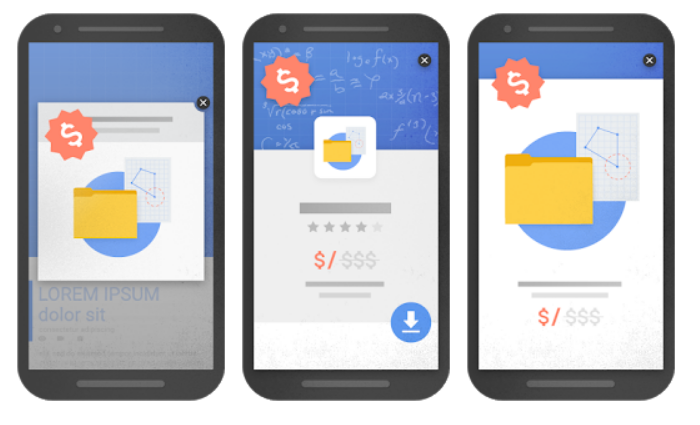
We’re not going to wade into the pop-up debate too much, but if you use pop-ups on your website, you should be aware that they can impact your mobile SEO.
Originally, webmasters may have suggested you disable pop-ups complete for mobile viewers. More recently, Google has announced that some types of pop-ups won’t hurt your rankings, but others do.
Mainly, Google wants website owners to do away with what it deems “intrusive” pop-ups. These are usually pop-ups that take up the entire screen on a mobile device or otherwise make it difficult to access content on a smartphone.
According to the Google Webmaster Central Blog, techniques that make content less accessible include the following:
Showing a pop-up that covers the main content immediately after the user accesses the page or while they’re browsing.
Displaying a standalone pop-up that must be dismissed before the user accesses the main content.
Using a layout where the main content has been inclined beneath the fold and the above-the-fold content appears similar to the standalone pop-up.
Generally, if your pop-ups look like this on mobile, Google will penalize you for it:
Google does ignore some pop-ups that fit these descriptions if they are necessary. For example, some websites are legally obligated to inform users that they use cookies or verify the user’s age before they can access the site. Small banners that are easy to dismiss are generally okay, too.
So, if you’re going to have non-essential pop-ups on your website experience, make sure they are small, non-intrusive, and easy to recognize and dismiss for a nice mobile SEO experience, like this banner on the top of the webpage below:

Developers used to block certain resources from mobile users — and, by extension, from Google’s crawlers. For example, they might block some written content to keep the page shorter or block some JavaScript from loading. This would make the website load faster and be easier to use on a smartphone.
This wasn’t a bad instinct because it did make the mobile experience better. Who wants to wait for JavaScript to load when all you want to do is read an article?
The problem with this approach these days is something we’ve already mentioned: Google’s mobile-first indexing technique. Whatever resources and content don’t appear on your mobile site won’t be crawled by Google. As far as the search engine is concerned, those assets probably don’t even exist for mobile SEO.
As we mentioned above, there are other ways to make your website load faster. Ensure you aren’t blocking any resources, such as JavaScript, CSS, images, and video for mobile users. Let Google crawl everything and let users see everything on your website.
If you can’t build a strong mobile experience with what you have, it may be time to take a second look at your design. If you absolutely need to block content or resources on your site, make sure they aren’t critical to your users.
The term “accessibility” doesn’t just refer to how quickly your website loads or how easy it is to navigate. According to the World Wide Web Consortium (W3C), putting accessibility into practice “is essential for developers and organizations that want to create high-quality websites and web tools, and not exclude people from using their products and services.”
If the Internet is for everyone, that means it needs to be accessible to people with disabilities too. Accessibility isn’t just an important ethical decision, it’s also an important business practice. Google will penalize websites that aren’t accessible.
Luckily, many of the aspects of mobile SEO overlap with accessibility. For example, all the following are elements of good mobile SEO, but they also exist to enhance your site’s accessibility:
Image alt attributes work with screen-reading technology to describe images to users who are visually impaired. Video transcriptions make videos more accessible to people who are hard of hearing. On-site sitemaps and easy navigation tools make it easier for people who use voice commands to browse your website.
Start by looking at the way your pages appear on mobile. Are you using negative space to make it easy to identify content? Is your typeface large enough to read on the screen?
You should also pay attention to your image alt attributes and captions. If someone with a screen reader hears the alt attribute attached to one of your images, will they understand what is being depicted, or will they hear something like “image underscore seven three two one dot jpeg?”
Keep in mind that you’ll need to optimize your website for all sorts of devices, whether they are a phone, a tablet, or an AI assistant device.
There are also other areas of accessibility that you won’t be able to cover just by optimizing your website for mobile. To ensure your website is accessible, follow the Web Content Accessibility Guidelines (WCAG).
Finally, you should follow general Mobile SEO guidelines to ensure your website is optimized for mobile. That means installing Google Search Console, generating and submitting a sitemap, using keywords, and adding structured data so it’s easy for Google to crawl your pages, among other strategies.
Check out some of our great mobile SEO and general SEO resources to learn more about on-page and off-page SEO:
If you can follow these steps, you’ll be well on your way to creating a mobile-optimized website that will look fantastic on any smartphone. Plus, Google will love you that much more.
For more information about Mobile SEO and mobile site optimization, reach out to our Mobile SEO experts at Bliss Drive.
Enjoyed this article? 👉 Read more: Breadcrumbs & SEO: What They Are & Why They Matter

