When exploring what makes a site structure user-friendly, consider how intuitive navigation and clear hierarchical organization play an essential role in guiding you effortlessly through content. Consistent page layouts and logical content flow further enhance your experience, minimizing cognitive load and helping you find information quickly. Mobile responsiveness guarantees seamless access across all devices. But what other elements contribute to a truly satisfying user journey?

When you're designing a website, ensuring intuitive navigation is essential for enhancing user experience. You want visitors to find what they're looking for without frustration.
Start by keeping your navigation bar simple and consistent across all pages. Use familiar terms in your menu to avoid confusion. Group related items logically so users can predict where to find specific content.
Consider the "three-click rule," which suggests users should reach their desired page within three clicks. This isn't a strict rule, but a helpful guideline to keep navigation efficient.
Also, incorporate a search bar for quicker access to information. Test your navigation design with real users to gather feedback.
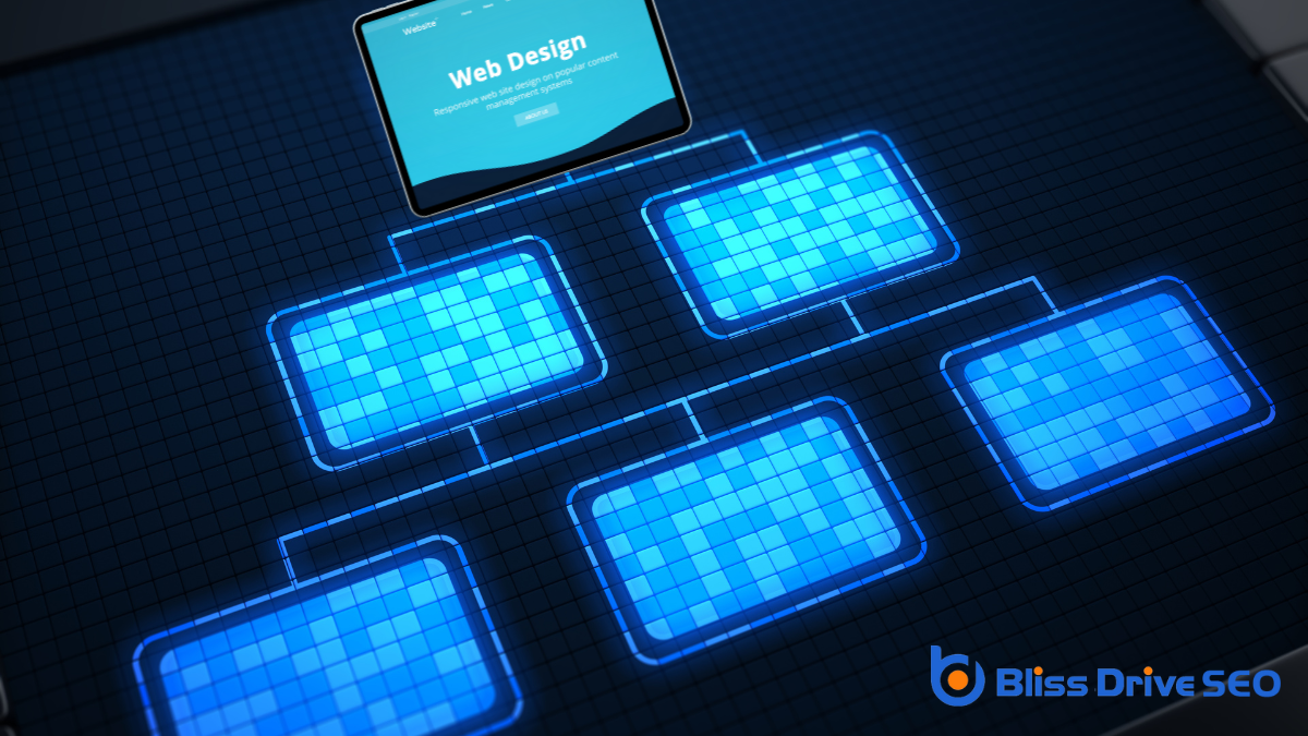
A clear hierarchical organization is essential for a well-structured website, as it helps users easily locate information. When you organize content logically, visitors quickly understand your site's structure.
Start by categorizing information into main topics and subtopics. This way, users can follow a natural flow, moving from general categories to specific details without confusion.
Use headings and subheadings to guide users through your content. A well-defined hierarchy helps them know where they're at any point.
Confirm your menu reflects this organization, making it intuitive to explore. Remember, simplicity is key—too many categories can overwhelm.
To enhance user experience, guarantee your website maintains consistent page layouts across all sections. This consistency helps users feel familiar and confident as they navigate your site. When every page looks and functions similarly, visitors know what to expect, reducing confusion and frustration.
Use the same header, footer, and navigation menus everywhere. This keeps the experience seamless and intuitive.
Ensure that design elements like fonts, colors, and button styles remain uniform. Consistent layouts also improve accessibility, making it easier for users with disabilities to navigate.
When you keep everything aligned and predictable, users can focus on the content rather than figuring out how to use the site. Remember, a consistent design creates a cohesive and professional impression, boosting user satisfaction.
To guarantee a logical content flow on your website, focus on creating an intuitive navigation design that guides users effortlessly.
Maintain a consistent visual hierarchy so visitors can easily discern the importance of each section.
Simplify information access by organizing content clearly, making it straightforward for users to find what they need.
Ever wondered why some websites feel like a breeze to navigate? It's all about intuitive navigation design. When you visit a site, you should immediately know where to go and how to find what you're looking for. This design involves organizing content logically, so you don't have to think twice about your next click.
Clear labels, familiar icons, and straightforward menus guide you effortlessly, reducing the time spent searching.
Intuitive navigation respects users' expectations. If you're familiar with the layout, you'll feel more comfortable and engaged. Websites achieve this by prioritizing essential information and minimizing clutter, allowing you to focus on what matters.
It's not just about aesthetics; it's about creating a seamless experience that anticipates your needs and meets them efficiently.
A well-maintained site structure thrives on a consistent visual hierarchy. By organizing content logically, you make it easier for users to follow the flow and understand the information presented.
Start with clear headings and subheadings. This approach guides your visitors, helping them quickly grasp the main ideas and details without feeling overwhelmed. Use font sizes, colors, and styles to distinguish different sections. Consistency in these elements boosts familiarity and reduces cognitive load.
Ascertain that your content flows naturally from one point to the next. Avoid abrupt jumps or unrelated ideas that could confuse readers. By keeping your visual hierarchy consistent, you enhance user experience, making it straightforward for visitors to find what they need effortlessly.
Building on the foundation of a consistent visual hierarchy, providing simplified information access is key to enhancing user experience. You want visitors to find what they need without frustration.
To achieve this, guarantee your content follows a logical flow. Start with broad categories, then drill down into more specific details. Keep navigation intuitive; use clear labels and consistent naming conventions. This approach reduces cognitive load, helping users process information easily.
Avoid clutter by prioritizing content that matters most to your audience. Use bullet points and concise paragraphs to break down complex ideas.
Implement search functionality so users can locate information quickly. By doing so, you're not just organizing content; you're guiding users on a seamless journey through your site.
While designing a user-friendly website, ensuring mobile responsiveness is essential. Your users are often on the go, accessing websites from various devices. A responsive design adapts seamlessly to different screen sizes, enhancing usability and ensuring content looks great everywhere.
You want your visitors to enjoy a smooth experience, whether they're using a smartphone, tablet, or desktop. Consider employing flexible grids, images, and CSS media queries to create a responsive layout.
Prioritize touch-friendly navigation, as mobile users rely on taps and swipes. Test your site on multiple devices to verify responsiveness firsthand. By doing so, you'll enhance user satisfaction and engagement.

As you focus on creating a mobile-responsive design, don't overlook the importance of fast loading times.
Quick page loads are essential for keeping visitors engaged and reducing bounce rates. A slow site can frustrate users and drive them away.
To make certain your site loads swiftly, consider these four steps:
Guarantee accessibility by using alt text for images, providing keyboard navigation, and implementing screen reader compatibility. Test your site with accessibility tools and gather feedback from disabled users to make necessary improvements. Always prioritize inclusivity.
Color contrast is essential for readability and accessibility. It guarantees text and important elements stand out, helping users with visual impairments. Choose contrasting colors to make your site more inclusive and easier to navigate for everyone.
You should actively gather user feedback through surveys or usability tests. Analyze the data to identify common issues. Prioritize these insights and implement changes. Keep users informed about updates so they feel valued and engaged.
To optimize images for SEO, you should compress files without losing quality, use descriptive filenames, and include alt text. Make certain images are mobile-friendly and choose appropriate formats like JPEG or WebP for faster loading times.
You should conduct usability testing regularly, ideally every few months or whenever you make significant updates. This helps guarantee your website meets user needs and remains intuitive, enhancing both user experience and overall functionality.
To create a user-friendly site structure, focus on intuitive navigation and clear hierarchical organization. Consistent page layouts help users feel at home, while logical content flow reduces mental effort. Don't forget mobile responsiveness, ensuring a seamless experience on any device. Fast loading times are essential, too, as they keep users engaged and satisfied. By implementing these elements, you'll make it easy for users to find information and enjoy their time on your site.
When you think about web design, you might wonder how all the parts come together to form a seamless user experience. It's more than just picking colors and fonts—it's about structuring content with HTML, styling with CSS, and adding interactivity through JavaScript. But what really makes a design effective? How do these elements influence user engagement and satisfaction? By understanding the underlying principles of usability and accessibility, you'll start to see how each decision impacts the final product. Curious about how responsive design fits into this puzzle? Let's uncover the secrets behind successful web design.
When you plunge into the world of web design, understanding the basics is key to creating an effective and engaging online presence. You need to grasp the importance of HTML, CSS, and JavaScript as they form the backbone of web design. HTML structures your content, CSS styles it, and JavaScript brings it to life with interactivity.
Recognizing how these technologies work together is essential in shaping a website that's not only visually appealing but also functional.
As you venture further, pay attention to usability and accessibility. A well-designed website should be easy to navigate for all users, including those with disabilities. This means using clear language and intuitive structures and ensuring compatibility with screen readers.
Accessibility isn't just a legal requirement; it's about making your site welcoming to everyone.
Don't forget the importance of responsive design. With the variety of devices people use today, your website should look great and function well on any screen size. This involves using flexible grids and layouts, ensuring images scale properly, and optimizing for mobile.

When designing a website layout, focus on visual hierarchy to guide your visitors' eyes to the most important elements first.
Consistent navigation design guarantees users can find what they're looking for without frustration.
A significant aspect of effective web design is understanding the importance of visual hierarchy in a website's layout.
Visual hierarchy guides your visitors' eyes and attention to the most important elements first, making the site easy to navigate and understand. It involves arranging and organizing elements strategically so users can process information in a logical order.
Here's how you can apply visual hierarchy:
Effective web design always includes consistent navigation, which is essential for enhancing user experience and guaranteeing visitors can find the information they need quickly. When you maintain a uniform navigation structure across your site, users can easily locate what they're looking for without frustration. This consistency helps build familiarity, making each visit feel intuitive and straightforward.
Start by organizing your main menu logically. Group related items together and use clear, concise labels. Visitors shouldn't have to guess where a link might lead. Stick to common terminology for universal understanding. For instance, use "Contact" instead of something vague like "Reach Out."
Ascertain your navigation is visible and accessible from every page. A sticky menu that stays at the top as users scroll can be beneficial, especially for extensive sites. This way, no matter where they're on your website, the main paths are always within reach.
Finally, test your navigation across different devices. With increasing mobile usage, your design should adapt seamlessly to smaller screens. Responsive navigation guarantees all users, regardless of device, can enjoy a superior browsing experience.
When you choose the right colors and typography for your website, you greatly enhance the user experience by making it more engaging and intuitive.
These elements are essential in establishing your brand identity, helping visitors instantly recognize and connect with your brand.
Additionally, they play an important role in enhancing readability and accessibility, ensuring that your content is clear and accessible to all users.
Color and typography greatly influence user experience, often shaping first impressions and guiding user interactions. When you land on a website, the colors you see immediately send signals to your brain, affecting your mood and perception. Typography, on the other hand, guarantees that the information isn't only readable but also conveys the right tone.
Here's how they impact user experience:
Imagine landing on a website where the colors and typography instantly remind you of a brand you love. This isn't by chance. It's a deliberate design choice to establish a strong brand identity.
Colors and typography aren't just decorative. They communicate a brand's personality and values. For instance, vibrant colors can convey energy and excitement, while muted tones suggest sophistication and calmness.
Think about the brands you recognize instantly. Their color schemes and font choices likely play a big role in that quick recognition. When you use consistent colors and typography, you create a visual language that speaks to your audience. It builds trust and familiarity, which are essential for brand loyalty.
Choosing the right colors involves understanding color psychology and how different hues affect emotions and perceptions. The right typography, on the other hand, reflects the tone of your brand. A playful brand might use whimsical fonts, while a more formal one opts for clean, classic typefaces.
Establishing a strong brand identity through colors and typography sets the stage for improved readability and accessibility. When you choose the right colors, you guide your users effortlessly through your content. Complementary colors create visual harmony and help highlight important information.
Typography plays an equally essential role. The right font size and style make your text easy to read, guaranteeing your message is heard loud and clear.
Consider these tips to enhance readability and accessibility:
Crafting a user-friendly interface is vital for creating an engaging and intuitive experience for your audience. You want your website to be easy to navigate so users can find what they need without frustration.
Start by organizing content logically, using clear headings and subheadings. This helps users quickly identify the information they're looking for.
Focus on simplicity by minimizing the number of clicks needed to reach important pages. Use consistent design elements, like buttons and icons, to guide users intuitively. Make certain these elements are easily identifiable and function as expected.
Clear, legible typography also plays a vital role. Choose fonts that are easy to read, with appropriate size and spacing.
Color contrast is important, too. Confirm there's enough contrast between text and background colors to enhance readability. Avoid overwhelming users with too many colors or flashy animations that could distract from the main content.
Finally, test your interface with real users. Gather feedback to identify areas for improvement. Watching someone interact with your design might reveal usability issues you hadn't noticed.

An essential aspect of modern web design is making certain your site is responsive and mobile-friendly. With the growing number of users accessing websites via mobile devices, it's imperative to provide a seamless experience across various screen sizes.
Responsive design means your website adjusts its layout and content based on the device's screen size, guaranteeing readability and usability.
To achieve this, consider these key elements:
When diving into web design, having the right tools and resources can markedly streamline your workflow and enhance creativity. Start with design software like Adobe XD or Sketch. These programs let you create wireframes and prototypes efficiently, offering features that simplify complex design tasks.
If collaboration is key, Figma allows multiple people to work on the same design in real time, fostering teamwork and feedback.
For coding, consider using a code editor such as Visual Studio Code. It supports various languages and offers extensions to customize your workspace, making coding less intimidating. Dreamweaver is another option if you want to blend design with coding seamlessly.
Utilize online resources like Google Fonts and Unsplash to access free typography and high-quality images. These can elevate your design without breaking the bank. Websites like Awwwards provide inspiration by showcasing award-winning web designs, sparking new ideas.
Lastly, don't overlook the power of community forums and tutorials on platforms like YouTube or Medium. They offer solutions to common challenges and keep you updated on the latest trends.
With these tools and resources, you'll be well-equipped to tackle any web design project.
In web design, it's all about blending HTML, CSS, and JavaScript to create engaging and functional websites. You should focus on usability, accessibility, and visual hierarchy to enhance user experience. Don't forget the power of color and typography in shaping your site's personality. Make sure your design is responsive, adapting smoothly to any device for maximum reach. With the right tools and resources, you can craft a user-friendly interface that captivates and serves your audience effectively.
When considering if web design is good for freelancing, you should weigh the flexibility it offers against the responsibilities it demands. You can choose your projects and set your own rates, which sounds appealing. However, you'll also need to manage client expectations and handle the unpredictability of income. Your skills in communication and time management will be just as essential as your design expertise. As you ponder this freelancing path, think about whether the potential rewards outweigh the challenges. What strategies can you use to navigate the complexities of balancing creative freedom with business acumen?
Mastering essential skills is important for success in web design freelancing. As a freelancer, you need more than just creativity; you must understand the technical aspects that bring your designs to life.
Start by honing your proficiency in essential web design tools like Adobe Creative Suite or Sketch. You'll also need to have a solid grasp of HTML, CSS, and JavaScript, as they're the building blocks of any website.
Communication is another significant skill. You've got to clearly convey your ideas to clients and understand their needs. This means active listening and asking the right questions.
Remember, successful projects often hinge on effective communication.
Problem-solving is key as well. You'll encounter challenges and need to think on your feet to find solutions. A proactive approach will set you apart and keep your projects on track.
Lastly, time management is fundamental. Juggling multiple clients or projects requires prioritizing tasks and meeting deadlines.
Use tools like calendars and task management apps to stay organized and efficient.

With your skills honed and ready, let's explore the income potential and opportunities in web design freelancing. As a freelancer, you have the ability to set your own rates. This flexibility means you can align your pricing with your expertise and the complexity of each project.
In web design, rates can vary widely, ranging from $30 to $150 per hour or more, depending on your experience, portfolio, and the demand for your services.
Opportunities are abundant. Start by targeting small businesses and startups that need a professional online presence but mightn't have the budget for a large agency. These clients often value the personalized service a freelancer like you can provide.
You can also expand your reach by exploring niche markets, such as e-commerce sites or non-profit organizations, where specialized design skills can set you apart.
Additionally, consider diversifying your income streams. Offer related services like website maintenance, SEO optimization, or graphic design to attract more clients.
By networking and building a strong online presence through platforms like LinkedIn or Behance, you increase your visibility and potential client base.
Steering client expectations is essential in web design freelancing. You need to guarantee clients understand what's feasible and what's not. It's important to communicate this early on. During initial discussions, clearly outline what you can deliver within their budget and timeframe. By doing this, you prevent misunderstandings and build trust.
Use simple language and visuals to explain design concepts. Clients mightn't be familiar with technical jargon, so break it down into easy-to-understand terms. If a client asks for features that aren't achievable, explain why they mightn't work and suggest alternatives that can fulfill their needs.
Regular updates are key to keeping clients informed. Schedule check-ins to discuss progress and any potential changes. This keeps them involved and reassures them that their project is on track. Always be honest about delays or challenges and offer solutions to mitigate them.
Lastly, set boundaries. While it's tempting to say "yes" to every request, doing so can lead to scope creep. Clearly define the project's limits and stick to them. This approach not only manages expectations but also guarantees you maintain control over your workload.
Handling workload challenges effectively is essential for a successful freelancing career in web design. As a freelancer, you'll juggle multiple projects, deadlines, and client communications. It's important to manage these elements efficiently to avoid burnout and guarantee client satisfaction.
Here are some practical strategies to help you stay on top of your workload:
Why consider freelancing in web design? It offers flexibility and independence. You can choose projects that align with your interests and schedule your work around personal commitments. This autonomy allows you to balance your professional and personal life effectively.
Furthermore, freelancing lets you work from anywhere, eliminating commuting stress and giving you a global client base.
However, freelancing isn't without challenges. One major downside is income instability. Unlike a salaried job, your earnings can fluctuate depending on the number of projects you secure. This uncertainty requires careful budgeting and planning.
Additionally, you must handle all aspects of the business, from client acquisition to invoicing, which can be time-consuming and demanding.
There's also the potential for isolation. Without colleagues around, you might miss the camaraderie of a traditional office. Networking becomes vital to combat this and stay updated with industry trends.
Plus, work-life balance can be tricky. It's easy to overwork when home is also your office, so setting boundaries is essential.
In web design freelancing, you're stepping into a rewarding and flexible career. Master essential skills, manage your time well, and communicate effectively to thrive. You'll enjoy setting your rates and choosing projects, which boosts your independence. While balancing client expectations and workloads can be challenging, the income potential and diverse opportunities make it worthwhile. Embrace the pros and prepare for the cons, and you'll find web design freelancing a fulfilling path.
When you're tackling a web design project, understanding the five essential steps can make all the difference in achieving a seamless user experience. You start with Planning, where defining your goals and understanding your audience sets the stage for success. Then, the Design phase lets you craft visually appealing layouts and choose the right colors and fonts. Development follows, translating your design into a functional website. Testing guarantees everything works perfectly across devices. Finally, Launching the site involves more than just going live; there's SEO to take into account and ongoing maintenance. But what happens when these steps don't go as planned?
Planning is the cornerstone of any successful web design project. It sets the foundation for everything that follows, so you need to approach it with care and attention. Start by identifying your goals. What do you want your website to achieve? Whether it's increasing sales, sharing information, or building a brand, having clear objectives will guide your entire process.
Next, understand your audience. Who'll visit your site, and what are their needs? Consider their preferences and behaviors to create a user-friendly experience. This might involve researching demographics, interests, and online habits to tailor your site accordingly.
You'll also want to define your site's scope. This involves listing the features and content you'll need. Be realistic about what you can achieve within your budget and timeline. It's essential to avoid scope creep, which can derail your project.
Additionally, gather resources like content, images, and any other materials needed. Organize these elements to guarantee a smooth changeover into the design phase.
Finally, create a sitemap to outline the structure of your site. This visual guide will help you and your team maintain clarity and focus as you move forward.
Design is often the most visually engaging phase of the web design process, where ideas begin to take shape. At this stage, you'll translate your plan into a visual representation. Start by choosing a layout that aligns with your goals and audience. This will serve as the skeleton of your site, determining how users will navigate and interact with your content.
Next, focus on typography. Select fonts that enhance readability and reflect your brand's personality. Remember, consistency is key. Stick to a few font styles to maintain a unified look.
Then, consider color schemes. Colors evoke emotions and can influence user behavior, so choose wisely. Make certain your palette enhances the user experience and adheres to your brand's identity.
Images and graphics play an essential role, too. Opt for visuals that are high-quality and relevant to your content. They should support your message, not distract from it.
Finally, make sure that your design is responsive. Users will access your site from various devices, so make certain it adapts to different screen sizes seamlessly. This attention to detail will create a more engaging and accessible experience for your users.
With the design in place, it's time to plunge into the development phase, where your vision becomes a functional reality. This stage involves translating your static designs into a dynamic website. You'll start by setting up the environment and choosing the right tools and technologies like HTML, CSS, and JavaScript. These form the backbone of your site, dictating its structure, style, and interactivity.
Next, you'll focus on building the front-end and back-end systems. The front end is what users see and interact with directly. It requires meticulous attention to detail to guarantee everything aligns with the design blueprint.
The back-end, on the other hand, manages data and guarantees smooth communication between the server and the user's browser. You'll need to implement databases and server-side scripts here.
Integrating content management systems (CMS) is another critical task. A CMS allows you to update content efficiently without diving into code each time.
As you develop, keep user experience in mind, guaranteeing the site is responsive and accessible across different devices and browsers. This phase is where coding prowess meets creativity, transforming your design into a seamless, interactive digital experience.
As development wraps up, it's crucial to guarantee everything functions flawlessly before launching the website. Testing guarantees that the user experience is smooth and all features work as intended. By thoroughly testing, you'll identify any bugs or issues that need fixing, guaranteeing your site runs smoothly for every visitor.
Start by checking the website's functionality. Test every feature, button, and link to make sure they perform correctly. Simulate different user scenarios to uncover potential issues. You'll want to guarantee the website is both bug-free and intuitive.
Next, focus on compatibility. Websites should display and function seamlessly across various browsers and devices.
Test on:
Don't underestimate the power of user feedback. Invite a small group to interact with your site, providing insights into usability and potential improvements.
Testing is the final step to confirm your website is polished and ready to engage users effectively.
After thorough testing and refinement, it's time to launch your website and share it with the world. This is an exciting step, but it requires careful execution to guarantee everything goes smoothly.
First, double-check that your domain name is correctly registered and linked to your hosting service. Make sure all the files are uploaded to your server, and verify that your website displays correctly on multiple devices and browsers.
Next, update your website's SEO settings. Confirm that your meta tags, descriptions, and keywords are optimized for search engines, which helps users find your site more easily. Consider submitting your website's sitemap to search engines like Google to enhance its visibility.
Before you officially go live, notify your audience about the launch date through social media or newsletters. This builds anticipation and excitement.
Once live, monitor your site closely for any issues. Track analytics to see how users interact with your content and make adjustments as needed.
Lastly, remember that launching your website isn't the end but the beginning. Stay committed to maintaining and updating your site regularly, guaranteeing it remains relevant and valuable to your audience.
By following these five key steps, you'll create a successful website that meets your goals and connects with your audience. Start by planning effectively to identify your objectives and understand your target users. Design an engaging layout with the right colors and typography. Develop your site using reliable coding practices and content management systems. Test thoroughly to guarantee everything works seamlessly across devices. Finally, launch confidently with proper domain registration, SEO optimization, and a plan for ongoing maintenance.
Creating a personal website might seem intimidating at first, but it's more straightforward than you think. Start by selecting the right platform that matches your technical skills and website goals. Whether you choose WordPress for its flexibility or Squarespace for its user-friendly design, each offers unique advantages. Then, you'll need a domain name that captures the essence of your brand. But how do you guarantee your website stands out and functions smoothly? Let's explore the essential steps, from hosting and design to launching, that will set you on the right path to a successful online presence.
When starting your journey to create a personal website, the platform's choice plays an essential role in shaping your online presence. You've got a myriad of options, each offering distinct features that cater to different needs. To make the right choice, first consider what you want your website to achieve. Are you showcasing a portfolio, starting a blog, or simply creating a digital space to share your thoughts? Answering this will guide you towards a platform that aligns with your goals.
Once you've defined your purpose, evaluate the ease of use each platform offers. You don't want to get stuck with something overly complex, especially if you're not tech-savvy. Platforms like WordPress, Squarespace, and Wix are popular for their user-friendly interfaces and customizable templates, allowing you to create visually appealing sites without needing to code.
Also, consider the level of support and community each platform provides. Access to tutorials, forums, and live support can be invaluable when you encounter challenges.
Finally, think about scalability. As your website grows, you'll want a platform that can accommodate increased traffic and functionality without requiring a complete overhaul. Making an informed choice will guarantee a smoother, more satisfying web-building experience.

Choosing the perfect domain name is an essential step in establishing your online identity. Your domain name is the first impression visitors have of your site, so it needs to be memorable and relevant. Think of it as your website's street address, guiding people right to your content.
Start by considering your purpose and audience. A domain name should reflect what you're offering or who you are. Keep it short and simple because complex names can be hard to remember or type.
Here are some tips to help you select a domain name:
Finally, verify the domain name aligns with your long-term goals. It's worth taking the time now to choose wisely, as changing it later can be a hassle.
Once you've settled on the right name, you'll be one step closer to launching your personal website.
Once you've chosen your domain name, the next essential step is setting up web hosting. Think of web hosting as the home for your website files, allowing people to access it online.
First, research different hosting providers like Bluehost, SiteGround, or HostGator, which are known for their reliability and customer support. Compare their features, such as storage space, bandwidth, and uptime guarantees, to find one that suits your needs.
After selecting a host, sign up for a hosting plan. Typically, beginner plans are affordable and offer everything you need to start. You'll need to provide some basic information and payment details. Once that's done, you'll receive login credentials for your hosting account.
Next, connect your domain name to your hosting account. This process usually involves updating the domain's nameservers with the details provided by your host. Don't worry—your hosting provider should have clear instructions or customer support to guide you.
Now, your website has a digital space to live. Remember, once the hosting setup is complete, you can start adding content and making your website uniquely yours. You're one step closer to having your personal website up and running!
Designing your website is an exciting step where creativity meets functionality. Here, you can express your personal style while guaranteeing a user-friendly experience. Start by choosing a website builder or a content management system (CMS) that suits your needs. Platforms like WordPress, Wix, or Squarespace offer various templates and tools to kickstart your design process.
Next, focus on layout and navigation. A clear, intuitive layout helps visitors find information easily. Keep your design simple and clean to avoid overwhelming your audience. Consistency in fonts, colors, and spacing is key to maintaining a professional appearance.
Consider these essential elements when designing your site:
With your website design in place, it's time to bring your creation to the digital world. First, you'll need to choose a reliable web hosting provider. This service stores your website's files and makes them accessible online. Consider factors like uptime reliability, customer support, and pricing when making your choice.
Once you've picked a host, follow their guide to upload your website files. Most providers offer easy-to-use tools or one-click installations for popular platforms like WordPress.
After launching, focus on maintaining your site to guarantee it remains functional and engaging. Regular updates are vital. Keep your content fresh and relevant by adding new blog posts, articles, or portfolio pieces. This not only attracts visitors but also improves your search engine ranking.
Additionally, update plugins and themes to secure your site against vulnerabilities. Monitor site performance with tools like Google Analytics. It helps you understand visitor behavior, which can guide improvements.
Don't forget backups—regularly schedule them to prevent data loss. Finally, engage with your audience through comments or emails, fostering a community around your site. By staying proactive, your personal website will thrive in the ever-evolving digital landscape.
Creating your personal website is an exciting journey that starts with choosing the right platform and selecting a domain name that truly represents you. Set up reliable web hosting to guarantee your site runs smoothly. Design it with a user-friendly layout that's both responsive and visually appealing. Once you've launched your site, don't forget to update your content regularly and monitor performance. By doing so, you'll keep your visitors engaged and make your online presence shine.
When you think about the best practices for web design, consider how user-centric principles can transform a website's effectiveness. You need to focus on intuitive navigation and mobile responsiveness, ensuring users find what they need effortlessly on any device. Fast load times are essential; nobody likes a slow site. Consistent branding ties everything together, but how do you achieve that with color and visuals? And what role does engaging content play in keeping your audience hooked? These elements form the backbone of a successful website, but what specific strategies can elevate them beyond the basics?
In today's digital landscape, placing the user at the center of your web design strategy isn't just beneficial—it's essential. By focusing on user-centric design, you guarantee that every element of your website serves a purpose and enhances the user experience.
Start by understanding your audience's needs, preferences, and behaviors. Conduct user research through surveys, interviews, or usability testing to gather valuable insights. This helps you create a website that resonates with your users and addresses their pain points.
Next, design with simplicity and clarity in mind. Avoid clutter and prioritize intuitive navigation so users can find what they need without frustration. Use consistent layouts, colors, and typography to create a harmonious experience. Confirm your content is clear and concise, offering value without overwhelming visitors.
Remember, users crave efficiency, so make interactions as seamless as possible.
Finally, don't forget to test your website regularly. Gather feedback and analyze user behavior to identify areas for improvement. By iterating on your design based on real user data, you can continually refine the experience.
Prioritizing user-centric design not only boosts satisfaction but also fosters trust and loyalty, driving long-term success for your website.

A website's mobile responsiveness is essential in today's digital world, where users access the internet from a variety of devices. You need to make certain that your website adapts seamlessly to different screen sizes, from smartphones to tablets. Mobile responsiveness isn't just about fitting content onto smaller screens; it's about creating an ideal user experience regardless of the device.
Start by using flexible grids and layouts. This approach allows your content to resize and rearrange itself to fit any screen.
Also, don't forget to enhance images and media. Large files slow down load times, which can frustrate users and lead them to abandon your site. You can use responsive images that adjust the resolution based on the device.
Consider touch-friendly elements. Buttons and links should be easy to tap with a finger, avoiding too-small targets that can cause user errors. Make certain text is readable without zooming—use scalable fonts that adjust in size on smaller screens.
Lastly, test your website across various devices and browsers. Use tools like Google's Mobile-Friendly Test to identify issues and make necessary adjustments.
Smooth navigation serves as the backbone of an effective website, guiding users effortlessly to the information they seek. When designing your website, make certain visitors can easily find what they're looking for without any frustration.
Prioritize simplicity in your design. A cluttered navigation bar can overwhelm users, so focus on including only the most essential links.
Consider the structure of your site. Organize pages logically and group related content together. This way, users can predict where to find information. Use clear, descriptive labels for your menu items. They should communicate what each link leads to without ambiguity.
Don't underestimate the power of a well-placed search bar. It allows users to quickly locate specific information, enhancing their overall experience.
Visual cues also play a vital role in intuitive navigation. Make use of consistent icons and colors to help guide users through your site. Highlight important buttons or links to draw attention to them.
Ascertain all navigation elements are optimized for all devices, from desktops to smartphones, so users have a seamless experience regardless of how they access your site.
Boosting your website's performance with fast load times isn't just a luxury—it's a necessity. Users today expect websites to load in a blink. If your site takes longer than a few seconds, visitors might leave before they even see what you've got to offer. This isn't just about keeping users happy; it's also about search engine optimization. Search engines favor sites that load quickly, which can enhance your site's visibility.
To guarantee your website loads fast, start by optimizing images. Large image files can slow down your site, so compress them without losing quality. Also, consider lazy loading, which means images load only when they appear on the screen.
Another tip is to minimize HTTP requests. Every element on your page, like scripts and stylesheets, means another request, so combine files where possible.
Don't forget about browser caching. By allowing browsers to store certain files locally, returning visitors will experience faster load times.
Finally, consider using a Content Delivery Network (CDN). CDNs distribute your site's content across multiple servers worldwide, reducing the distance data travels to reach users.

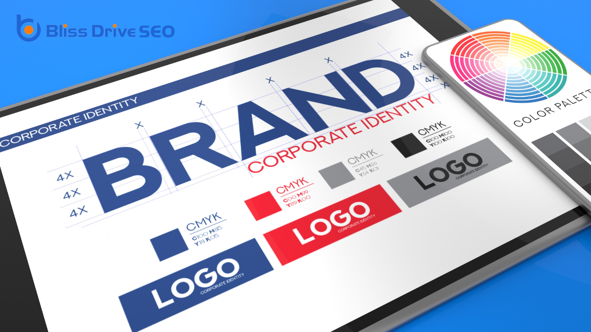
Consistency is the backbone of effective branding. When you maintain a uniform look and feel across your website, it reinforces your brand's identity and helps build trust with your audience.
Imagine visiting a website where every page looks different. It's confusing, right? You want your visitors to instantly recognize they're still on your site, no matter where they navigate. Consistent use of colors, fonts, logos, and messaging achieves this recognition.
Start with your logo. It should be prominently displayed and linked back to your homepage. Use a consistent color scheme that aligns with your brand identity. Choose fonts that are easy to read and use them consistently.
Don't forget about tone; your content's voice should reflect your brand's personality across all pages.
Creating a style guide can be incredibly helpful. It acts as a reference, ensuring every design element aligns with your brand's principles. This guide should include color codes, typography, logo usage, and writing style.
In today's digital landscape, verifying your website meets accessibility standards is essential. Not only does it broaden your audience, but it also demonstrates a commitment to inclusivity.
Start by incorporating semantic HTML. Use proper tags for headings, lists, and sections so screen readers can interpret your content correctly. It's critical for users who rely on assistive technologies.
Next, confirm all images have descriptive alt text. This provides context to users who can't view the images directly. Remember, the alt text should convey the function and content of the image, not just a simple description.
Keyboard navigation is another significant aspect. Some users can't use a mouse, so verify your website can be fully navigated using a keyboard. Test tab orders and confirm all interactive elements are accessible.
Don't forget about captions and transcripts for multimedia content. Videos should have captions for those who are deaf or hard of hearing, and transcripts should be available for audio content.
Regularly test your website with accessibility evaluation tools. These can identify issues you might've overlooked.
Staying updated on accessibility guidelines, like the Web Content Accessibility Guidelines (WCAG), verifies your site remains compliant and accessible to everyone.
A strategic use of color enhances both the aesthetics and functionality of your website. It's not just about picking colors you like; it's about choosing hues that align with your brand and create a cohesive look.
Start by selecting a primary color that represents your brand's identity. This will be your main hue, setting the tone for your site's overall feel.
Next, consider using complementary colors to highlight important elements like call-to-action buttons or navigation menus. These colors should contrast well with your primary shade, making them stand out without clashing.
Remember, less is often more; stick to a limited color palette to avoid overwhelming visitors.
Also, be mindful of color psychology. Different colors evoke different emotions and reactions. For instance, blue can convey trust and professionalism, while red might grab attention and create a sense of urgency.
Think about what emotions you want your visitors to feel and choose colors accordingly.
Lastly, verify that your color choices support readability. Use high contrast between text and background colors to guarantee that your content is easy to read. This not only improves user experience but also encourages users to stay on your site longer.

Captivate your audience with high-quality visuals that not only enhance the appearance of your website but also communicate your brand's message effectively.
Visuals are powerful tools that can draw visitors in and keep them engaged. When you select the right images or graphics, you're not just decorating your site; you're crafting a visual narrative that speaks volumes about your values, products, or services. Quality visuals make your content more shareable and memorable.
To guarantee your visuals leave a lasting impression, keep these pointers in mind:
When optimizing your website for SEO, start by crafting a solid keyword integration strategy to boost visibility.
Don't overlook the importance of meta tags, as they play a vital role in how search engines interpret your content.
Make certain your design is mobile-friendly to cater to the growing number of users browsing on their devices.
In today's digital landscape, integrating keywords effectively into your web design is essential for boosting SEO performance. When done right, keywords can greatly improve your site's visibility and draw in more organic traffic.
Start by researching relevant keywords that align with your content and audience. Tools like Google Keyword Planner or SEMrush can help identify terms your target audience frequently searches for. Once you've gathered your keywords, it's vital to distribute them naturally throughout your website.
Consider these tips for seamless keyword integration:
Meta tags play an essential role in how search engines perceive and rank your website. They're snippets of text that describe a page's content, and they don't appear on the page itself but only in the page's code. When you optimize meta tags effectively, you give search engines critical information that helps them understand what your website offers, potentially improving your site's visibility in search results.
Start with the title tag, the most important meta tag. It should be concise yet descriptive, including relevant keywords that align with the page's content. Remember, it's the first impression users get from search results, so make it compelling.
Next, focus on the meta description. While it doesn't directly impact rankings, a well-crafted description can increase click-through rates by enticing users to visit your site.
Don't ignore meta keywords, even though they're not as influential as they once were. They can still provide context to search engines.
Regularly review and update your meta tags to reflect any changes in content or SEO strategy. By prioritizing meta tags, you're setting a solid foundation for your website's success in search engine optimization.
A mobile-friendly design is essential for successful SEO optimization in today's digital landscape. With more users accessing websites via smartphones and tablets, search engines prioritize mobile-friendly sites in their ranking algorithms.
To stay competitive, you must guarantee your website is optimized for mobile devices. This not only improves your site's visibility but also enhances user experience, leading to higher engagement and conversion rates.
To create a mobile-friendly design, consider these key elements:
Crafting engaging content is essential for capturing your audience's attention and keeping them on your site. You need to think about the value your content provides. Start by understanding your audience's needs and interests. Ask yourself what problems you can solve for them. When you address their concerns, they're more likely to stay engaged.
Use clear and concise language. Avoid jargon and overly complex sentences, as they can confuse your readers. Instead, write in a way that's easy to understand, with a natural flow. Break up text with headings, bullet points, and images to make content more digestible.
Incorporate storytelling to connect with your audience on an emotional level. People love stories, and they can make your content more relatable and memorable. Share real-life examples or case studies that illustrate your points.
Don't forget to encourage interaction. Ask questions or include calls to action to prompt your readers to comment or share their thoughts. This not only keeps them engaged but also helps build a community around your content.
Incorporating best practices in web design guarantees your website captivates and retains users. Focus on user-centric design by making navigation intuitive and guaranteeing mobile responsiveness. Don't overlook the importance of fast load times, as they're essential for a seamless experience. Consistent branding through effective color use and high-quality visuals strengthens your identity. Engage users with content tailored to their needs and optimize for SEO. Regular feedback and testing keep your site functional and relevant.
Creating your own website from scratch can seem intimidating, but it's more manageable when broken down into clear steps. You'll start by defining the core purpose of your site, which will guide every decision you make. Selecting a domain name that resonates with your brand is essential, followed by choosing a dependable web hosting service. Once those foundations are set, organizing your site's structure will guarantee smooth navigation. But how do you design an engaging layout that captures your audience's attention? Let's explore the intricacies of crafting a website that stands out.
Before diving into the technical aspects of building a website, it's crucial to define its purpose. You need to ask yourself what you want your website to achieve. Are you aiming to showcase your portfolio, sell products, or maybe share your thoughts through a blog? Having a clear purpose sets the foundation for every decision you make moving forward.
Think about your target audience. Who are they, and what are they looking for? Understanding your audience helps shape the content and design of your site to match their needs. For instance, if you're targeting professionals, your website should have a polished, formal look. On the other hand, a site aimed at teenagers might be more vibrant and interactive.
Next, consider your website's goals. What actions do you want visitors to take? Whether it's signing up for a newsletter, making a purchase, or simply reading your posts, defining these goals will guide the layout and functionality of your site.

Your domain name is the digital address where visitors will find your website, so choosing the right one is crucial. It's your first impression, and a memorable name can make a big difference.
Start by brainstorming words related to your website's purpose. Consider using keywords that describe what your site offers. This can boost your search engine ranking and make it easier for people to find you.
Keep it short and simple. A concise domain name is easier to remember and type. Avoid using complex words or phrases that might confuse visitors. Make certain it's easy to spell and pronounce. If possible, stick to popular extensions like .com, as they're more familiar to users.
Check for availability. Many domain names have already been taken, so you might need to get creative. Use online tools to see if your desired name is available. Consider using a thesaurus to find synonyms or adding a prefix or suffix to create a unique name.
Finally, confirm your domain name is unique and doesn't infringe on existing trademarks. This avoids legal issues and guarantees your brand stands out.
Choose wisely, as this will be your website's identity.
When starting on the journey to establish your online presence, choosing the right web hosting provider plays a pivotal role. A web host stores your website's files and makes them accessible online. This decision impacts your site's speed, reliability, and security.
Begin by evaluating your needs. Are you expecting high traffic, or is your site just starting out? Different hosts offer varied plans, so understanding your requirements helps you avoid overspending or under-preparing.
You should also consider the host's reputation. Read reviews and seek recommendations to guarantee reliability. Downtime can hurt your site's credibility, so look for a provider with a strong uptime guarantee.
Additionally, check if they offer customer support when you need it. Problems can arise anytime, and responsive support can save you headaches.
Another aspect to explore is scalability. As your website grows, your hosting needs might change. Choose a provider that offers easy upgrades without complications.
Finally, don't overlook security features. Confirm the host provides robust security measures to protect your data and your visitors.
Before you start creating your website, it's essential to define the key pages you'll need, like the homepage, about page, and contact page.
Organize your navigation flow to guarantee visitors can easily find what they're looking for.
This planning step will help you build a user-friendly and effective site.
Creating an effective website starts with defining its key pages and planning the site structure. You need to identify the essential pages that will best serve your audience and your goals. Without a clear understanding of what pages to include, your site could become cluttered and confusing.
Start by considering the purpose of your website and what information your visitors will find most valuable.
Here's a simple way to think about your key pages:
To guarantee a seamless user experience, organizing the navigation flow of your website is essential. Think of your website as a map. Users need clear routes to find what they're looking for without any confusion.
Start by listing all the key pages you've defined. Group similar pages together under logical categories. This grouping helps users make sense of your site and find information quickly.
Next, create a simple menu structure. Your main navigation menu should include the most important sections of your website. Keep it straightforward—too many items can overwhelm visitors. Use clear, descriptive labels for each menu item. For instance, instead of labeling a page "Stuff," opt for "Products" or "Services" to convey a clear message.
Don't forget about secondary navigation. These are links to less critical pages like privacy policies or terms of service. Place them in the footer or a sidebar, where they're accessible but not distracting.
Finally, test your navigation flow. Ask friends or family to explore your site and provide feedback. Their experience can shed light on areas for improvement.
A well-organized navigation flow makes your website intuitive and user-friendly.

The blueprint of your website is its layout, guiding visitors through your content effortlessly. A well-designed layout guarantees that users can easily find what they're looking for and enjoy a seamless experience.
To create an effective layout, start by considering the following key elements:
White space improves readability and can highlight important features by giving them room to breathe.
To develop your website content effectively, start by identifying your target audience so you can tailor your message to their needs.
Organize your content structure in a logical way that guides visitors through your site seamlessly.
Finally, focus on writing clear messaging that communicates your purpose and value right from the start.
Understanding your target audience is essential when developing your website content. It guides the tone, style, and type of information you present. Without a clear picture of who your audience is, your website may not effectively communicate its intended message.
Here are three steps to help you identify your target audience:
Having identified your target audience, it's time to focus on how to organize your content for clarity and impact. Start by outlining the main sections of your website. Think about the information your visitors need right away and what can be explored in-depth. Creating a logical flow is essential. For example, a home page should provide an overview, while subsequent pages dive deeper into specifics.
Utilize a simple yet effective structure. Consider a hierarchy where broader topics are broken down into subtopics. This approach helps users navigate your site with ease. Use headings and subheadings to guide them through the information.
It's also helpful to include a clear navigational menu that's consistent across all pages. Remember to prioritize your content. Highlight vital information and group related content together. This not only enhances user experience but also improves search engine optimization.
Keep your design clean and uncluttered; less is often more when it comes to web design. Finally, test your structure by having someone unfamiliar with your site navigate it. Gathering feedback can reveal areas of confusion, allowing you to refine the user journey and confirm your content is organized effectively.
Crafting clear messaging is essential for engaging your audience and conveying your website's purpose effectively. When you communicate your message clearly, visitors understand what you're offering and why they should care.
Start by knowing your audience and what they need. This understanding shapes how you write and what you emphasize on your site.
Here are three steps to help you craft clear messaging:
This approach resonates more deeply with readers, making them more likely to engage with your content.
Before launching your website, it's crucial to test its functionality to guarantee a seamless user experience. Start by exploring your site as if you're a user, clicking on every link to verify they lead to the right pages. Make sure your forms work properly; test each field and submit them to see if you receive the expected responses. Check that all interactive elements perform as intended, such as buttons, drop-downs, and sliders.
Next, verify your website's responsiveness by viewing it on different devices and screen sizes. Use tools that simulate various devices or physically check with a smartphone, tablet, and desktop. Confirm that images resize correctly and text remains readable.
Don't forget to test your website's loading speed. Slow pages can frustrate users and lead them to leave. Use online tools to identify speed issues and optimize images, scripts, and other elements.
Finally, perform a browser compatibility test. Open your site on different browsers like Chrome, Firefox, Safari, and Edge to confirm that it looks and functions consistently.
With your website thoroughly tested, you're ready to launch and share it with the world. This step is essential, as launching signifies the shift from development to the public.
To guarantee a smooth launch, choose a reliable hosting provider and link your domain to your hosting account. Once your site is live, it's time to focus on promotion to attract visitors and grow your audience.
To effectively promote your site, consider these three strategies:
Building your own website from scratch might seem intimidating, but you've got this! Start by clearly defining your website's purpose and audience. Choose a memorable domain name and reliable hosting. Plan a logical site structure, design an engaging layout, and develop compelling content. Don't forget to test everything thoroughly to guarantee a seamless experience for your visitors. Once you're ready, launch your site and promote it using social media and SEO strategies to attract and engage your audience.
When you're designing a website, five golden rules can guide you toward creating a successful and engaging user experience. You should start by putting user needs at the forefront, ensuring your design is both intuitive and accessible. With the rise of mobile browsing, responsiveness is essential, and you can't overlook the importance of fast load times to keep users engaged. Clear navigation and a well-defined visual hierarchy make finding information easier. But how do you balance engaging content with consistent branding? There's much more to explore in mastering these principles.
When diving into user-centric design, empathy is your most valuable tool. You want to step into the users' shoes and understand their needs, frustrations, and desires. It's not just about creating something visually appealing; it's about designing an experience that genuinely resonates with your audience.
Begin by conducting thorough research. Talk to your users, gather feedback, and observe how they interact with your website. This will help you identify pain points and opportunities for improvement.
Next, focus on creating intuitive navigation. Users should effortlessly find what they're looking for without feeling overwhelmed. Keep things simple. Cluttered pages confuse users, so prioritize clean layouts and clear calls to action.
Also, consider accessibility. Confirm your design accommodates all users, including those with disabilities. This isn't just a checkbox to tick; it's about making your site usable for everyone.
Finally, test and iterate. User feedback is gold. After implementing changes, gather insights on how they impact the overall experience. Are users finding it easier to navigate? Are they engaging more with your content?
Use this feedback to refine and enhance your design continuously. Remember, user-centric design is an ongoing process, not a one-time task.

In today's digital landscape, guaranteeing your website is mobile responsive isn't just an option—it's a necessity. With the majority of internet users accessing sites via mobile devices, you can't overlook this vital aspect of web design. A mobile-responsive site adapts seamlessly to different screen sizes, offering a superior viewing experience whether someone uses a smartphone, tablet, or desktop.
When designing your website, consider how elements like text, images, and navigation will appear on smaller screens. If users have to pinch and zoom or scroll excessively, they'll likely leave your site in frustration.
Use responsive design techniques such as flexible grids and layouts, as well as scalable images, to create a smooth, user-friendly experience.
Think about touch-friendly navigation too. Buttons and links should be easy to tap, with sufficient spacing to prevent accidental clicks. Testing your website on various mobile devices guarantees it performs well across the board.
Embracing mobile responsiveness not only enhances user satisfaction but also improves your site's search engine ranking. Many search engines prioritize mobile-friendly sites, so making your site responsive is also a smart strategy for visibility and reach.
Prioritize this to keep pace with evolving user expectations.
Fast load times are vital for keeping visitors engaged and satisfied with your website. If your site takes too long to load, users might leave before even seeing your content. To guarantee your site loads quickly, you'll want to optimize images by compressing them without losing quality. Large images can slow down your site, so using the right format and size is essential.
Use browser caching to store static files on visitors' devices. This way, returning visitors don't have to reload the same files, speeding up their experience. You can also minimize HTTP requests by combining files like scripts and stylesheets. Fewer requests mean faster load times.
Another key step is to use a content delivery network (CDN). A CDN distributes your site's content across various servers worldwide, reducing the distance data travels to reach users. This helps everyone enjoy faster access to your site.
Don't forget to enable gzip compression, which reduces the size of your site's files, making them quicker to transfer.
Regularly test your site's speed using tools like Google PageSpeed Insights to identify areas for improvement. By following these steps, you'll guarantee a fast-loading, user-friendly website.
When you're designing a website, focus on creating a simple menu structure that guides users effortlessly.
Use descriptive labels so visitors know exactly what to expect when they click.
Consistency in layout helps users find what they need without confusion, enhancing their overall experience.
Crafting intuitive navigation is essential for an effective web design. When you simplify your menu structure, you make it easier for visitors to explore your site without feeling overwhelmed.
Start by focusing on the most critical sections of your website. Identify the key areas you want users to access quickly, and limit the number of top-level menu items to avoid clutter.
Think about how users naturally look for information. Arrange your menu items in a logical order that aligns with their expectations. Categories should be clear and distinct, helping users find what they need without second-guessing.
A streamlined menu enhances user experience, encouraging visitors to stay longer and explore further.
Consider using dropdown menus for subcategories, but don't overdo it. Too many layers can lead to frustration.
Test your menu with real users to verify it's intuitive and effective. If they can navigate your site with ease, you're on the right track.
It's also essential to maintain a user's trust by delivering on the promise of your labels.
If they click "Contact Us," they shouldn't end up on a blog post.
Descriptive labels help your visitors navigate with confidence and ease, keeping them engaged and satisfied.
Building on the importance of descriptive labels, a consistent layout is key to guiding users effortlessly through your website. When your site maintains a uniform structure, visitors know what to expect as they navigate from page to page. This predictability enhances user experience and reduces confusion, making it easier for them to find what they're looking for.
Start by keeping your primary navigation menu in the same location on every page. This strategy guarantees users don't have to search for how to move around.
Use the same font, color scheme, and button styles across your site. Consistency in design elements not only creates a cohesive look but also reinforces your brand identity.
When designing a website, you need to focus on visual hierarchy to guide your users' attention effectively.
Prioritize key elements by making them larger or positioning them strategically, and use color contrast to highlight important features.
A well-designed website places importance on prioritizing key elements using a visual hierarchy to guide the user's eye seamlessly through the content. You need to make certain your website's most critical information stands out, capturing attention immediately.
Start by identifying the primary goals of your site. Whether it's a call-to-action button, a headline, or important visuals, these elements should be prominently featured.
Visual hierarchy helps users understand what's important at a glance. You can achieve this by varying sizes, weights, and positions of text and images. Larger and bolder elements naturally draw more attention, so use these to highlight essential information.
Positioning also matters—place crucial content where users are most likely to see it, such as the top or center of a page.
Consider the flow of information. Arrange elements logically, leading users through a clear path. Use whitespace strategically to separate sections and avoid clutter, making it easier for users to focus on what matters most.
To effectively guide users through your website's content, color contrast plays a pivotal role in establishing a clear visual hierarchy. By strategically using contrasting colors, you can highlight essential elements and direct your audience's attention where you want it. This technique helps readers easily differentiate between various sections, making your site more navigable and user-friendly.
Start by selecting a dominant color that aligns with your brand. Use this as the primary color for backgrounds or large areas. Then, choose contrasting colors to emphasize buttons, links, and calls to action. High contrast between text and background enhances readability, ensuring users don't struggle to discern critical information.
It's not just about aesthetics—effective color contrast improves accessibility, catering to all users, including those with visual impairments.
Experiment with different shades to find the right balance. Too much contrast can overwhelm, while too little might leave elements blending together. Remember, the goal is to guide users intuitively through your content.
Consistency is key—stick with a defined color palette to maintain cohesion across pages. This thoughtful approach to color contrast enhances your website's usability and leaves a lasting impression.
Creating engaging content is essential for capturing your audience's attention and keeping them on your website longer. To start, understand your audience's needs and interests. By doing this, you can tailor your message directly to them, making your content more relevant and appealing. Use simple language and avoid jargon, guaranteeing your message is easy to digest.
When writing, keep your sentences short and concise. Break up large chunks of text with subheadings and bullet points, which help readers scan the page quickly. Remember, most visitors skim content, so highlight key information to grab attention.
Incorporate visuals like images, infographics, or videos to complement your text. Visuals not only make your page look attractive but can also aid in explaining complex ideas more effectively. Confirm your visuals are high-quality and relevant to the content you're presenting.
Engagement doesn't stop at content creation. Encourage interaction by including calls to action (CTAs). Whether it's leaving a comment, sharing on social media, or exploring other pages, CTAs guide users through your site, keeping them engaged and interested.
Consistent branding is the backbone of a memorable web presence, guaranteeing your site stands out and stays recognizable. When you maintain a uniform brand identity across your website, you build trust and familiarity with your audience.
Start by using the same logo, color scheme, and typography throughout your site. This creates a cohesive look and feel that users will associate with your brand.
Think about your brand's voice and tone. Are you friendly and casual, or more professional and formal? Whatever it is, keep it consistent in your website's text, including headings, captions, and calls to action. When users encounter your brand online, they should get a clear sense of who you are and what you stand for.
Also, make sure your images and graphics align with your brand's style. Choose visuals that reflect your values and mission. Consistency in your imagery reinforces your brand's message and makes your site visually appealing.
Finally, don't forget about your site's layout and user interface. A consistent navigation structure helps users find information easily and supports a seamless user experience.

Frequently overlooked but essential, integrating accessibility standards into your web design guarantees everyone can interact with your site, including those with disabilities. Making accessibility a priority isn't just about compliance; it's about making your content available to a broader audience.
Start by familiarizing yourself with the Web Content Accessibility Guidelines (WCAG). These guidelines provide a framework for creating content that's more accessible to everyone, including people with visual, auditory, and cognitive impairments.
Consider adding alt text to images so screen readers can describe them to users with visual impairments. Ascertain your site is navigable using a keyboard, as some users can't operate a mouse. Use sufficient color contrast to help those with visual impairments easily read your content. Closed captions or transcripts for video content are essential for those with hearing impairments.
Check your website's accessibility using tools like WAVE or Lighthouse. These tools can identify areas where your site may not meet accessibility standards, helping you make necessary adjustments.
A successful website's evolution doesn't stop after its initial launch; it's an ongoing journey of refinement and enhancement. To keep your site relevant and engaging, you need to prioritize continuous improvement. This means regularly reviewing your website's performance, functionality, and content. By doing so, you can identify areas that need a tweak or a complete overhaul.
Start by analyzing user feedback. Listen to what visitors are saying about their experience on your site. Are they finding what they need easily? Are there any recurring complaints? This feedback is invaluable in guiding your improvements.
Also, keep an eye on web analytics. Metrics like bounce rates and session durations can offer insights into how users interact with your site and where they might be encountering issues.
Don't forget to stay updated with the latest web design trends and technologies. The digital landscape changes quickly, and what worked last year mightn't be as effective today. Embrace new design tools and techniques that can enhance user experience and streamline navigation.
Lastly, test frequently. Make changes, and then test to see if they positively impact your goals. Continuous improvement isn't just about change; it's about making informed decisions to better serve your audience.
In web design, always put the user first by crafting an accessible, mobile-responsive site. Guarantee fast load times to keep users engaged and implement clear navigation to guide them effortlessly. Use visual hierarchy to present information effectively and create engaging content that reflects a consistent brand identity. By integrating these elements, you'll build a cohesive web presence. Don't forget to continuously refine your design, guaranteeing it evolves with user needs and technological advancements.
When you think about web design, it's not just about making things look good; it's about creating a seamless experience for users that aligns with your brand's goals. You might wonder why some websites keep you engaged while others fall flat. Web design plays an essential role in guiding how users interact with content, from smooth navigation to ensuring everything works well on any device. But what's the real key to turning casual visitors into loyal users or customers through design? Let's explore the intricate elements that make web design an integral part of your digital strategy.
Enhancing user experience is the cornerstone of effective web design. When you visit a website, you want it to be intuitive and easy to navigate. The layout should guide you seamlessly from section to section, making it simple to find what you're looking for. A cluttered or confusing design frustrates users and can quickly drive them away. So, it's vital to prioritize clarity and simplicity.
Think about how quickly a page loads. You expect it to be fast, right? Slow load times can make you lose interest, so optimizing speed is imperative. You also want the content to be relevant and engaging, capturing your attention immediately. Visuals should complement the text, not overwhelm it, and enhance your understanding of the information presented.
Responsive design is another key aspect. You might browse on a phone today and a laptop tomorrow. The site should adapt smoothly to different screen sizes, maintaining its functionality and aesthetic appeal.
When you're building your website, visual storytelling techniques can effectively communicate your brand's identity.
Use consistent design elements like color schemes, typography, and imagery to reinforce your brand message.
This consistency helps users immediately recognize and connect with your brand.
Through the art of visual storytelling, you can effectively communicate your brand's identity, capturing the essence of what makes it unique. This approach goes beyond just aesthetics; it involves weaving a narrative through images, colors, and design elements that resonate with your audience.
By using visual storytelling, you're not just showing what your brand looks like—you're telling a story about its values, mission, and personality.
To start, focus on selecting images and graphics that align with your brand's core message. These visuals should evoke emotions and spark connections, making your audience feel something about your brand.
Use colors strategically, as they can subtly convey mood and tone. A vibrant palette might suggest energy and innovation, while softer hues could communicate calm and reliability.
Incorporate typography that reflects your brand's voice. Bold and modern fonts might convey confidence, whereas elegant scripts could suggest sophistication.
Remember, every element should serve the broader narrative.
Finally, consider layout and composition. A well-organized design guides the viewer's eye, ensuring they absorb your story as intended.
Uniformity is the cornerstone of crafting a cohesive brand identity through web design. When you guarantee that design elements like colors, fonts, and layouts remain consistent across your website, you're reinforcing your brand's image in the minds of your visitors.
This consistency makes your site feel reliable and professional, which in turn builds trust with your audience. Every color choice or font style should echo your brand's voice, making visitors immediately recognize your site as part of your brand family.
Think of consistency as your brand's signature. When you apply the same design elements on every page, you create a visual language that communicates who you are without words.
It's like meeting someone who always wears the same style of clothing. Over time, you associate that style with them, making them memorable.
Similarly, a consistent web design helps your brand stand out in a sea of competitors.
To boost conversion rates, focus on creating persuasive call-to-actions that guide users to take the desired steps.
You should also guarantee your website uses an effective visual hierarchy, making it easy for visitors to find key information quickly.
Crafting an effective web design isn't just about aesthetics; it's also about guiding users toward desired actions. One of the key elements in achieving this is the persuasive call-to-action (CTA). A well-designed CTA can notably boost your conversion rates by prompting users to take the next step, whether it's signing up for a newsletter, making a purchase, or downloading an eBook.
To create compelling CTAs, clarity is essential. Use direct, action-oriented language like "Get Started," "Sign Up Now," or "Download Free Guide." These phrases tell users exactly what to do next.
Positioning also plays an important role. Place CTAs where the user is most likely to see them, like at the end of a blog post or prominently on a landing page.
Don't underestimate the power of color and contrast. Choose a color that stands out against your website's background to grab attention. Also, make certain that your CTAs are visually distinct and easy to click across all devices.
Finally, test different versions to see which ones resonate most with your audience. By refining your CTAs, you can effectively guide users and enhance your site's overall performance.
In web design, an effective visual hierarchy is crucial for guiding users seamlessly through your site and enhancing conversion rates. When visitors land on your page, they need to know where to look first, what's most important, and how to navigate without confusion. Visual hierarchy helps you achieve this by organizing content in a way that naturally directs attention.
Start by prioritizing elements like headlines, images, and calls to action. Use size, color, and placement strategically. Larger fonts and bold colors can make key information pop, while strategic positioning can guide the eye. For instance, placing a compelling headline at the top draws attention immediately and sets the stage for the rest of the content.
Remember, whitespace isn't just empty space; it's a powerful tool that can enhance readability and focus. By giving elements room to breathe, you highlight essential parts without overwhelming users.
Consider the user's journey. Ask yourself, "What do I want them to see first? Where should they go next?" Align your visual hierarchy with these goals. By doing so, you guarantee visitors not only stay longer but also take desired actions, greatly boosting your conversion rates.
Enhancing user experience and improving navigation is essential for any successful web design. When visitors land on your site, they want to find information quickly and effortlessly. If your navigation is intuitive, users will feel comfortable exploring your content, which can lead to increased engagement and conversions.
Start by organizing your content logically. Think about what your users are looking for and prioritize those elements. A well-structured menu with clear labels guides visitors smoothly through your site.
Implementing a consistent navigation system across all pages guarantees users don't get lost. Use familiar terms and symbols, like a magnifying glass for search, to reduce confusion. Navigation bars should be easily accessible and visible on all devices.
Sticky headers or collapsible menus can help maintain accessibility without occupying too much space. Confirm that your links are functional and lead to relevant content. Broken links can frustrate users and damage your credibility.
Regularly test your site to catch any issues before they impact your audience. Providing a search bar can enhance navigation further, allowing users to find specific content swiftly. Remember, the goal is to make your site user-friendly, encouraging visitors to stay and explore.

Accessibility is the cornerstone of inclusive web design, guaranteeing everyone can use your site regardless of their abilities. By prioritizing accessibility, you're not just adhering to legal standards; you're creating a welcoming environment for all users, including those with visual, auditory, cognitive, or motor impairments.
This approach broadens your site's reach and enhances everyone's user experience.
Start by using clear, descriptive text for images so those who rely on screen readers get the full picture. Confirm your site's color contrast is adequate for users with visual impairments.
Keyboard navigation should be seamless, providing an alternative for those who can't use a mouse. Remember, not everyone processes information at the same speed, so offering multiple ways to consume content, like transcripts for audio or video, is beneficial.
Testing is essential. Use accessibility tools to evaluate your site's performance and gather feedback from actual users with disabilities. This firsthand insight is invaluable for identifying areas of improvement.
Optimizing for search engines is essential to get your website noticed. Search Engine Optimization (SEO) helps your site rank higher in search results, making it more visible to potential visitors.
Start by researching keywords relevant to your content and integrate them naturally throughout your site. This includes your titles, headings, and meta descriptions. Avoid keyword stuffing, as search engines prioritize quality content.
Next, focus on creating high-quality, informative content that caters to your audience's needs. Provide value by answering common questions and offering solutions to problems. Search engines reward sites that engage users and keep them coming back for more.
Ensure your site is technically sound by improving its loading speed and ensuring it's free of broken links. Use descriptive alt text for images, which not only helps with SEO but also enhances accessibility.
Don't forget about backlinks. These are links from other reputable sites pointing to yours. They act as a vote of confidence, boosting your site's credibility and ranking.
Regularly monitor your site's performance using tools like Google Analytics. Adjust your strategies based on what works best for your audience.
With consistent effort, you'll see improved visibility and traffic.
In today's digital landscape, adapting your website for mobile devices is essential, as more than half of all web traffic comes from smartphones and tablets.
If your site isn't mobile-friendly, you risk losing potential visitors who might find it difficult to navigate or access your content.
Let's explore how you can guarantee your website meets the needs of mobile users.
1. Responsive Design: Implement a Responsive Design that adjusts seamlessly to different screen sizes and orientations.
This means your website will look and function well on any device, providing an ideal user experience.
2. Simplified Navigation: Mobile users need to find information quickly and easily.
Simplify your navigation by using clear and concise menu options.
Confirm buttons and links are large enough to be tapped easily without frustration.
3. Fast Loading Times: Mobile users expect websites to load quickly.
Optimize images and use efficient coding practices to reduce load times.
A slow website can lead to higher bounce rates, negatively affecting user engagement.
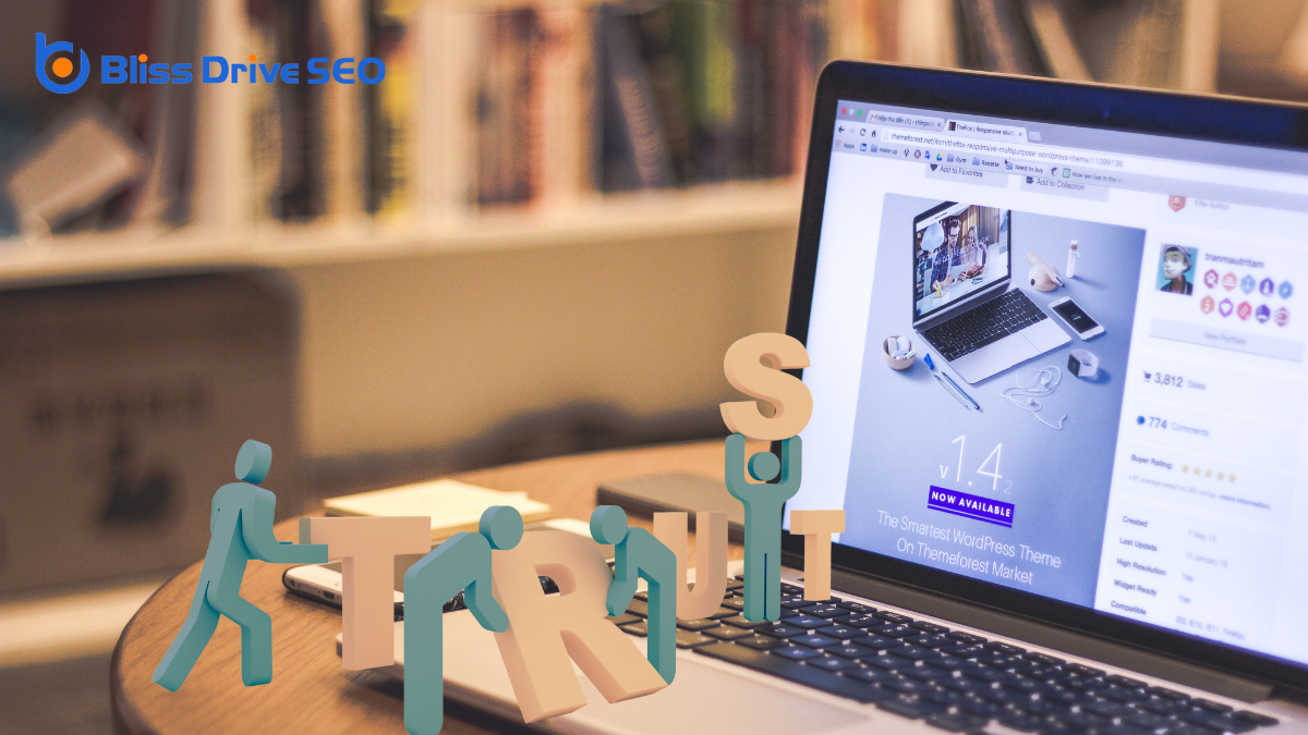
Establishing trust and credibility on your website is essential for converting visitors into loyal customers. When people land on your site, they need to feel confident that your business is legitimate and reliable.
Start by ensuring your website has a professional design. A clean, organized layout with consistent branding shows attention to detail and professionalism. Avoid clutter and make navigation intuitive; this helps visitors find what they need without frustration.
Incorporate trust signals like customer reviews and testimonials. Real feedback from satisfied customers builds credibility and reassures new visitors.
It's also important to display contact information prominently. An easily accessible phone number or email address makes you approachable and transparent, which are key components of trust.
Security features can't be overlooked. Make sure your website has SSL certification, especially if you're handling sensitive information. Display security badges to assure visitors their data is safe.
Additionally, keep your content accurate and up-to-date. Regular updates signal that your business is active and engaged.
Lastly, having a clear privacy policy shows you respect users' information. By implementing these strategies, you'll build a trustworthy online presence that encourages visitors to become committed customers.
In web design, your goal is to create a site that captivates and engages users. You achieve this by enhancing user experience, clearly communicating your brand identity, and boosting conversion rates. With intuitive navigation and accessibility features in place, users will find it easy to explore your content. Optimizing for search engines and mobile devices guarantees you reach a wider audience. Ultimately, a well-designed website builds trust and credibility, encouraging users to take the actions they desire.
When you're designing a website, you might wonder what makes it truly stand out. The answer often lies in the three main languages of web design: HTML, CSS, and JavaScript. Each plays a distinct role, forming the backbone of modern web pages. HTML sets the structure, CSS styles it beautifully, and JavaScript adds interactivity. But how do these languages actually work together to create seamless web experiences? Understanding their individual contributions and how they integrate can transform your approach to web design. Are you ready to explore how these languages can elevate your web projects?
How do you begin creating a webpage? The first step is understanding HTML, which stands for Hypertext Markup Language.
It's the backbone of any webpage, providing the structure and essential elements. Think of HTML as the skeleton of your webpage; it organizes content and gives it order. You'll use HTML tags to define different parts of your webpage, like headings, paragraphs, and links.
To start, you'll need a basic text editor like Notepad or a more advanced one like Visual Studio Code. When you open a new file, you'll write your HTML code there.
Begin with a '' declaration to tell the browser that you're using HTML5. Then, use '', '', and '' tags to lay out your page. The '' section includes metadata and the page title, while the '' section contains the visible content.
Each element you add, like a paragraph or image, needs specific tags. For instance, use '
' for paragraphs and '' for images.
Once you've grasped the basics of HTML, it's time to explore CSS, or Cascading Style Sheets, which brings your webpage to life with style and design.
CSS allows you to control the look and feel of your website, making it visually appealing and user-friendly. By separating content (HTML) from presentation (CSS), you can easily update your site's appearance without changing its structure.
With CSS, you can:
To start, you'll write CSS rules that target specific HTML elements using selectors. These rules define the styling properties you want to change.
You can apply CSS inline, embedded within HTML, or externally through a separate file. For larger projects, external CSS files are recommended for better organization and reuse.
Understanding CSS is essential to crafting a visually cohesive and responsive web design that enhances user experience.
In the world of web development, JavaScript is the dynamic force that transforms static pages into interactive experiences. It's the language that breathes life into your website, allowing you to create everything from simple forms to complex animations.
With JavaScript, you're not just adding layers of interactivity; you're enhancing user engagement by making your site more responsive and functional. You'll find JavaScript indispensable in tasks like form validation, dynamic content updates, and creating interactive maps.
It allows you to modify HTML and CSS on your webpage, meaning you can change content and style on the fly without needing to reload the page. This not only improves user experience but also can considerably speed up your site's performance.
JavaScript also plays a vital role in the client-server interaction. By using frameworks like Node.js, you can handle server-side operations, making JavaScript a versatile tool for both front-end and back-end development.
It bridges the gap between technology and creativity, enabling you to build applications that aren't just visually appealing but also highly functional. Mastering JavaScript opens up a world of possibilities, allowing you to craft web experiences that are truly engaging.
You've now got a solid grasp of the three main languages of web design: HTML, CSS, and JavaScript. HTML lays the foundation by structuring content, CSS brings it to life with style and color, and JavaScript adds the magic of interactivity. By mastering these, you can create engaging and visually appealing websites. So, plunge into it, experiment, and let your creativity shine as you build the web experiences of tomorrow.
When you think about a web design system, you're considering more than just aesthetics; it's about creating a unified experience across digital platforms. Imagine a toolkit that enhances efficiency, fosters innovation, and maintains brand identity—all while streamlining the development process. But how does it really facilitate cross-functional collaboration and guarantee scalability in an ever-evolving tech landscape? And why is prioritizing accessibility so vital? These are the questions that reveal the true purpose behind a web design system, inviting a deeper exploration into its impact on both users and teams alike.
Achieving consistency across platforms is essential for an effective web design system. As someone interested in web design, you know how important it is for your users to have a seamless experience, no matter what device they're using.
Consistency isn't just about making things look the same; it's about ensuring functionality and design elements work cohesively. When users switch from a desktop to a mobile device, they expect the website to have the same look and feel, which builds trust and familiarity.
To achieve this, you should focus on maintaining uniform branding elements such as colors, fonts, and images. These elements should be consistent in every element of the design, from buttons to navigation bars.
Consistency also means ensuring that your site's functionality is reliable across different browsers and devices. By using a standardized set of design components, you can streamline development and reduce errors, making the design process more efficient.

To enhance design efficiency, it's essential to leverage a web design system that streamlines the process from start to finish. You'll find that a well-defined system reduces repetitive tasks, allowing you to focus on creativity and innovation. It provides a library of reusable components, so you don't have to start from scratch every time you design a new page. This not only saves time but also guarantees a cohesive look and feel across your project.
When you're working with a web design system, you'll notice that it offers clear guidelines and best practices. This means you can quickly make decisions without second-guessing if your choices align with the overall project. It's like having a roadmap that guides you, reducing the risk of errors and inconsistencies.
Moreover, collaborating with your team becomes much smoother. Everyone's on the same page, using the same elements, which minimizes confusion and miscommunication. You'll spend less time fixing mistakes and more time pushing your project forward.
While a web design system boosts efficiency, it also plays an essential role in streamlining development processes. Imagine diving into a project with consistent components and predefined guidelines at your fingertips. This setup minimizes guesswork, allowing you to focus on creating rather than constantly reinventing the wheel.
A web design system provides a cohesive set of UI elements and design patterns, which means you don't have to start from scratch every time. You'll find that reusing these elements speeds up the development process and guarantees consistency across different parts of your project.
Consider how much time you save when everyone on your team speaks the same design language. With a shared understanding of the design system, developers and designers can communicate more effectively, reducing misinterpretations and revisions.
The web design system serves as a central resource, promoting collaboration and alignment across your team. This cohesion not only accelerates the development process but also enhances the quality of the final product.
A web design system often acts as the cornerstone for promoting scalability and flexibility in your projects. When you use a well-structured design system, you create a foundation that can grow alongside your needs. This growth is critical as your project evolves, allowing you to add new features or pages without starting from scratch.
The predefined components and guidelines provide consistency, so you don't have to reinvent the wheel each time your project expands.
Flexibility is another key advantage. Design systems aren't rigid; they're adaptable. They allow you to make changes efficiently because you're working within a framework that accommodates updates.
You'll find it easier to maintain the visual and functional integrity of your project, even as you make changes. This adaptability helps you respond to user feedback and emerging trends without disrupting the entire system.

Effective web design systems play a pivotal role in facilitating cross-functional collaboration within a team. When you're working with diverse groups like developers, designers, and content creators, a unified system guarantees everyone stays on the same page.
It helps bridge gaps and improves communication by providing a common language and set of tools. This way, each team member understands their role and how it fits into the bigger picture.
Here are four ways a web design system boosts collaboration:
When you streamline design processes, you cut down on repetitive tasks and free up time for creativity.
By fostering a consistent visual language, you guarantee that every element aligns seamlessly, reducing the need for constant revisions.
Efficient resource utilization means you can focus on innovation instead of reinventing the wheel with each project.
How often do you find yourself reinventing the wheel in web design projects?
It's easy to fall into this trap, but using a web design system can help you streamline the process. By leveraging a well-defined system, you'll reduce redundancy and save precious time.
Here's how it can transform your workflow:
Embrace a web design system and make your workflow more efficient.
Building on the efficiency of a streamlined design process, a consistent visual language further enhances your web design projects. By establishing a clear set of design principles, you guarantee that all elements across your website harmonize effortlessly. This consistency eliminates confusion for users and helps them navigate your site intuitively, recognizing patterns and understanding your brand's ethos without thinking twice.
When you maintain a consistent visual language, you reduce redundancy in design. Instead of reinventing the wheel for every new page or section, you rely on a predefined set of colors, fonts, and styles. This not only saves time but also minimizes errors. Your design team isn't constantly debating over which shade of blue to use or what font aligns best with your brand. They can focus on innovation and creativity within the established framework.
Moreover, consistent visual language strengthens your brand's identity. When users see familiar design elements, they associate them with your brand, building trust and recognition.
Ultimately, by embracing a consistent visual language, you create a cohesive, professional appearance that resonates with your audience, enhancing their overall experience and making your web design efforts more effective.
Maximize the potential of your web design projects by efficiently utilizing resources and reducing redundancy. By doing so, you save time, cut costs, and enhance the overall quality of your work.
A web design system helps you accomplish this by providing a standardized set of guidelines and components. Here's how it works:
When you focus on improving user experience, simplifying navigation flow becomes essential.
By enhancing visual consistency, you guarantee that users can easily recognize patterns and predict actions.
Don't forget to increase accessibility standards, making sure everyone can interact with your site effortlessly.
Maneuvering a website should feel like a breeze, not a labyrinth. To achieve this, simplifying the navigation flow is essential. You want your visitors to find the information they need effortlessly, without frustration. This is where a well-structured web design system comes into play. It provides clear pathways and intuitive layouts, guaranteeing users don't get lost.
Consider these four strategies to enhance navigation flow:
A seamless navigation flow paves the way for an engaging user experience, but enhancing visual consistency is equally important. When you explore a website, your eyes naturally search for familiar patterns. Consistent design elements like colors, fonts, and layouts guide you, ensuring you don't feel lost or confused. By maintaining a cohesive look across all pages, you provide users with a sense of stability and trust.
Visual consistency doesn't just make things look pretty; it reinforces your brand identity. When you use the same design principles across your website, it helps users recognize your brand instantly. This familiarity can create a stronger connection, making users more likely to return. Think of it as setting a tone that resonates with your audience.
You also enhance the usability of your site by being consistent. When users know what to expect when they click a button or navigate to a new page, it reduces cognitive load. This means they don't have to spend extra time figuring out how things work, improving their overall experience.
Emphasizing visual consistency makes your website not only more intuitive but also more enjoyable to use.
Inclusive design is more than a buzzword; it's a necessity in today's digital world. When you focus on increasing accessibility standards, you guarantee that everyone, regardless of their abilities, can access and benefit from your website.
This isn't just about compliance; it's about creating a positive user experience for all. By making your web design more accessible, you're not only broadening your audience but also showing that you value inclusivity.
Here are four key ways to increase accessibility standards:
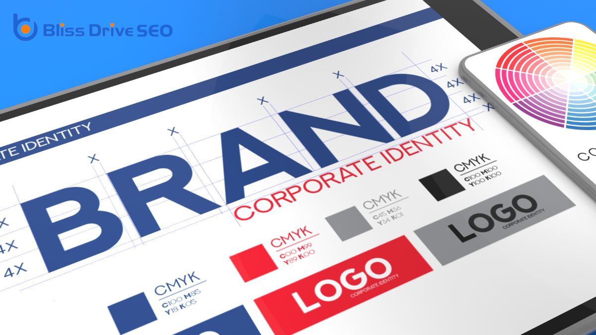
Consistency in web design is key to maintaining brand identity. Users who visit your website should instantly recognize your brand through elements like color schemes, typography, and imagery. A web design system helps you achieve this by providing a standardized set of design principles and components that guarantee your website speaks with one voice.
You might think of it like a brand's visual language—every part of your site should align with your brand's identity.
Using a web design system, you can easily replicate your brand's look and feel across different pages and even other digital platforms. This approach not only reinforces brand recognition but also builds trust with your audience. When visitors see a cohesive design, it suggests professionalism and reliability, making them more likely to engage with your content.
Furthermore, a web design system reduces the chances of inconsistencies that can confuse users or dilute your brand message. By having a clear set of guidelines and reusable components, you guarantee that everyone on your team, from designers to developers, is on the same page.
This unified approach strengthens your brand's identity and keeps your online presence polished and professional.
By leveraging a web design system, you can greatly speed up your time to market. This tool provides a structured approach, allowing you to reuse components and create consistency across platforms.
Here's how it can accelerate your development process:
Understanding and utilizing a web design system helps you deliver high-quality products swiftly. It empowers your team to focus on creativity and innovation rather than getting bogged down in repetitive design and development tasks.
To stay ahead in web design, you need to embrace new technologies that can enhance functionality and aesthetics.
By implementing responsive design practices, you guarantee your site looks great on any device.
Prioritizing user experience helps you meet the ever-changing expectations of your audience.
In today's rapidly evolving digital landscape, embracing new technologies isn't just an option but a necessity for staying competitive. You must be proactive in adapting your web design system to remain relevant. Integrating fresh technologies can enhance user experience, improve functionality, and keep your digital presence ahead of the curve.
Here's how you can achieve this:
As the digital world continues to evolve, responsive design practices are vital to guarantee your website delivers a superior user experience across all devices. You can't ignore the variety of screens your audience uses, from smartphones to tablets and desktops.
Employing responsive design guarantees your site adjusts seamlessly, offering a consistent look and feel, no matter the device.
Start by using flexible grid layouts and fluid images. These adapt to different screen sizes, maintaining the integrity of your design.
Don't forget to implement media queries in your CSS. They're the backbone of responsive design, allowing you to apply different styles depending on the device's characteristics, like width and resolution.
It's also essential to prioritize loading speed. A responsive site should load quickly on mobile devices, where users often have less bandwidth.
Compress images, leverage browser caching, and minimize HTTP requests to keep performance high.
Finally, test across multiple devices and browsers. Tools like Google's Mobile-Friendly Test can help you guarantee your site functions as expected.
User experience stands at the forefront of web design, driving the necessity to adapt to evolving trends. As a designer, you need to prioritize how users interact with your site, guaranteeing it's intuitive and engaging.
Trends in web design shift rapidly, and staying ahead means understanding what your audience needs and expects. Here's how you can focus on user experience priorities:
By embracing a web design system, you guarantee that your digital platforms will be consistent and efficient. You'll streamline development, making your team more agile and collaborative. By using standardized components, you not only maintain brand identity but also enhance user experience. This system lets you adapt quickly to new trends and technologies, accelerating your time to market. Ultimately, you're fostering innovation and scalability, aligning your team toward a unified design vision that resonates with users.
When you think about web designing, imagine crafting a digital space that's both inviting and functional, much like setting up a cozy coffee shop that pulls people in. It's about blending artistry with utility, using tools like HTML and CSS to build layouts that speak to your audience. Picture an e-commerce site where every image, review, and button is strategically placed to guide a shopper effortlessly. But what really makes a design effective, and how do you keep users coming back for more? There's more to uncover as we explore the intricacies of web design and its impact.
Understanding web design is vital for creating effective and engaging websites. When you immerse yourself in web design, you're not just picking colors or placing images; you're crafting experiences. Your goal is to make certain visitors can navigate smoothly, find information easily, and enjoy their time on your website. It's about blending functionality with aesthetics to guarantee users are both informed and delighted.
Web designing involves a variety of skills and disciplines. You need to be familiar with HTML, CSS, and possibly JavaScript, as these are the building blocks of any website. But it doesn't stop there. You'll also need to understand the principles of user experience (UX) and user interface (UI) design. These principles help you organize content logically and create a layout that's intuitive to users.
In the world of web design, keeping up with trends is imperative. Styles and technologies evolve rapidly, so staying current guarantees your designs are fresh and relevant.

When you're focusing on web design, two critical elements to master are visual design principles and user experience.
Visual design isn't just about aesthetics; it shapes how users interpret and interact with your site.
Prioritizing user experience guarantees your website is intuitive and engaging, keeping visitors coming back.
Though web design encompasses various aspects, the visual design principles form its core, guiding the creation of aesthetically pleasing and functional websites. When you grasp these principles, your web designs won't just look good; they'll communicate effectively with your audience.
Start by considering balance, which guarantees a stable appearance across your site. Distribute elements evenly, whether you're aiming for symmetrical or asymmetrical balance, to maintain harmony.
Contrast plays an essential role in making important elements stand out. Use it to emphasize key points by varying color, size, or font. It helps direct attention where you want it most.
Next, consider alignment, which keeps your content organized and readable. Proper alignment avoids a messy look and makes navigation intuitive.
Another principle, repetition, reinforces your brand's identity through consistent use of colors, fonts, and styles. This consistency builds familiarity and trust with your users.
Finally, focus on white space, or the empty space around elements. Don't underestimate its power. It provides breathing room and guides the viewer's eye naturally through the content.
A website's success hinges on its user experience (UX) design, which guarantees that visitors find it intuitive and engaging. When designing a site, focus on how users will interact with it. You want them to navigate effortlessly, find information quickly, and enjoy the overall experience. This means considering layout, accessibility, and responsiveness to ascertain everything works smoothly across all devices.
Think about your target audience and their needs. What do they expect to accomplish on your site? If it's an e-commerce site, they should easily browse and purchase products. If it's informational, they should locate content with minimal effort. Use clear calls to action and logical navigation paths to guide users seamlessly through their journey.
Also, pay attention to loading times. No one likes waiting for pages to load—slow sites can frustrate users and drive them away. Optimize images and streamline code to keep your site fast and efficient.
Incorporate user feedback to refine and improve the experience continually. Testing and iterating based on real user interactions help you create a website that not only looks good but also functions excellently, assuring a satisfying user experience every time.
In the dynamic field of web design, a web designer plays an indispensable role in crafting visually appealing and user-friendly websites. As a web designer, you're the creative force behind the layout, color scheme, typography, and overall aesthetics of a site. You guarantee that the website isn't just visually stunning but also aligns with the brand's identity and message.
By focusing on the user's experience, you design intuitive navigation and guarantee information is accessible and engaging. Your job involves understanding the client's needs and translating them into a digital format that resonates with the target audience. This means you'll need to balance creativity with functionality, making sure that every design element serves a purpose.
Communication is essential, as you'll collaborate with clients, developers, and other team members to bring your vision to life. You'll also stay updated on the latest design trends and technologies. This helps you create modern websites that meet current user expectations.
Problem-solving skills are important because you'll often need to find innovative solutions to design challenges. Ultimately, your role is to create websites that captivate users and provide a seamless, enjoyable experience.
When you're diving into the world of web design, having the right tools at your disposal can make all the difference.
These tools help streamline your workflow, enhance creativity, and guarantee the final product is both functional and visually appealing.
By equipping yourself with the right resources, you can tackle web design projects with confidence and efficiency.
Here's a list of essential web design tools you should consider:
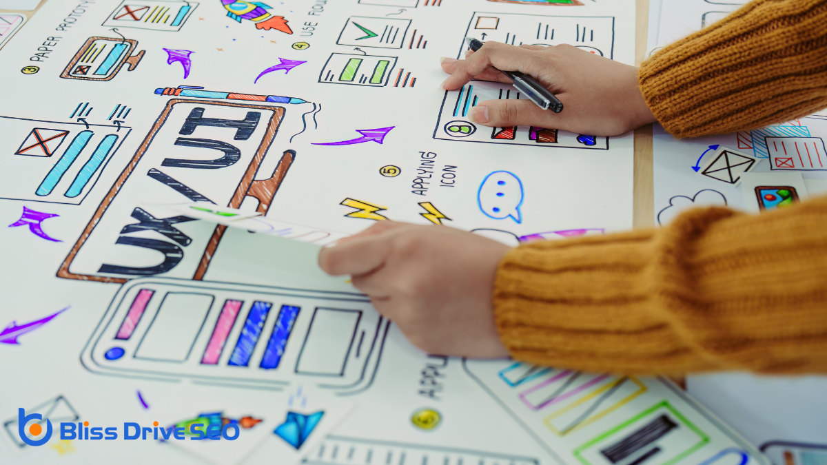
Having the right tools sets the stage for an effective design process, but understanding the core principles of effective design truly elevates your work. These principles guide you to create visually pleasing and functional websites.
First, embrace simplicity. A clutter-free design makes your site easy to navigate and enhances user engagement.
Next, focus on balance. Distribute elements evenly across your page to create a sense of harmony, whether through symmetrical or asymmetrical layouts.
Contrast is also essential. It highlights important sections and guarantees readability, often achieved through variations in color, size, or typography.
Speaking of typography, choose fonts wisely. They should be legible and suit the website's tone.
Alignment is another key principle. Proper alignment creates a clean structure, helping users easily find information.
Consistency can't be overlooked. Use uniform colors, fonts, and styles across all pages to build trust and guarantee a seamless experience.
Finally, think about the hierarchy. Organize content logically, using headings and subheadings to guide users through information effortlessly.
Every great website prioritizes user experience and interface, driving engagement and satisfaction. When you design a website, focusing on how users interact with it is essential. A seamless user experience (UX) means your visitors find what they're looking for easily and enjoyably. The user interface (UI) complements this by providing an aesthetically pleasing and intuitive design.
Consider these key aspects to enhance UX and UI:
In today's digital world, you can't overlook the importance of responsive design in enhancing user experience.
By adapting to different screen sizes, your website guarantees that visitors enjoy a seamless and engaging interaction, whether they're on a phone or a desktop.
This approach also improves site accessibility, making your content available to a wider audience, including those with varying needs and devices.
Responsive design is essential for enhancing user experience in today's digital age. It guarantees that your website looks great and functions well on every device, from smartphones to desktops.
By focusing on responsive design, you can meet your users' expectations and provide a seamless experience, which is vital for retaining visitors and encouraging them to explore your site further.
When you prioritize enhancing user experience through responsive design, consider the following benefits:
Imagine visiting a website where the text spills off the screen or buttons overlap, making it frustrating to navigate. This is what happens when a site isn't designed to adapt to different screen sizes.
In today's world, people use various devices like phones, tablets, and desktops to access websites. If your site doesn't modify to these screen sizes, you risk losing visitors who can't easily interact with your content.
Responsive design guarantees your website looks and functions well on any device. It's all about creating a flexible layout that adapts to the user's screen. You want images to resize appropriately, text to remain readable, and navigation to stay intuitive.
By implementing responsive design, you enhance the user experience, making it seamless regardless of the device.
To achieve this, use flexible grids, responsive images, and CSS media queries. These tools help your site dynamically adjust its elements.
As you guarantee your website adapts to various screen sizes, you also need to focus on improving site accessibility. Accessibility guarantees everyone, including individuals with disabilities, can use your site without barriers.
By prioritizing this, you enhance user experience and broaden your audience reach. Here's how to make your site more accessible:

Amidst the complex world of web design, examining a real-world case study can illuminate practical strategies and common pitfalls.
Consider the transformation of Airbnb's website. Initially, the site faced issues with user navigation and slow loading times. These problems often deterred potential users and affected overall engagement. By analyzing user feedback and conducting thorough usability testing, Airbnb's design team identified key areas requiring improvement.
They focused on simplifying the user interface, making navigation intuitive and seamless. By optimizing images and streamlining the code, they markedly reduced loading times, enhancing user experience.
Additionally, Airbnb adopted a mobile-first approach, ensuring that the site functioned efficiently across all devices. This strategic shift not only improved accessibility but also increased their user base.
Throughout this redesign process, Airbnb maintained a consistent visual identity, reinforcing brand recognition. They used A/B testing to evaluate changes, ensuring every decision was data-driven and user-centric.
By prioritizing user experience and leveraging technology effectively, Airbnb transformed its website into a powerful tool for connection.
In this case study, you can see how focusing on simplicity, speed, and consistency can turn web design challenges into opportunities for growth and success.
The landscape of web design is rapidly evolving, driven by technological advancements and changing user expectations. As a budding web designer, you need to stay ahead of the curve by embracing emerging trends that are shaping the future of web design.
Here are some key trends you should watch:
These trends aren't just buzzwords; they're shaping how users interact with the digital world.
By incorporating these elements into your designs, you can improve user engagement and remain competitive.
Remember, keeping your skills updated with these innovations isn't just an option—it's a necessity in today's fast-paced digital landscape.
Stay curious, keep learning, and your web designs will continue to shine.
In web designing, you're crafting more than just a website; you're creating an experience that combines aesthetics and functionality. As a web designer, you guarantee each element—from color schemes to user interfaces—works harmoniously to engage users. By keeping up with modern trends and prioritizing responsive design, you guarantee accessibility and satisfaction across devices. Remember, a well-designed site isn't just visually appealing; it's a powerful tool that communicates effectively and meets users' needs seamlessly.

